MOB-ImplementationGuide-EN-5.2
Entersoft Business Suite® | Entersoft CRM® | Entersoft Mobile Suite®
Technical manual
Identity
Document version 4.0
Software version ESMobile 5.2
Last update December 2022
Copyright
© Copyright 2011 Entersoft A.E. All rights reserved.
No part of this work may be reproduced, transmitted, stored, or used in any form or by any means, without the prior written permission by Entersoft S.A. Regarding the content of the present document…
- It may be altered at any time.
- It serves exclusively informative goals.
- No guarantee whatsoever is handed out for the possibility of existing mistakes, or the wrongful use or unwanted results, produced by the use of processes hereby followed and recommended.
Περιεχόμενα
- 1 Introduction
- 2 Overview screen (ListForm)
- 3 Photo gallery screen (SFListForm)
- 4 Selection list screens
- 5 Data entry screens
- 5.1 Master entity (EditForm)
- 5.2 Master-Detail entity (DocForm)
- 5.2.1 Screen Data
- 5.2.2 Display format / Header
- 5.2.3 Display format / Contents
- 5.2.3.1 Element display location
- 5.2.3.2 Image column (ImageCell)
- 5.2.3.3 Standard action buttons
- 5.2.3.4 Configure a selected entry
- 5.2.3.5 Element format properties
- 5.2.3.6 Element processing properties (LineEditing)
- 5.2.3.7 Format by condition (Binding)
- 5.2.3.8 Header area
- 5.2.3.9 Grouping area
- 5.2.3.10 Totals area
- 5.2.4 Display format / Other areas
- 5.2.5 Advanced functionality
- 5.3 Named task (NamedTask)
- 6 Informative screens
- 7 Special screens
- 8 Business rules
- 9 App customization
- 10 Ideas & Solutions
- 10.1 User interface
- 10.2 DocForm screen type
- 10.2.1 Line grouping
- 10.2.2 Line sorting
- 10.2.3 Bulk edit line elements
- 10.2.4 Discount value allocation
- 10.2.5 Line total discount %
- 10.2.6 Balance limit excess
- 10.2.7 Gift lines
- 10.2.8 Change collection type button
- 10.2.9 Auto generate task
- 10.2.10 Auto generate document
- 10.2.11 Auto add analysis line
- 10.2.12 Split document
- 10.3 Online business policy
- 11 Appendix
Introduction
The purpose of this document is to provide all the necessary technical information to experienced users who wish to modify the default functionalities of the iOS Entersoft Mobile Suite (ESMobile) application. In brief, the individual objectives are:
To provide detailed implementation instructions for the individual screens of the ESMobile application. Note that the screens, that are either modified or fully implemented at an ESMobile application customization level, are considered custom and are automatically marked with an asterisk.
To provide information about the extension possibilities concerning the functionality schema of the ESMobile application.
Requirements for using the ESMobile application and the present manual include:
being familiar with the interface & use method for each mobile device.
the knowledge of all the necessary actions to install and setup the IIS & Application server
proper set-up of the required equipment
 Note that
The present manual applies to all ESMobile platforms (iOS, UWP, Android). The parts that, by way of exception, relate to a specific ESMobile platform, are marked accordingly.
The individual examples of this manual are available for download at the mPortal tool.
Symbols

|
iOS platform |
|---|---|

|
Universal Windows (UWP) platform |

|
Android platform |
Overview screen (ListForm)
The overview screen (ListForm) in its simplest form is used to display data in the form of a list. However, by means of a case-by-case “appendix”, it is possible to extend the ListForm screen with the following features:
Display of the list's numeric data in the form of a Graph.
Redirection, by focusing a list entry, to the Dashboard screen. The Dashboard screen allows the user to expand the ListForm screen information and to directly perform a series of actions.
The elements required to implement a ListForm screen are:
| Element | Comment |
|---|---|
| Command | Using a ListFormCreatorCommand command is required. |
| Form | In order to implement the display format in its simple form it is necessary to use an AdvancedList.xml file. The Graph screen appendix is implemented in a ChartParams.xml file, while the dashboard screen appendix in an ExtraLayoutParams.xml file. |
Next up in this section, you will be provided with detailed implementation instructions for “ListForm” screens, using a specific example.
Screen Data
Example SampleListForm
Defining the ListForm screen data and the command-form link is possible by appropriately configuring the sub-properties of the command file. The command file should be in the Commands sub-folder of the ESConfig or CSConfig area. Attention: the command file name should match the name of the command in the file.
 Example
Suppose that we wish to create a screen that displays customer addresses in the form of a list. This list must fulfill the following basic specifications:
Include only active customers.
Display information from the customer & their addresses.
Be sorted alphabetically based on the “Name” column of a person.
Suppose also that the form of this screen is SampleListForm
| Property | Comment |
|---|---|
| FormID | The folder in ESForms or CSForms where the relevant AdvancedList file of the form can be found, namely SampleListform folder for this example. |
| Title | The label that appears as a screen ListForm title, in this example, the label "Points of Sales". |
| Filter | The “static” filtering criterion for the data, in this example, the ta.Inactive column. |
| BaseSelect | The “select query” that specifies the data to be displayed. |
| ESQueryID | The name of the independent definition file for the base select query. It is automatically filled-in only in the case where, for the purpose of re-using the select query, it’s meant to be defined in an independent file. In such a case, the BaseSelect property must be empty. Note that the independent select query file should be located in the Queries sub-folder of the ESConfig or CSConfig area. |
| SearchPanelFilter | The alternative search criteria. |
| SearchPanelID | The name of the independent definition file for the alternative search criteria. It is automatically filled-in only in the case where, for the purpose of re-using the search criteria, they’re meant to be defined in an independent file. In such a case, the SearchPanelFilter property must be empty. Note that the independent select criteria file should be located in the SearchPanels sub-folder of the ESConfig or CSConfig area. |
| LoadDataOnOpenForm | Right after the screen is called, it displays the data (true), or displays-updates the data after the user fills in the search criteria (false). In cases of a list with a big number of entries, it is recommended to set this property as False. This way, data will appear only after editing the filter criteria, while at the same time clearing the filter criteria will not cause the list to update. |
| CacheSearchPanel | Maintains the content of entry search criteria (true), or clears them the screen is closed (false). |
| OrderBy | The “static” sorting criterion for the data, in this example, the p.Name column. |
Sorting
Example SampleListForm
Specifying the alternative sorting criteria for an entry list is possible in the command file and by appropriately configuring the SortBy property. If there are alternative sorting criteria specified in the command, the  -Sort button appears on the top right part of the screen. By pressing this button it is possible to switch between the available criteria. It is recommended that, in case the user has opted for implementing alternative sorting criteria, the static sorting criterion is also defined as one of them.
Regarding the definition method and the available properties for the alternative sorting criteria, the following apply:
| Property | Comment |
|---|---|
| Caption | The label displayed as the criterion title. |
| ESCaptionID | Exclusively refers to the product translation process (Translation key). |
| Expression | The fields – sorting direction of the entries list. |
| Default | The criterion that has value True is the default sorting criterion of the entry list. This value overrides a possible OrderBy property of the command. |
 Example
Suppose that we wish to extend our ListForm screen so that, in addition to the person’s “Name” column sorting , there is also the possibility of ascending or descending sorting based on the “ABC class” customer column, while also maintaining the person’s Name as a default criterion.
 Search
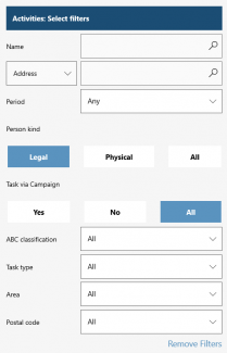
Example SampleSearchPanel
Specifying alternative criteria for searching an entry list is possible in the command file and by appropriately configuring the SearchPanelFilter property or the SearchPanelID property.
The definition method and search criterion characteristics vary depending on the column type to which the criterion will apply. The available criteria types are: ColumnNames, FieldChooser, DateField, DropDown, Autocomplete & Boolean. Note here that the “Remove filters” button is automatically added to the bottom-right of the alternative criteria screen. Pressing this button directly resets the content of the individual search criteria to their original value.
ColumnNames
Refers to a string-type column and the content is typed in by the user. Regarding the definition method and the available criteria properties, the following apply:
| Property | Comment |
|---|---|
| ID | The criterion SEQ.NO should be unique. |
| minimumInput | The number of characters we wish to be required in order to directly refresh the entries list. By keeping this property empty, pressing the  -Search button is also needed to refresh the entries list -Search button is also needed to refresh the entries list
|
| title | The label displayed as the criterion title. |
| column | The command column on which the criterion is applied. The * character is used to indicate, on a case-by-case basis, the following:
|
| default | The default criterion value. |
| keyboard | For the alphanumeric keypad to appear focused on numbers, set value “num”. Concerns the iOS platform only |
| soundex | Specifically, for the person’s fields name-address code-item description & catalogue item, it is possible for the search result to be the same, regardless of whether the criteria is typed in uppercase-lowercase or Greek-Latin characters. To activate this feature, it is necessary to:
lastly, in the SoundexMappingsID property of the ListForm command, specify the SoundexConversion value |
Example
| Suppose that we wish to implement a search criterion for list entries, based on the person's "Name" column.
|
|---|

FieldChooser
Refers to a string-type column and the content is typed in by the user. Used to aggregate multiple ColumnNames-type criteria into one criterion. Regarding the definition method and the available criteria properties, the following apply:
| Property | Comment |
|---|---|
| ID | The criterion SEQ.NO should be unique. |
| minimumInput | The same applies as for the ColumnNames criterion. The property is relevant to all individual criteria. |
| title | The label displayed as the criterion title. |
| column | The same applies as for the ColumnNames criterion. |
| soundex | The same applies as for the ColumnNames criterion. |
Example
| Suppose that we wish to implement a search criterion for list entries, by selecting one of the person's “Address” or “Telephone” columns. | |
|---|---|
  
| |
DateField
Refers to a date-type column, which allows the user to select a time period. Regarding the definition method and the available criteria properties, the following apply:
| Property | Comment | |
|---|---|---|
| ID | The criterion SEQ.NO should be unique. | |
| title | The label displayed as the criterion title. | |
| column | The command column on which the criterion is applied. | |
| defaultselection | The default criterion value. The available options are: | |
* 3-Today
|
* 6-Current week
| |
Example
| Suppose that we wish to implement a search criterion for list entries, based on the task's "Start date" column. The criterion is set to 3-Today by default. | |
|---|---|
 
| |
Boolean
Refers to an integer-type column that always refers to two values (true / false). Regarding the definition method and the available criteria properties, the following apply:
| Property | Comment |
|---|---|
| ID | The criterion SEQ.NO should be unique. |
| title | The label displayed as the criterion title. |
| column | The command column on which the criterion is applied. Note that, if the column to which we wish the criterion to be applied is not by nature of the integer type, it must be converted accordingly into an integer. |
| truetext | The label that appears when the criterion condition is met. |
| truevalue | The column value when the criterion condition is met. |
| falsetext | The label that appears when the criterion condition is not being met. |
| falsevalue | The column value when the criterion condition is not being met. |
| nonetext | The label that appears if there is no specific value selected. |
| the room was a one-off room | The default criterion value. |
Example-1
| Suppose that we wish to implement a search criterion for list entries, based on the "Person type" column. We also want the criterion to allow the user to switch between Legal and Physical person and have value 0-Legal person as the default.
|
|---|

Example-2
| Suppose that we wish to implement a search criterion for list entries, based on the task's "Related campaign" column. We also want the criterion to allow the user to switch between tasks within and without the campaign and have no default value. Provided that the “related campaign” column is of GID type, the ViaCampaign column must be used, which has the following definition:
cast (
) ViaCampaign |
|---|
DropDown
Refers to a string-type column, which allows the user to select from list of values. Regarding the definition method and the available criteria properties, the following apply:
| Property | Comment |
|---|---|
| ID | The criterion SEQ.NO should be unique. |
| title | The label displayed as the criterion title. |
| column | The command column on which the criterion is applied. |
| default | The label that appears if there is no specific value selected from the list. |
| query | The “select query” that specifies the data to be displayed in the value selection list. The syntax should be of form:
<query>select ValueMember, DisplayMember1, DisplayMemder2 from...</query> where
|
| selectedvalue | The default criterion value. A fixed value can be specified, or alternatively, a select query. In this case, the syntax should look like this:
<selectedvalue>query: select ValueMember from...</selectedvalue> |
| binding | Restrict the list of values of a criterion, based on the value selected in another criterion. The syntax should be of form:
<binding bindelement="" filter=""/> where
|
Example-1
| Suppose that we wish to implement a search criterion for list entries, based on the customer's "ABS class" column. We also want the criterion to display a selection list and have category B as its default value. | |
|---|---|
 
| |
Example-2
| Suppose that we wish to implement a search criterion for list entries, based on the "Task type" column. We also want the criterion to display a selection list and have task type ES.SAP as its default value. |
|---|
Example-3
  Suppose that we wish to implement a search criterion for list entries, based on columns "Area & “Zip code” of the person’s address. We also want the criteria to display a selection list and be able to restrict the list of values of criterion Zip code, based on the value selected for Area. Suppose that we wish to implement a search criterion for list entries, based on columns "Area & “Zip code” of the person’s address. We also want the criteria to display a selection list and be able to restrict the list of values of criterion Zip code, based on the value selected for Area.
|
|---|
AutoComplete
Refers to a string-type column that allows the user to find a value by typing and select multiple values. Regarding the definition method and the available criteria properties, the following apply:
| Property | Comment |
|---|---|
| ID | The criterion SEQ.NO should be unique. |
| title | The label displayed as the criterion title. |
| column | The command column on which the criterion is applied. |
| query | The “select query” that specifies the data to be displayed in the value selection list. The syntax should be of form:
<query>select ValueMember from...</query> where ValueMember is the value based on which the entries will be filtered. |
| binding | The same applies as for the DropDown criterion. |
| multiselect | Multiple selection of values (true) or not (false). |
Example
| Suppose that we wish to implement a search criterion for list entries, based on the "Task type" column. We also want the criterion to display a selection list and allow the selection of multiple values.
|
|---|

Display Format / List
Example SampleListForm
The displayed elements of the ListForm screen as a list can be set by appropriately configuring the individual properties of the form's AdvancedList file. Note that the ListForm screen consists of two main areas (RowTemplates), the data area (Normal RowTemplate) and the header area (Header RowTemplate). The design specifications differ per area.
Next up in this section, you will be provided with detailed design instructions for the ListForm areas.

Data area
Setting the data range (normal RowTemplate) is mandatory and always refers to the first RowTemplate of the form’s AdvancedList file. Regarding the definition method and the properties available at an area level (RowTemplate) and element level (Cell), the following applies:
| Property | Comment | ||
|---|---|---|---|
| RowTemplate | |||
| Height | The area height. | ||
| Cell-Required | |||
| Type | The ListForm in its simple form only supports TextCell-type elements. | ||
| Bounds | The display location of the element. The 4 sizes of this property determine x, y, width & height respectively, with 240 as the maximum screen width. | ||
| CellSource | The command column that corresponds to the element. | ||
| Cell-Optional | |||
| Name | A name for informative purposes. | ||
| Visible | Display (true) or hide (false) the element. | ||
| Alignment | The alignment of the element’s content with the following values available: Left, Right & Center. | ||
| FontSize | The font size. | ||
| FontStyle | The font style, with the following values available: Regular, Bold & Italic. | ||
| ForeColor | The font color, with the following values available: Black, Blue, Brown, Cyan, Gray, Darkgray, Green, Lightgray, Magenta, Orange, Purple, Red, White & Yellow. | ||
| BackColor | The background color, with the following values available: Black, Blue, Brown, Gray, Green, Orange, Red, White & Yellow. | ||
| FormatString | The display format of a numeric element. Some typical options are: | ||
| Definition | Result | ||
| {0:G} | 16325.62 | ||
| {0:C} | 16,325.62 € | ||
| {0:N} ή {0:#,#.00} | 16,325.62 | ||
| {0:P} ή {0:0.00\%} | 163.26 % | ||
| {0:#.0} | 16326 | ||
Example
| Suppose that we wish to implement a ListForm screen that displays the following elements in the data area: Name, Address, Telephone & ABC class of the customer. Suppose also that we wish to implement a different display format for the Name element than that of the rest. |
|---|
Note that
Specifically for an iOS platform and for the ListForm screen to function properly, the form's AdvancedList file must have property SelectedTemplateIndex assigned. In this property should indicate the Normal RowTemplate SEQ.NO, namely SEQ.NO 0.
Specifically for an iOS platform, it is possible to differentiate the elements and display format between Normal and Selected entry. The settings required are:
Define a second RowTemplate (Selected RowTemplate) in the form's AdvancedList file. The definition method and available properties are exactly the same as described for Normal RowTemplate.
Specify the Selected RowTemplate SEQ.NO in property SelectedTemplateIndex.
Header area
Defining the header area (Header RowTemplate) is optional and is done by indicating the RowTemplate SEQ.NO in the TemplateIndex property of section HeaderRow and by assigning property true to the ShowHeader property. Regarding the definition method and the properties available at an area level (RowTemplate) and element level (Cell) of the area, the following applies:
| Property | Comment |
|---|---|
| RowTemplate | |
| Height | The area height. |
| BackColor | It must be specified by using an RGB color code and should be in format #0,0,0. Concerns UWP & Android platforms only. |
| Cell-Required | |
| Type | Header RowTemplate only supports TextCell-type items. |
| Bounds | The display location of the element. The 4 sizes of this property determine x, y, width & height respectively, with 240 as the maximum screen width. |
| CellSource | The label displayed as the title. It should be specified in format ""Title"" where label quot; indicates the quotation marks. |
| Name | Exclusively refers to the product translation process (Translation key). |
| Cell-Optional | |
| Visible | Display (true) or hide (false) the element. |
| Alignment | The alignment of the element’s content with the following values available: Left, Right & Center. |
| FontSize | The font size |
| FontStyle | The font style, with the following values available: Regular, Bold & Italic. |
| ForeColor | The font color, with the following values available: Black, Blue, Brown, Cyan, Gray, Darkgray, Green, Lightgray, Magenta, Orange, Purple, Red, White & Yellow. |
| BackColor | The background color, with the following values available: Black, Blue, Brown, Gray, Green, Orange, Red, White & Yellow. |
Example
| Suppose that we want the ListForm screen of our example to also display the header area. |
|---|
Display Format / Graph
Example SampleListFormChart
As mentioned above, adding a ChartParams.xml file to the ListForm screen as an “appendix” also enables the ability to display the data of a list as a graph. The available graph types are: Column, Bar, Pie, HalfPie & Doughnut.
Example
Suppose that we wish to implement a ListForm screen that displays the top 10 customers based on turnover. Suppose also that we want it to display them as a list, as well as a Bar-type graph.
In order to do this, a ChartParams.xml file must be added to the folder where the form's AdvancedList file is also located. In our example, that folder is SampleListFormChart.

Dashboard screen
Example SampleDashboardForm
As mentioned above, the Dashboard screen is an “appendix” to the ListForm screen, which allows the user, by focusing on a list entry, to expand the information of the ListForm screen, as well as directly perform a series of actions. Next up in this section, you will be provided with detailed implementation instructions for the Dashboard screen, using a specific example.
Example
Let say that we wish to implement a ListForm screen which, in addition to displaying customer addresses in a list, also provides direct access to the customer's additional information: VAT number, Occupation, Family, basic contact Information & basic Financial data.
In order to do this, an ExtraLayoutParams.xml file must be added to the folder where the form's AdvancedList file is also located. In our example, that folder is SampleDashboardForm.
Entries list
The display format of the entries list follows a default template consisting of 1 image column and 2 data columns-rows. Therefore, the display format of the entries list is "redefined" and this can be done via the following properties of the form's ExtraLayoutParams file:
| Property | Comment |
|---|---|
| imagecolumn | The command column that corresponds to the image file name. |
| imagefolder | The folder where the image file is located. |
| title | The command column that corresponds to element Column-1 & Row-1. This element displays in Bold. |
| formtitle | The command column that corresponds to the Dashboard screen title. Note that, if this property is empty or does not exist, the title of the Dashboard screen uses the title property. |
| titlewidth | The width of the title element (%). |
| subtitle | The command column that corresponds to element Column-1 & Row-2. |
| subtitlewidth | The width of the subtitle element (%). |
| info1 | The command column that corresponds to element Column-2 & Row-1. |
| info1width | The width of the info1 element (%). |
| Info2 | The command column that corresponds to element Column-2 & Row-2. |
| Info2width | The width of the info2 element (%). |


Main area
The additional elements that our example requires are defined in section extraparamsof the form's ExtraLayoutParams file. For the ergonomic display of the elements, defining multiple extraparams sections is also possible. Regarding the definition method and the available area properties, the following apply:
| Property | Comment |
|---|---|
| Area | |
| title | The label displayed as the area title. |
| ID | The area’s SEQ.NO, which should be unique. |
| Element | |
| name | The command column that corresponds to the element. |
| caption | The label displayed as the element’s caption. |
| type | The element type. Values email, facebook, location, mobile, skype, telephone, twitter & web automatically give the item the corresponding functionality (e.g. by assigning the location type to an element, pressing it redirects the user to the map). |

Other areas
The other areas that make up a Dashboard screen are its pages-segments and menu buttons. The information displayed in these areas require the appropriate definition, on a case-by-case basis, of the actions button.
Action buttons (ButtonCell)
The action buttons always refer to a command to be executed. The action buttons can be defined in the form's AdvancedList file and by using a ButtonCell-type element. Elements of this type can be defined in the RowTemplate of the data area.
Note that
Specifically for an iOS Platform, it is mandatory to specify ButtonCell-type elements in RowTemplate for the selected entry, i.e. The RowTemplate specified in property SelectedTemplateIndex.
Regarding the definition method and the available properties of a ButtonCell-type element, the following apply:
| Property | Comment | ||||||
|---|---|---|---|---|---|---|---|
| Required | |||||||
| Type | The element must be of type ButtonCell. | ||||||
| Text | The label displayed as the button title. | ||||||
| CellSource | The select query column of the ListForm screen with which the variable [CURRENT] or [PARENT] of the command to which the button refers. | ||||||
| Name | The command and the “specifications” of its execution. The required property configuration varies considerably, depending on the command type (prefix) of the button. | ||||||
* A button for a view-type command of an entry or entries list,
| |||||||
* A button for adding a new entry type of command,
| |||||||
|
|
For a button of adding a new plan-based measurement (PARENT=CellSource) at a selected point of sales (CURRENT=suffix) | ||||||
* A button for adding a new document-type of command,
| |||||||
|
|
To enter a new order (suffix=1) on a selected job (PARENT=Cellsource) | ||||||
* A button to switch commands based on a condition,
| |||||||
|
|
For a button where the screen to be displayed varies according to the type of selected, (CURRENT=CellSource) | ||||||
* A button to switch command types based on a condition,
| |||||||
|
|
In order to toggle between the new appointment button at a selected point (PARENT=CellSource) or a button to view an existing one (CURRENT=Cellsource), depending on the asTask column value. | ||||||
| Note here that, in special cases where there is a need for more than one variable, the variables and their columns are specified as the button's suffix. In this case, the CellSource property must be empty. | |||||||
|
|
|||||||
| DesignName | The button's show or hide “specifications”. It consists of the following two parts:
| ||||||
|
Platform | ||||||
| 8 | Merchandising | 2 | iOS | ||||
| 22 | Field Service | 3 | Android | ||||
| 322 | xVan | 4 | UWP | ||||
| 1024 | Medical Representative | 9 | UWP & Android | ||||
|
|
To (a) hide the button for an C customer of ABC class and to (b) show the button on all platforms, but only in the Merchandising application. | ||||||
| <Property Name="DesignName" Value="[NA]ABCClass=C[NA]#82#89" /> | |||||||
| Optional | |||||||
| ImageDefault | The image used as the button’s icon. Note that in the case of the Dashboard screen the property is inactive and therefore specifying an icon is unnecessary. | ||||||
| Visible | Show (true) or hide (false) the button. Specified only in case the user wants to hide the button, for all applications-platforms, from the Dashboard screen menu buttons  -Actions, -Actions,  -Online, or -Online, or  -Information. -Information.
| ||||||
Pages-Segments
It is recommended that the ButtonCell-type elements related to information display should be included in the pages-sections area of the Dashboard screen, namely the Segments section of the form’s ExtraLayoutparams file. Regarding the definition method and the available area properties, the following apply:
| Property | Comment |
|---|---|
| Title | The label displayed as the tab title. |
| Position | The page’s SEQ.NO, which should be unique. |
| Command | The ButtonCell that corresponds to the information to be displayed. This property’s content should match the Name property content of the ButtonCell. Note that the maximum number of commands per page is 4, with the exception of the first page (Position 0) where it's 3 commands. |
| IsMainSegment | The first page (Position 0) has value true, while the other pages have value false. |
Example
Suppose we wish to expand the Dashboard screen to have direct access to customer-related local database information, such as: Contacts, Open tasks, History of Appointments & Sales. Suppose also that we wish this information to appear in distinct segments of the Dashboard screen pages.


Note that
In case the design needs of the Dashboard screen are quite specialized, the specific elements that related to pages-segments can be defined using section ESTabs. Note here that, if the user chooses to use section ESTabs, section Segments is automatically rendered inactive. The configuration setup instructions for section ESTabs are provided below, in section Pages-Segments/ESTabs.
Menu buttons
It is recommended that ButtonCell-type elements that relate to direct execution of an action are included in the default buttons of the Dashboard screens. This is possible by using section negotiations of the form's ExtraLayoutParams file. Configuring section newactions is not mandatory, but is strongly recommended to facilitate user navigation around the Dashboard. The Dashboard default menu buttons and the settings required to add them, on a case-by-case basis, are:
| Button | Setting | Comment | |
|---|---|---|---|
|
|
Actions | Adding buttons related to adding a new entry is recommended. | |
|
|
Online | It is recommended to add buttons that concern displays information at a direct connection with the server. | |

|
View | It is recommended to add a button that redirects the user to the Data entry screen of the current entry. | |

|
Attachments | It is recommended to add a button that redirects the user to the attachments management screen. | |

|
Dropbox | It is recommended to add a button that redirects the user to the Dropbox application. Concerns the iOS platform only. | |
|
|
Information | It is automatically configured, by collecting all the buttons, from the form's AdvancedList file, that have not been added to another Dashboard segment or button. The order in which these actions are displayed depends on the order set in the form's AdvancedList file. | |
Example
Suppose that we wish to expand the Dashboard screen to meet the following needs:
Allows the user to directly call actions for new Order & new Collection.
Make it possible to display - in direct connection with the server- reports Customer tab & Customer aging of accounts.


Note that, specifically for menu button -Actions, it is possible to configure options displayed so that only the "popular" ones are displayed initially and, when pressing "…", all of them display. To enable this feature, the following settings are required:
- Add, to the form’s AdvancedList file, a ButtonCell-type element, with value More in property Name.
<Cell Type="Resco.Controls.AdvancedList.ButtonCell">
<Property Name="Text" Value="..." />
<Property Name="Name" Value="More" />
<Property Name="DesignName" Value="#82#89" />
</Cell>
- Add, to section newactions of the form’s ExtraLayoutParams file an element with the following definition and activate the subcommon property in all the not popular options of the
 -Actions button
<newaction>
<command>xxx</command>
<online>false</online>
<subcommand>true</subcommand>
</newaction>
<newaction>
<command>More</command>
</newaction>
Special settings
This section shall briefly, as well as by means of a specific example, present the form's ExtraLayoutParams file properties, that allow for further configuration of the behavior of a Dashboard screen.
| Property | Comment | |
|---|---|---|
| onclickcommand | By filling in this property, an action button allows the user, by focusing on a list entry, to override the display of the Dashboard screen and to directly display the screen that corresponds to the button. In case this functionality is selected, it is recommended to include the action button concerning the transition to the Data entry screen of the current entry. | |
| AlertCommand | By filling in this property an action button allows the user, by focusing on a list entry, to display a notification message under conditions. Note here that the display condition and message content are set at the special type command Alert Command and by using the ShowMessage property of the command. Note also that, as with all action buttons, this one must also be specified in the AdvancedList file of the ListForm screen. Concerns the iOS platform only. | |
|
|
To display a message when focusing on a “Competitors” list entry: | |
| action1command | By filling in an action button in this property, this button is automatically added to the top-right of the screen Dashboard as an icon. Up to 3 buttons of this format can be set (properties: action1command, action2command & action3command). A classic example of using this functionality is the Calendar Dashboard screen that displays the Start, End, and Cancel appointment actions in icon format. Note here that each icon can be defined in the AdvancedList file of the form, in particular in the ImageDefault property of the action button. | |
|
|
For the start appointment button of the Calendar Dashboard screen | |
| primarykeycolumn | It is possible to automatically refresh, when running an SQLCommand-type of command, the data displayed on the Dashboard screen. To make use of this feature, it is necessary to:
Special attention should be paid, in order to include both the specified column and the table.field to the select query of the ListForm command. Note here that enabling the auto-refresh functionality requires you to specify “true” in the RefreshParent property of command order to be executed. | |
|
|
To refresh the Calendar Dashboard screen after executing the “Finish” appointment action (command SQLAppComplete) | |
Advanced functionality
Configure a selected entry 

Example SampleListForm
Especially on an iOS platform, and if, for any reason, we wish the ListForm screen not to be expanded with the Dashboard appendix, it is also possible to display a action button (ButtonCell) type of element, by simply focusing on a list entry. The following settings are required to enable this feature:
- Specify a ButtonCell-type of element in the AdvancedList file of the form. The way in which this type of element is defined and its available properties are exactly the same as those described in the corresponding section of the Dashboard screen, except that here it is also recommended to specify the icon with which the button becomes visible, in property ImageDefault.
- Do not add the ExtraLayoutParams.xml file to the ListForm folder.
Example
| Suppose that we wish to enable the ListForm screen to directly call the New order action. | |
|---|---|

| |
Data bulk update
Example SampleListFormBulkUPD
A ListForm screen can be used as a data bulk update tool for all the selected entries in a list. The following settings are required to enable this feature:
- Button configuration. The button that calls the action to be performed is configured using the special type of command InvPopCommand. The distinctive feature of this type of command is that it allows an update query to be called (BaseUpdate property).
- Button activation. Activating the button is possible by indicating the InPopCommand file in the RightButtonDefinition property of the ListForm command. The syntax of the property should be [POP]InvPopCommand. Filling in this property expands the ListForm screen with the default menu button
 -Actions. Please note here that for the screen to function properly, it is required that:
The first column of the ListForm command select query refers to the unique identification key of a list entry.
In the ListForm folder there is the ExtraLayoutParams.xml file.
Example
Suppose that we wish to implement a ListForm screen that will be used as a bulk update tool for the site’s “Flag-1” field. Suppose also that the bulk update action has been implemented through the SampleListForBulkUPDAction command.

Pages-Segments / ESTabs
Example SampleESTabs
As mentioned above, the definition of the elements related to the pages-segments of a Dashboard screen (Segments section of the ExtraLayoutParams file) is subject to specific limitations in terms of the number-size and display location of the segments per page. If we wish to design a Dashboard that overrides these limitations, the tabs-segments can be defined in the ESTabs section of the ExtraLayoutParams file. At the same time, using the ESTabs section, it is possible to display the data either as a graph or as a percentage index.
Regarding the definition method and the properties available at a page level (ESTab) and a segment level (ESTabItem), the following applies:
| Property | Comment |
|---|---|
| ESTab | |
| Caption | The label displayed as the tab title. |
| ESCaptionID | Exclusively refers to the product translation process (Translation key). |
| RowDefinitions | The number of rows on the page. At this stage, the Height property is inactive. |
| ColumnDefinitions | The number of columns on the page. At this stage, the Width property is inactive. |
| ESTabItem | |
| Command | The ButtonCell that corresponds to the information to be displayed. This property’s content should match the Name property content of the ButtonCell. |
| Row, Column, RowSpan, ColumnSpan | These 4 sizes determine the segment’s position-height-width, respectively. |
| IsMain | On the page that contains the main area of the Dashboard screen, value “true” is indicated, while “false” is indicated on the other pages. |
Example
Suppose, that we wish to implement a Dashboard screen on the Point-of-sales list, where the “General” page has the format shown in the image, meaning 4 unequal segments, in one of which a Graph-type element has been placed.

Photo gallery screen (SFListForm) 

Example SampleSFListForm
The photo gallery screen (SFListForm) is typically used to display data as an image, while simultaneously providing, by focusing on an entry, the following features:
Redirection to another screen for additional information.
Immediate execution a series of actions.
The elements required to implement a SFListForm-type screen are:
| Element | Comment |
|---|---|
| Command | The user is required to use a ListFormCreatorCommand-type of command: Regarding the elements defined at a command level (data, sorting & searching), the exact same apply as described for a ListForm screen. |
| Form | In order to implement the screen's display format, it is necessary to use an AdvancedList.xml file. Regarding the definition method of the elements area and title area display, the same apply generally as described for a ListForm screen This section shall briefly, as well as by means of a specific example, present both of the points that differ and those that are distinctive features of a SFListForm-type screen. |
Example
Suppose that we wish to implement a screen that displays our customer list but, instead of displaying it as a list, displays it as a photo gallery, using the company logo as a picture. Suppose also that we wish to display, apart from the logo, the customer name and the company's headquarters address-phone number.

Display format / Special settings
Data area
Regarding the definition method and available properties of the data area (Normal RowTemplate), combined with what applies for the ListForm screen, the following apply:
Element display location
On an SFListForm screen, the element display location is not defined by the Bounds property, but by a set of properties that determine the placement of the element into a grid. Regarding the configuration of the element display location, the following apply.
| Property | Comment |
|---|---|
| Grid | |
| Version | In case a new screen is implemented, assigning value 2 is recommended. The improvements to this version, compared with the previous one, are:
|
| Rows, Columns | These 2 sizes determine the number of rows-columns in the grid. |
| Size | The height of a list entry. This applies to all RowTemplates and is used only in case the Height property of individual the RowTemplates is empty. |
| Orientation | The direction of scrolling on the screen. The available options are: vertical & horizontal. |
| ItemSpan | It works in conjunction with the Orientation property and determines the number of entries in the screen per line (vertical orientation) or per column (horizontal orientation). |
| Cell | |
| Row, Column, RowSpan, ColumnSpan | These 4 sizes determine the element’s position-height-width. Note here that particular attention should be paid so that these sizes keep the element within the grid limits. |

Image column (ImageCell)
On an SFListForm-type screen, the image column is set using an ImageCell-type element. Regarding the definition method and the available properties of the element, the following apply:
| Property | Comment |
|---|---|
| Type | The element must be of type ImageCell. Alternatively, it can also be defined as CarouselPopupCell, therefore, by focusing on the element, the image is zoomed and alternative images can be displayed. |
| CellSource | The command column that corresponds to the element must be designated. |
| ImageSource | The command column that we wish to use to associate a list entry with an image file name. Filled in only if we wish to set a column other than the one assigned to the CellSource property. |
| ImageFolder | The folder where the image files are located. It is only filled in case we wish to designate a folder other than the "default" one, ProductImages. |
| ImageCaption | The command column that we wish to display as a caption below the image. It is only filled in if we wish to display a caption. |
| Height, Width | The image dimensions. Filled in only if we wish the image to not occupy its full space based on the Row, Column, RowSpan & ColumnSpan properties. |
| Name | It is only filled in if we wish the element to behave as ButtonCell, meaning, to refer to a command to be executed. Regarding the definition method, the exact same apply as described for ButtonCell of the ListForm Display, we simply need to make sure that:
|
Example-1
| Suppose that we wish the image column to simply display the company logo. Suppose also that the association column of an entry with an image file is the customer code. |
|---|
Example-2
| Let’s say that we wish to extend the above element, in order to make it possible for the user to switch, by focusing on an image column, to a screen with the customer’s financial details. |
|---|
Action buttons (ButtonCell)
 The action buttons always refer to a command to be executed. In order to define the rest of the action buttons on a SFListForm type of screen, the exact same applies as described in the corresponding section of the ListForm type of screen. The only difference is that, in the case of the an SFListForm type screen, the icon showing the button is also required to be set. Alternatively, the button can also be set using an ImageCell type of element. Regarding the icon setup, on a case-by-case basis, the following applies:
| Property | Comment |
|---|---|
| ButtonCell | |
| Type | The element must be of type ButtonCell. |
| ImageDefault | To complete this property, the icon should be "converted" to encoding Base64. This conversion can be easily done by using tools such as www.browserling.com/tools/image-to-base64.. |
| Height, Width | The button dimensions. These are only filled-in if we wish the button to not occupy its full space based on the Row, Column, RowSpan & ColumnSpan properties. |
| ImageCell | |
| Type | The element must be of type ImageCell. |
| ImageSource | First, under the command select query, there must be a column whose content corresponds to the name of the image file to be used on the button, and then, in the ImageSource property the name of this column must be specified. |
| ImageFolder | The folder where the image files are located must be set. |
Example-1
| Suppose that we wish to enable in the ListForm screen to directly call the new Order action. Suppose also, that we wish to use a ButtonCell type of element. |
|---|
Example-2
| Suppose that we wish to enable in the ListForm screen to directly call the new Order action. Suppose also that we wish to use an ImageCell type of element and that the image file we wish to use is Sample_SalesOrder.png of the CSImages folder. |
|---|
Configure a selected entry
On an SFListForm screen, two RowTemplates can be set for the data area. This feature covers the need to differentiate the elements and the display format between the Normal and Selected entry. The following settings are required:
- Define a second RowTemplate (Selected RowTemplate) in the form's AdvancedList file. The definition method and available properties are exactly the same as described for Normal RowTemplate.
- Specify the Selected RowTemplate SEQ.NO in property SelectedTemplateIndex.
Note here that by assigning the SelectDeselect value at the AdvancedList file of form SelectionMode, the screen allows the user to select / de-select an entry, while by specifying true to the MultiSelect property, it also allows the user to select multiple entries.
Example
Suppose we wish to expand our SFListForm screen with additional action buttons. Suppose also we wish, for ergonomic purposes, that the action buttons are only displayed on a selected entry.

Element format properties
On a SFListForm type of screen, it is now possible to adjust some of the properties that relate to the data area formatting. Specifically, the following:
- Color. Color-related properties (ForeColor, BackColor, etc.) can also be specified using a HEX color number.
<Property Name="ForeColor" Value="6A5ACD" />
- Alignment. The values available for the Alignment property are: Left, UpperLeft, LowerLeft, Right, UpperRight, LowerRight & Center, UpperCenter, LowerCenter.
- Wrapping. The desired behavior is defined, in case the content of the element exceeds the limits of its position, in the LineBreakMode property. The available values are: 0-Do not wrap, 1-Wrap at word boundaries, 2- Wrap at character boundaries, 3-Truncate the head of text, 4-Truncate the tail of text & 5-Truncate the middle of text.
Format by condition (Binding)
On a SFListForm type of screen, it is possible to differentiate by condition (Binding) some of the properties related to the data area. The settings required to enable this feature are:
- Command. Definition, in the select query of the command, of a distinct column whose content describes the Binding condition.
- Form. Define this column as Value of the elements in the AdvancedList file of the form, to which we want the Binding condition to apply. This should happen in the form {Binding Column}, where Column is the column describing the Binding condition. The string type properties, where Binding can be used, are BackColor, ForeColor & BorderColor, while the boolean type properties are InputTransparent & Visible.
Note here that the design specifications of the screen require two elements to be displayed in the exact same position on it, which is the case in our second example, we must ensure that the InputTransparent property is adjusted in parallel with the Visible property. The Binding condition of this property should result in the opposite value to the one specified for Visible property.
Example-1
Suppose we wish to expand our SFListForm screen to also display the customer ABC class information. Suppose also that we wish to differentiate the ForeColor property of this element, based on the class in which each customer is part.

Example-2
Suppose we wish to expand our SFListForm screen so that the new Order action is only available to Class A customers. For customers of classes, a screen with the customer's financial information appears in lieu of this action.

Header area
In screens of SFListForm type it is also possible to display a header area (Header RowTemplate). Defining this area is optional, while it can be activated by indicating the relevant RowTemplate SEQ.NO in the HeaderTemplateIndex property of the form's AdvancedList file.
For the definition mode and available properties of the area the exactly same applies as described in the corresponding section of the ListForm screen, except for adjusting the element display location, where it is also necessary to place the element within a grid.
Grouping area
Example SampleSFListGrouping
In screens of SFListForm type it is also possible to display a data grouping area. To enable this feature simply specify the column of the command select query which is the grouping criterion, to the GroupField property of the AdvancedList file of the form.
Especially in the case of a SFListform screen that refers to the Item or Client entity, it is also possible to centrally specify the grouping criterion. In order to set up this behavior, the following are required.
- Specify mobile parameters SFList_GroupFieldItem & SFList_GroupFieldICustomer of the desired criterion, for the Item & the Customer respectively, based on which we wish the grouping to take place. Of course, the user must make sure that this criterion is included in the select query columns of each command.
- Specify, in the GroupField property of the form’s AdvancedList file, the corresponding mobile parameter. This should be in the form of ##SFList_GroupFieldItem or ##SFList_GroupFieldICustomer, respectively.
In any case, by focusing on the area of a group, this group is expanded-collapsed, while by pressing the  -Collapse button all groups are expanded-collapsed. If, for any reason, we want to hide the button, value True should be specified in property HideExpandButton of the SFListForm command.
Example-1
Suppose that we wish to implement a ListForm screen that displays the top item for turnover per customer. Suppose also that we want the screen data to be grouped based on mobile parameter SFList_GroupFieldItem, to which the ItemGroup value is specified.
. 
Example-2
Suppose that we wish to change our SFListForm screen, so that the data grouping takes places based on the ABCClass column.

Note here that regarding the display format of the area, the background color is on default and the available information is the grouping criterion & the count of entries in the group. For any kind of differentiation in the display format, it is necessary to specify, in the AdvancedList file of the form, a special RowTemplate (sectionHeader RowTemplate). Regarding the definition method and the available properties of the area, the following apply:
| Property | Comment |
|---|---|
| RowTemplate | |
| Name | The sectionheader label is mandatory. |
| Height | The area height. To hide the area, specify value 0. |
| BackColor | The area’s background color. It can also be defined by using a HEX color number. |
| Cell | |
| Type | The element must be of type TextCell. |
| CellSource | The grouping criterion requires the GroupField label, while the entries count required the Count label. |
Example-3
Suppose that, we want to keep our existing ABCClass-based SFListForm data grouping, but we also want to change the display format of the grouping area.

Alternative layouts
Example SampleSFListForm
In a SFListForm screen, using the alternative layouts, it is possible to dynamically change the display format of the screen. The following applies regarding the necessary settings.
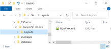 Layout configuration. The layout can be configured using an AdvancedList.xml file. As for how to define the individual elements of the AdvancedList file, the exact same applies as described for the "default" layout of the SFListForm screen.
- Layouts location. The alternative layout files can have any name other than “AdvancedList.xml” and should be placed in the Layouts sub-folder of the area that contains the “default” layout of the SFListForm screen.
- Layout call button. Alternative layouts can be called using the
 -Layouts button of the screen SFListForm. To display this button, it is necessary to define the available layouts in the Layouts section of the SFListForm command. The link between a button and a layout file is created by specifying the layout file name in the FormID property

Example
| Suppose that we wish to expand our SFListForm screen with a layout that also displays the customer list in the form of an entry list. Suppose also that this layout file is named RowView.xml. |
|---|


Selection list screens
Selection screens are not stand-alone screens. They are always called through the interface of a Data entry screen. They display data as a list and they’re used as an "update" tool for entities, by either assigning a value to a field, or by importing an entry. Their functionality varies somewhat, depending on what part of the application the screen is called from.
Standard selection list (InvForm)
Example SampleListForm
The standard selection list (InvForm) is called by focusing on a specific field of a Data entry screen and is used as a tool to search & select an entry in order to assign it to a field of the screen from which it is called. The elements required to implement an InvForm-type screen are:
| Element | Comment |
|---|---|
| Command | The user is required to use an InvFormCreatorCommand type of command Regarding the elements defined at a command level (data, sorting & searching), overall the same applies as described for a ListForm type of screen. This section shall briefly, as well as by means of a specific example, present both of the points that differ and therefore require special attention when implementing an InvForm type of screen. |
| Form | In order to implement the screen's display format, using an AdvancedList.xml file is required. Regarding the definition method of the elements display area, the exact same apply as described for a ListForm type of screen. |
Example
| Suppose that we wish to implement a screen that will be used as an address selection list in the Data entry screen of a ES.MCH-Measurement type of task. Let’s also assume that the specifications for the data and the layout display of this screen are fully identical to those in example SampleListForm. |  
|
|---|---|
Data / Special settings
Regarding settings at a command level, in conjunction with those applicable to a ListForm-type screen, the following apply as well.
- Type. An Invform CreatorCommand type of command must be used.
- Data. A column must be present in the select query, which will constitute the unique identification key of a list entry, named GID. For our example, a column named GID should be present in the select query, referring to the GID field of the ESGOSites table.
- Command properties. The FilterBy property should exist even with empty content. This property enables dynamic filtering of the list data, based on the value of other fields of the Data entry screen. For our example, this property will be used to filter the address list, based on the person to whom our Data entry screen refers. The syntax of the property should be in the following form:
<FilterBy Type="System.String"
Value=" Column1#=#DataMember1,Column2#=#DataMember2,…" />
Column is the select query column, on which the filtering will be applied.
DataMember is the Data entry screen element, based on which the filtering will take place.
Add lines list (AddLineForm)
Example SampleAddLineForm
The AddLineForm-type screen is called by an appropriately configured button of the task-document Data entry screen and used as a tool to search and select entries, in order to insert them to the task-document lines. The AddLineForm screen automatically acquires the following additional features, in relation to the InvForm screen:
Ability to select multiple entries.
Add column that enables the display of an image related to the list entries.
Ability to assign a value to an element of the task-document lines.
The elements required to implement an AddLineForm-type screen are:
| Element | Comment |
|---|---|
| Command | The user is required to use an InvFormCreatorCommand type of command Regarding the elements defined at a command level (data, sorting & searching), overall the same applies as described for a ListForm type of screen. This section shall briefly, as well as by means of a specific example, present both of the points that differ and therefore require special attention when implementing an AddLineForm type of screen. |
| Form | In order to implement the screen's display format, it is necessary to use an AdvancedList.xml file. Regarding the definition method of thedisplay elements in the data area, the exact same apply as described for a ListForm type of screen. |
Example
| Let’s assume that we wish to implement a screen that will be used as an add line list in the Data entry screen of a 1-Order type of document. Let’s also assume that we want this list to show some of the main item information (code, description, price, etc.). Let’s also assume that the form of this screen is SampleAddLineForm. | 
|
|
|---|---|---|
Data / Special settings
Regarding settings at a command level, in conjunction with those applicable to a ListForm-type screen, the following apply as well.
- Type. An InvForm CreatorCommand type of command must be used.
- Data. In the select query
there should be a column, named GID, that constitutes the unique identification key of a list entry. For our example, a column named GID should be present in the select query, referring to the GID field of the ESFIItem table.
In case the unique identification key of a list entry is composed by more than one column, the GID column should derive from the composition of said columns.
there should be a column named Qty, with the constant 1.0.
there should be a column named Code, even with empty content. This column is used to link a list entry with an image file name. Note here that, by means of appropriate configuration, it is possible to differentiate this behavior.
there should be the following two columns, fMUCode & fItemMUGID, even with empty content. These columns are used to enable the selection of a measurement unit. For the Task entity in particular, it is recommended that a column exists for assigning a base measurement unit of the item, in the corresponding element of the task line.
there should be a column named ItemMUDecimals, if we wish to check the allowed decimals in the quantity, by measurement unit.
- Command properties. Property SelectaAllEnabled should be activated, if we wish to be able to bulk enter quantity for the total of selected entries.
Assign value to element (Assign_CellSource)
As mentioned above, one of the special features of AddLineForm is the ability to assign a value to an element of the task-document lines. To use this feature, simply define, in the select query the command, a distinct column of the format ValueMember Assign_CellSource, where
ValueMember is the value to be assigned, which can be a constant, the content of a field, or even an expression.
CellSource is the element of the task-document line where the assignment will take place. Note that any store or non store field of the line can be defined as an element to be assigned.
Example
| Let’s assume that we want the “Manufacturer” column of our AddLineForm to be assigned to the “Text-1” element on the document line. |
|---|
Note that
In case the scenario of assigning a value to an element is sufficiently specific, it is also possible to define the assign condition through the use of the Business Rules tool.
Display format / Special settings
Regarding the definition method and available properties of the data area, combined with what applies for the ListForm screen, the following apply:
Image column
As mentioned above, one of the AddLineForm special features is the ability to assign a value to add an image column related to the list entries. To automatically enable this feature, it is necessary that:
In the ProductImages folder of the device, there are image files whose name is the matches the content of the select query Code column of the command and their type matches the content of mobile parameter ImageFileExextension.
The device parameter Item_ShowThumbs should be set to value 1-Yes.
At the same time and through an appropriate adjustment of the AddLineForm command, it is possible to differentiate the default “standards” of image display. The following settings are required:
| Property | Comment |
|---|---|
| ImageColumn | The select query column that we wish to use to associate a list entry with an image file name. |
| ImageDirectory | The folder where the image files are located. |
| ImageExtension | The type of image files. |
Note that by focusing on the image, it is automatically magnified and the it is possible to display an item’s detailed screen, as well as send the image via E-mail.
Example
| Let’s assume that we want the image column of our AddLineForm screen to display the logo of the item manufacturer, instead of the item image. Let’s also assume that the image files are type png and are located in the CSImages/Logo folder. | |
|---|---|
 
| |
Standard action buttons
Especially on the iOS Platform, simply changing the name of the form to contain the label ItemInvForm, causes the AddLineForm screen to be automatically enhanced, by focusing on an entry, with the following standard action buttons.
| Button | Comments |
|---|---|

|
Increase the selected entry’s quantity. |

|
Decrease the selected entry's quantity. |

|
Displays an analysis screen of the quantity in item dimensions. This button is available in documents only. |

|
When focusing, the pop up numeric keypad appears, for directly set a quantity. |

|
Displays a measurement unit selection screen. This button is available in documents only. |

|
Displays a comment input screen on the selected entry. |

|
De-select an entry. |
The info specified by these buttons in the AddLineForm screen are transferred as is into the corresponding fields in the task-document line.
Example
Suppose we choose to change the form name of our example from SampleAddLineform to SampleAddLineItemInvForm

Add lines list (AddLineSFForm)
Example SampleAddLineSFForm
The AddLineForm type of screen is called by an appropriately configured button of the task-document Data entry screen and used as a tool to search and select entries, in order to insert them to the task-document lines. This AddLineSFForm is available only on UWP & Android platforms.
Note that
An AddLineForm screen built on an iOS platform can be used exactly as is on the UWP & Android platform. An AddLineSFform screen implementation is only required if the screen needs to be enhanced with the standard action buttons.
The data required to implement an AddLineForm-type screen are:
| Element | Comment |
|---|---|
| Command | The user is required to use an SFInvFormCreatorCommand type of command Regarding the elements defined at a command level (data, sorting & searching), overall the same applies as described for a ListForm type of screen. This section shall briefly, as well as by means of a specific example, present both of the points that differ and therefore require special attention when implementing an AddLineSFForm type of screen. |
| Form | In order to implement the screen's display format, it is necessary to use an AdvancedList.xml file. Regarding the definition method of the data display area, the exact same applies as described for a SFListForm type of screen. This section shall only present the settings required so that AddLineSFForm screen fully simulates the corresponding AddLineForm screen. |
Example
Let assume that we want to implement, on UWP or Android, an add lines list screen that fully simulates the SampleAddLineForm screen, in appearance and functionality.

Data / Special settings
Regarding settings at a command level, in conjunction with those applicable to a ListForm-type screen, the following apply as well.
- Type. An SFInvForm CreatorCommand type of command must be used.
- Data. In the select query
there should be a column, named GID, that constitutes the unique identification key of a list entry. For our example, a column named GID should be present in the select query, referring to the GID field of the ESFIItem table. As mentioned above, in the AddLineForm screen section, in case the unique identification key of a list entry is composed by more than one column, the GID column should derive from the composition of said columns.
there should be a column named Qty, with the constant 1.0.
there should be columns named fMUCode & fItemMUGID, even with empty content. These columns are used to enable the selection of a measurement unit.
there should be a column named ItemMUDecimals, if we wish to check the allowed decimals in the quantity, by measurement unit.
- Command properties. Property SelectaAllQtyEnabled should be activated, in order to be able to bulk enter quantity for the total of selected entries.
Assign value to element (Assign_CellSource)
On an AddLineSFForm type of screen, in order to utilize the ability to assign a value to a task-document line element, the exact same applies as described in the corresponding section the AddLineForm screen.
Display format / Special settings
Regarding the definition method and available properties of the data area, combined with what applies for the ListForm & SFListForm screen, the following apply:
Element display location
As mentioned above, in UWP & Android the Bounds property is completely ignored, which leads to the sub-elements not having a specific display, but instead be “proportionally” allocated in the available space of the screen. In case this display format is not satisfactory, it is recommended to extend the AdvancedList file of the form with the properties regarding placing an element into a grid. In this case, regarding the adjustment of the element display location the exact same applies as described in the corresponding section of the SFListForm screen.
Image column (ImageCell)
On an AddLineSFForm type screen, the image column is specified at the RowTemplate of the data area, using an ImageCell-type element. Regarding the definition method and available properties of the image column, the exact same applies as described in the corresponding SFListform screen section.
Standard action buttons
On an AddLineSFForm type screen, the standard action buttons are specified at the RowTemplate of the data area, using TextCell & ButtonCell type elements. Let’s also assume that we wish, for ergonomic purposes, that the standard action buttons are only displayed on a selected entry. Adding the standard action buttons to the AddLineSFForm screen requires to define the element using the following, per button, properties.
| Button | Property | Property value | ||
|---|---|---|---|---|
|
|
Increase quantity | Type | ButtonCell | For the increase quantity button
|
| CellSource | Qty | |||
| Name | PlusButton | |||
|
|
Decrease quantity | Type | ButtonCell | |
| CellSource | Qty | |||
| Name | MinusButton | |||
|
|
Item dimensions | Type | ButtonCell | |
| CellSource | Qty | |||
| Name | AnalysisButton | |||
|
|
Quantity | Type | TextCell | |
| CellSource | Qty | |||
| Name | Qty | |||
|
|
Measurement unit | Type | TextCell | |
| CellSource | fMUCode | |||
| Name | MMButton | |||
| DesignName | zoom=MMButton | |||
|
|
Line comment | Type | ButtonCell | |
| CellSource | Assign_Reasoning | |||
| Name | ReasoningButton |
Configure a selected entry
In an AddLineSFForm type of screen, it is possible to differentiate the elements and display format between Normal and Selected entry. Regarding the definition method and available properties of the area, the exact same applies as described in the corresponding SFListForm screen section. However, special attention should be paid to the following properties.
| Property | Comment |
|---|---|
| SelectedTemplateIndex | The RowTemplate SEQ.NO relating to a selected entry (Selected RowTemplate) must be declared. |
| SelectionMode | The SelectDeselect value must be declared, in order to allow the user to select / de-select an entry. |
| MultiSelect | Value “true” must be assigned, to enable the selection of multiple entries. |
| AlternateRowColor | Value “true” must be assigned, to be able to differentiate the BackColor of entries that correspond to already saved task-document lines. This property should be assigned to the RowTemplate concerning a normal entry (Normal RowTemplate). |
Grouping area
Contrary to the AddLineForm screen, the AddLineSFForm screen also allows the user to display a grouping area of data. Regarding the definition method and available properties of the area, the exact same applies as described in the corresponding SFListForm screen section.
Data entry screens
The Data entry screens are usually called up with an action button on a selected entry of a list and used to create a new entry or manage an existing one. Both the display format and the functionality of the Data entry screen varies considerably, depending on the entity it is currently handling.
Master entity (EditForm)
Example SampleEditFormMaster
The Data entry screen of a master entity (EditForm) is used to manage the entry details that refers to one of the core entities of the ESMobile application. These are:
Person, Customer & Address. For these entities, it is possible to both create a new entry, as well as view-modify an already existing one.
Item. For this entity, it is only possible to view an existing entry.
The data required to implement an EditForm-type screen are:
| Element | Comment |
|---|---|
| Command | The user must use a command of type NewFormCreatorCommand or EditFormCreatorCommand, to create or manage an entry, respectively. |
| Form | In order to implement the screen's display format, it is necessary to use a DetailView.xml file. |
Next up in this section, detailed implementation instructions for EditForm type of screens will be given, using a specific example.
 Attention
To ensure a smooth update of the ESMobile app, it is necessary that the screen's command file is custom, in case the screen DetailView file is custom. This rule applies even if no intervention is necessary in the command file.
Screen Data
Defining the EditForm screen data, as well as the command-form link, is possible by appropriately configuring the individual properties of the command file. The command file should be in the Commands sub-folder of the ESConfig or CSConfig area. Attention: the command file name should match the name of the command in the file.
Example
Let’s assume that we wish to implement a Data entry screen that can be used to view an entry of the “Competitors” list. This screen is simply intended to display some basic data of the person, but without allowing the user to make changes. Let’s also assume that the form of this screen is SampleEditFormMaster.
| Property | Comment |
|---|---|
| FormID | The folder in ESForms or CSForms, where the relevant AdvancedList file of the form can be found. For this example, it is the SampleEditFormMaster folder. |
| Title | The label that appears as a screen EditForm title. In this example it is label “Edit Competitor”. |
| Filter | The “link” column of the data list with the EditForm screen to be displayed. In this example, it is column PersonGID. Keep in mind that the [CURRENT] variable comes from the CellSource property of the Data entry screen call key. |
| BaseSelect | The “select query” that specifies the data to be displayed. It must contain all columns referring to the DetailView file of the form. |
| BaseInsert | The insert query that specifies the data to be inserted. It should be entered only in case the EditForm screen refers to an entity for which it is possible to create a new entry. |
| BaseUpdate | The update query that specifies the data to be modified. It should be entered only in case the EditForm screen refers to an entity for which entry modification it is possible. |
| Editable | Allow (true) or do not allow (false) interventions to the details of the screen entries. Note that, when there is a column named RecordState in the command’s select query, the value of property Editable is fully ignored and the intervention check is transferred to a selected entry level. If the entry's RecordState column has a value of 1, intervening to its details is not allowed. |
Display format
Specifying the display data of the EditForm screen is possible by appropriately configuring the individual properties of the form's DetailView file. Note here that the properties to be configured vary according to the type of data (Item) displayed. Regarding the definition method and the available properties per data type, the following apply:
| Property | Comment | |
|---|---|---|
| Tab page | ||
| Type | Specify ItemPageBreak. Used to define the screen page. | |
| Text | The label displayed as the tab title. | |
| Name | Exclusively refers to the product translation process (Translation key). | |
| Item-All types | ||
| Label | The label displayed as the element’s caption. | |
| DataMember | The command column that corresponds to the element. Note that it is not possible to assign the same column in more than one element. | |
| Name | Exclusively refers to the product translation process (Translation key). | |
| Enabled | Allow (true) or do not allow (false) interventions to the element. The value of this property is only taken into account if the ability to intervene at an order level has not been removed. | |
| Visible | Display (true) or hide (false) the element. | |
| Item-String | ||
| Type | Specify TextBox. By focusing on the element, the alphanumeric keypad is displayed. | |
| Tag | Especially in case we wish the alphanumeric keypad to be displayed focused on the numbers, specify value KL:num. Concerns the iOS platform only. | |
| MultiLine | Display the element on multiple rows (true) or only one (false). | |
|
|
To display Text-1 on multiple lines, | |

| ||
| DisableKeyboard | Remove the ability to fill-in this detail via keyboard (true) or not (false). Concerns the iOS platform only. | |
| DisablePaste | Remove the ability to fill-in by pasting (true) or not (false). Concerns the iOS platform only. | |
| Item-Numeric | ||
| Type | Specify ItemNumeric. By focusing on the element, the alphanumeric keypad pops up. | |
| Item-Date | ||
| Type | Specify one of the values that belongs to:
| |
| Item-Boolean | ||
| Type | Specify ItemCheckBox. The element takes the form of selection (value 1) / de-selection (value 0). | |
| Item-Enumerated | ||
| Type | Specify ItemComboBox. By focusing on the element, a screen with a default list of labels appears, the value of each corresponds to a specific number. | |
| StringData | Specify, in the form of a comma-separated list, the labels for possible list values. The order in which the labels are specified also indicates the option number, always starting with the number 0. | |
|
|
To display Flag-1 as boolean and flag-2 as enumerated, | |

| ||
| Item-Drop down | ||
| Type | Specify ItemLink. By focusing on the element, an entry list screen appears | |
| Tag | The display “specifications” of the entry list. The required property configuration varies considerably depending on the number of entries or the amount of information that we want the list to display, but also on whether we want the EditForm screen element to be active or not. | |
* Limited number of entries & information (POP)
| ||
|
|
To display an entries list from zoom table “Table-1” of the person, | |

| ||
* Extended number of entries & information (InvForm)
| ||
|
|
To display an entries list from table “Addresses” of the person, | |
* Inactive element (External)
| ||
|
|
To display the main person address, without allowing the user to make changes, | |

| ||
* Inactive element (SQL)
| ||
|
|
To display additional information on the person’s main address, without allowing the user to make changes, | |
|
| ||
| Item-Photo | ||
| Type | Specify Photo. By focusing on the element, the picture is enlarged. This type of element is available only on UWP & Android. | |
| PhotoPath | ||
| Height, Width | The height-width of the element. | |
| NumberOfRows | The number of rows of the element. It is used as an alternative definition for the height-width of the element and overrides these. | |
Advanced functionality
Condition-based intervention
It is possible to define a no-intervention condition on elements of the EditForm screen. The settings required to enable this feature are:
- Command. Define, in the select query of the command, a distinct column named RecordState, whose content describes the no-intervention condition. The no-intervention rule only applies to entries where the condition returns a value of 1.
- Form. Add to DetailView a record of the non-visible form corresponding to the RecordState column.
Example
Let’s assume that we want to only allow intervening in the data of the “Competitor” EditForm screen when the entry lacks the person's TRN.


Password protection
It is possible to define a desired degree of protection on elements of the EditForm screen. The settings required to enable this feature vary depending on whether we want to protect all elements or a specific element of the EditForm screen.
Total elements
The check is activated upon calling the EditForm screen. The degree of protection shall be adjusted by indicating value true to the appropriate command property, depending on the degree of protection desired.
|
Comment | ||
|---|---|---|---|
|
High degree of protection.
The approval code is provided by an authorized back-office user. When calling the EditForm screen, the device user is asked to enter this approval code. |

| |
|
Low degree of protection.
The approval code is the same as the user's password for the ESMobile app. When calling the EditForm screen, the device user is asked to enter this password. |

|
Specific element
The check is activated by focusing on an element of the EditForm screen. The protection level can be configured in the DetailView file of the screen and by in assigning the Tag property of each element, the #RequiresExtraPin or #RequiresPassword label for a high or low degree of protection, respectively. This feature is available on all types of elements of the EditFrom screen. Not that, especially in the case of an ItemLink-type element, labels must be assigned without the prefix of character #.
Example
Let’s assume that we want a low level of protection on the person's TRN & Tax Office details of the “Competitor” EditForm screen.
Required elements
It is now possible to specify an EditForm screen element as required. By enabling this feature, when saving an entry, it checks the EditForm screen elements, and if any of the required elements are empty, the save process fails and a relevant error message pops up.
The required elements are specified in the DetailView file of the EditForm screen and by assigning value “true” to the Required property of the relevant element, or alternatively by assigning the condition (using a numerical field) which makes it mandatory to fill in the element. This feature is available on all data types of the EditForm screen, except numeric fields that by default cannot be empty.
Example-1
| Let assume that we want the person's Name of the “Competitor” EditForm screen to be defined as required. |
|---|
Example-2
| Let’s assume that we want element Text-1 to be required, when element Flag-1 of the “Competitor” EditForm screen is enabled. |
|---|
Menu button (ActionsCommand)
Example SampleEditFormActions
It is possible to extend the EditForm screen with the default menu button -Actions. This extension meets the need for immediate action execution through the EditForm screen interface. The desired actions to be executed appear as distinct options in the menu button. To utilize this feature, the following settings are required.
Button configuration
Specifying the commands to be executed is possible using special command type CommandSelector. The special feature of this type of command is that it allows the user to specify a commands list (section CommandList). The individual commands syntax of the list should be
Part-1|Part-2|Part-3 where:
| Part-1: | Action label #Command |
|---|---|
| Part-2: | #AppIDPlatforfID1#AppIDPlatforfID2 |
| Part-3: | The execution "specifications" for the command. The required configuration varies according to the type of command to be executed.
where the source column of the variable [CURRENT] or [PARENT] is defined as DataSource, respectively. |
Button activation
- The display of the button - actions is activated by indicating the CommandSelector file in the ActionsCommand property of EditForm command. The syntax of the property should be in the following form:
CommandSelector|DataSource, where the source column of the variable [CURRENT] or [PARENT] is defined as DataSource. In case the DataSource is not common to all orders to be executed, the ActionsCommand property should be in CommandSelector|DataSource1|DataSource2|… format.
The DataSource column must be a distinct element in the DetailView file of the EditForm screen. Additionally, the contents of the DataMember & Name properties of this element should match the name of the DataSource column.
Example
Suppose that we wish to enable the “Competitor” EditForm screen to directly call the new Task creation action and to display its address list.

Master-Detail entity (DocForm)
The Data entry screen of a master-detail entity (DocForm) is used to manage the entry elements relating to the Task and Document entities of the ESMobile application. The distinctive DocForm screen feature is that it consists of the following parts, each of which is implemented in a stand-alone form file.
Header. Concerns the master part of the entity. It refers to key entity details (code, person, address, etc.) and its existence is mandatory.
Contents. Concerns the detail part of the entity. For the Task entity this part may refer to catalogue items, warehouse items, persons or resources and its existence is optional. The Document entity exclusively refers to warehouse items and its existence is mandatory.
Other areas. Using a relevant appendix, it is possible to expand the information displays on the DocForm screen, as well as directly perform a series of actions.
Note that
The DocForm screen implementation "principles" are generally the same, regardless of whether the screen concerns the Task entity or the Document entity. The parts that, by way of exception, concern a specific entity, are marked accordingly.
The elements required to implement a DocForm type of screen are:
| Element | Comment |
|---|---|
| Command | Task entity |
| The user must use a command of type NewTaskCommand or EditTaskCommand, to create or manage an entry, respectively. Note that, when the creation of a new entry is called through a person’s or point-of-sales interface, using a NewTaskFromPersonCommand or NewTaskFromSiteCommand type of command is required, respectively. | |
| Document entity | |
| The user must use a command of type NewDocumentCreatorCommand or EditDocumentCreatorCommand, to create or manage an entry, respectively. Note that, when the creation of a new entry is called through a point-of-sales or appointment's interface, using a NewDocumentFromSiteCommand or NewDocumentFromAppCommand type of command is required, respectively. | |
| Form | |
| Header | In order to implement the Header part, it is necessary to use a DetailView.xml file. |
| Contents | In order to implement the Contents part, it is necessary to use an AdvancedList.xml file. In addition, in order to implement a screen that displays the full details of the selected line, it is necessary to use a DetailView.xml file |
| Other areas | In order to implement the Other areas part, it is necessary to use an Actions.xml file. |
Note here that all of the form files that make up the DocForm screen must be in a default folder in the ESForms or CSforms area. In particular, the following applies per entity.
 Task entity
All of the form files should be in a sub-folder of the GenericTaskForm area. The name of the sub-folder should be the same as the InternationalID of the task type in question. Special attention should be paid in order to always use lower case characters for the sub-folder name. The file for the Header part (DetailView.xml) is placed in this area, while the files for the Contents part (AdvancedList.xml) & Fill line details (DetailView.xml), as well as for the Other areas part (Actions.xml) are placed in sub-folder TaskItem.
Document entity
 All of the form files should be in a sub-folder of the GenericDocForm area. The name of the sub-folder should be the same as the ID of the document type in question. All the files of the form are placed in this area. Note here that, the screen file with the Full line details (DetailView_LineItem.xml) is only available for configuration on UWP & Android.
Next up in this section, detailed implementation instructions for DocForm type of screens will be given, using a specific example. For the sake of simplification, our examples only refer to creating a new entry listing through the point of sales interface.
Screen Data
It is important to note that in the case of a DocForm screen the data is dynamically loaded and not derived from writing a select query at a command level. This means that the settings required at a command level are rather limited, because the columns available for the Header & Contents parts are default by the ESMobile application. The command file should be in the Commands sub-folder of the ESConfig or CSConfig area. Attention: the command file name should match the name of the command in the file. Regarding the required settings at a command level, the following applies per DocForm entity type.
Task entity
Example ES.MCH-Measurement
Example
Suppose that we wish to implement a Data entry screen which can be used to create a task of ES.MCH-Measurement type. We want this screen to display some basic identification details of the task and allow the user to manage item lines.
| Property | Comment |
|---|---|
| TaskType | The InternationalID of the task type. For this example, it's es.mch. |
| FormID | The folder in the ESForms or CSForms area, where the relevant AdvancedList form files related to the screen can be found. The definition should be in the form of the GenericTaskForm/InternationalID task type. For this example, it’s folder Generic TaskForm/es.mch. Defining this property is only mandatory only in case the task lacks the Contents part (e.g. ES.SAP-Sales appointment type of task). |
| NoDetail | The task also has a Contents part (false) or not (true). Defining this property is mandatory only in case the task lacks the Contents part (e.g. ES.SAP-Sales appointment type of task). Note here that this property only applies to iOS platforms. In UWP & Android, the corresponding setting is done in the ShowContents property of the screen's Actions file. |
| SaveMenu | The save button options. The typical options are: 1-Save, 2-Complete, & 3-Cancel. Mote here that setting the save options can also be done "centrally", by appropriately configuring the task type in question. In this case, the SaveMenu property must be empty. |
In a DocForm screen for the Task entity, the available columns in the Contents part include, on one hand, all fields of table “Task item” (ESTMTaskItem table) and, on the other hand, the non store fields of the table below.
| Column name | |||
|---|---|---|---|
| PersonName | ItemMUCode | LastCountedDate | ExtStringField1 |
| ItemCode | SiteGID | LastSoldDate | ExtStringField2 |
| ItemDescription | TypeGID | CountedQty1 | ExtStringField3 |
| InventoryItemCode* | TypeInternationalID | CountedQty2 | ExtStringField4 |
| InventoryItemDescription* | GroupField | CountedQty3 | ExtStringField5 |
| InventoryItemCodeDescription* | GroupFieldSubTotal1 | SoldQty1 | ExtDateField1 |
| CatalogueItemCode* | GroupFieldSubTotal2 | SoldQty2 | ExtDateField2 |
| CatalogueItemDescription* | Category1Code | SoldQty3 | ExtDateField3 |
| CatalogueItemCodeDescription* | Category2Code | ExtNumericField1 | ExtDateField4 |
| ItemFamilyCode | Category1Description | ExtNumericField2 | ExtDateField5 |
| ItemGroupCode | Category2Description | ExtNumericField3 | Warning |
| ItemCategoryCode | LastCountedQty | ExtNumericField4 | WarningMessage |
| ItemSubcategoryCode | LastSoldQty | ExtNumericField5 | Error |
| ItemTaskCategoryValueGID | LastSoldPrice | ErrorMessage | |
| * These columns receive content only when the line refers to an inventory item or catalogue item, respectively. If, for example, we want the “Item code” column to have content at all times, regardless of whether it refers to an inventory item or a catalogue item, the non store ItemCode field should be used. If we want it to have content only when it refers to an inventory item, the non store InventoryItemCode field should be used, while, if we want it to have content only when it refers to a catalogue item, the non store CatalogueItemCode field should be used. | |||
Document Entity
Example 1-Order
Example
Suppose that we wish to implement a Data entry screen which can be used to create a document of type 1-Order. We want this screen to display some basic identification details of the document and allow the user to manage item lines.
| Property | Comment |
|---|---|
| SiteGID | The point of sales where the document is issued. This property is dynamically sourced and therefore its content should be empty. Note here that properties PersonGID & AppGID play the exact same role. |
| DocType | The ID of the document type. For this example, it's 1. Defining this property is required only in cases the document type does not result from the configuration of the button for calling the action (e.g. Doc#NewDocumentfromApp#1 button) |
| NullCustomer | The document is of type stock movement (true) or sales - collection (false). Defining the property is mandatory only in case the document is of type stock movement (e.g. document of type 13-Delivery note to site). |
In a DocForm screen for the Document entity, the available columns of the Contents part include, on one hand, all fields of table “Item line” (ESFISalesDocLineItem table) and, on the other hand, the non store fields of the table below.
| Column name | ||||||
|---|---|---|---|---|---|---|
| ItemCode | ItemWeightQuantity | ExtStringField1 | ExtDateField1 | |||
| ItemDescription | ItemWeightMURelation | ExtStringField2 | ExtDateField2 | |||
| ItemFamilyCode | ItemWeightMUDecimals | ExtStringField3 | ExtDateField3 | |||
| ItemGroupCode | ItemWeightRelationWithMMU | ExtStringField4 | ExtDateField4 | |||
| ItemCategoryCode | ItemWeightMUCode | ExtStringField5 | ExtDateField5 | |||
| ItemSubcategoryCode | ItemVolumeQuantity | ExtNumericField1 | Warning | |||
| ItemMUCode | ItemVolumeMURelation | ExtNumericField2 | WarningMessage | |||
| GroupField | ItemVolumeMUDecimals | ExtNumericField3 | Error | |||
| fColorCode | ItemVolumeRelationWithMMU | ExtNumericField4 | ErrorMessage | |||
| fSizeCode | ItemVolumeMUCode | ExtNumericField5 | ||||
Display format / Header
The Header part is always placed as the first page of the DocForm screen. The form for this page is implemented using a DetailView.xml file. The definition method and available properties of the DetailView file are exactly the same as described for the EditForm type of screen.
Display format / Contents
The Contents part is always placed as the second page of the DocForm screen and always has the label "Contents" as title. The form for this page is implemented using a AdvancedList.xml file. The definition method and available properties of the AdvancedList file are generally the same as described for the ListForm type of screen. Note here that the AdvancedList file of the Contents part implemented on iOS can also be used, with some minimal interventions, on UWP & Android. However, in case the display format of the Contents tab is not satisfactory, the AdvancedList file should be expanded with the properties that relate to the special features of the SFListForn type of screen.
Example
Suppose that we've implemented a DocForm screen on iOS, which we want to use as is on UWP & Android.


As shown in the images of our example, using minimal interventions, the display format of the screen on UWP & Android satisfactorily simulates that of the iOS platform. The minimum required adjustments are:
- Adjust the BackColor property of both the entire screen and the data area.
- If the screen has a title area, add & adjust the HeaderTemplateIndex property.
- If the screen has a totals area, add & adjust the FooterTemplateIndex property. Note that, especially for the Document entity, it is necessary to configure the data of the totals area, based on the specifications that apply for UWP & Android. Instructions for the required settings are given below in section “Totals area”.
- If the screen has a grouping area, it is mandatory to expand the AdvancedList file with the properties related to the special features of the SFListForm screen.
Next up in this section, detailed implementation instructions will be given for the Contents part of a DocForm screen, using a specific example. For the sake of simplification, the example has been implemented so that the same AdvancedList file can be used on both the Task entity’s Data entry screen (for this example, ES.MCH-Measurement type of task) and the Document entity's Data entry screen (for this example, a 1-Order type of document).
Element display location
On a DocForm type of screen, the definition of the element display location of the Contents part varies, depending on the ESMobile application platform. In particular, the following apply per platform.
iOS platform. Adjust the Bounds property.
UWP & Android. Add the properties related to the grid definition (Rows-Columns properties) and the properties related to element placement inside the grid (Row, Column, RowSpan, ColumnSpan properties).
Example
| Suppose that we want to expand our AdvancedList file of the DocForm screen so that there is also an “adjustable” placement of elements in UWP & Android platform. | |
|---|---|

| |
Note that, through the ApplicationVisible property it is also possible to show or hide an element from a specific platform-application. The property is in the form #AppIDPlatforfID1#AppIDPlatforfID2, where:
|
Platform | ||||
|---|---|---|---|---|---|
| 8 | Merchandising | 2 | iOS | ||
| 22 | Field Service | 3 | Android | ||
| 322 | xVan | 4 | UWP | ||
| 1024 | Medical Representative | 9 | UWP & Android | ||
Example
| Suppose we wish to set up the AdvancedList file of our DocForm screen so that the Item code appears only on iOS platforms. |
|---|
Image column (ImageCell)
On a DocForm type screen, the image column of the Contents part is set using an ImageCell-type element. Regarding the definition method and the available properties of the element, the following apply:
| Property | Comment |
|---|---|
| Type | The element must be of type ImageCell. |
| CellSource | The column that links the line with the image file name. Note that if the association column does not belong to the fields in the line's table, the corresponding non store field should be used (e.g. for association based on item code, the non store ItemCode field is indicated). |
| ImageFolder | The folder where the image files are located. It is only filled in case we wish to designate a folder other than the "default" one, ProductImages. |
| ImageExtention | The type of image files. It is only entered in case we wish to designate a type other than the "default" one. Note that the default type can be designated in mobile parameter ImageFileExtension. |
| Height, Width | The image dimensions. Filled in only if we wish the image to not occupy its full space based on the properties of its display location. Concerns UWP & Android platforms only. |
| Visible | Display (true) or hide (false) the element. |
| Selectable | By indicating “true”, focusing on the image automatically enlarges it. Concerns the iOS platform only. |
Example-1
| Suppose that we wish the image column of our DocForm screen to display the image of the line item. | |
|---|---|

| |
Example-2
| Suppose that we wish the image column of our DocForm screen to display the logo of the line item manufacturer. Suppose also that we have ensured, through the Assign_CellSource functionality, that the manufacturer information is assigned to the StringField1 field of the line. | |
|---|---|

| |
Standard action buttons
On a DocForm screen, the action buttons on the Contents part can be defined using a ButtonCell-type element, where the ImageDefault property indicates the button icon and the Name property indicates the command to be executed. Adding the standard action buttons requires to define the element using the following, per button, properties.
| Button | Name | Comment |
|---|---|---|
|
|
PlusButton | Increases line quantity. |
|
|
MinusButton | Decreases line quantity. |
|
|
AnalysisButton | Displays an input screen for line quantity per dimension. Available only in the Document entity. |
|
|
ISUDButton | Displays a screen with the full line details, where the user can make changes in the individual line fields. |

|
DeleteButton | Deletes line. |

|
BalanceButton | Displays a screen, in direct connection with the back office, that provides information on the total item availability. When the line quantity exceeds the current site balance, this icon turns red. It is also necessary for property CellSource to indicate default value ItemCurrentBalanceBranchPositive. |

|
GiftButton | Assigns 100% discount to the discount field of the line, where mobile parameter Doc_GiftDiscount_Field has been specified. Available only in the Document entity. |
|
|
ItemMUCode | Displays a measurement unit selection screen. |
Example
| Let us say, for example, that we want to add the Delete line button to the Contents part of our DocForm screen. | |
|---|---|

| |
Configure a selected entry
In a DocForm screen it is possible to designate two RowTemplates for the data area. This feature covers the need to differentiate the elements and display format between the normal (Normal RowTemplate) and selected (Selected RowTemplate) line. The “principles” of implementing the Selected RowTemplate area vary depending on the entity to which the DocForm screen refers.
Task Entity. Designating a distinct Selected RowTemplate for the selected line is not supported. However, in the AdvancedList file on the screen, there should be the SelectedTemplateIndex property, which should have value 0.
Document Entity. Designating a distinct Selected RowTemplate for the select line is mandatory, even if its details are is identical to the normal line. However, it is also mandatory that, in the AdvancedList file of the screen, there is the SelectedTemplateIndex property, which should have the value of the SEQ.NO of Selected RowTemplate. Especially on iOS, as selected RowTemplate the one with SEQ. NO 1 must be mandatorily designated.
The definition method and available properties of the selected line are exactly the same as described for the normal line.
Element format properties
Regarding the element format properties of the Contents part in the DocForm screen, the following apply.
| Property | Comment | |||
|---|---|---|---|---|
| Alignment | The alignment of the element’s content with the following values available: Left, Right & Center. Especially on UWP & Android, values UpperLeft, LowerLeft, UpperRight, LowerRight & UpperCenter, LowerCenter can also be used. | |||
| LineBreakMode | The behavior in case the content of the element exceeds the limits of its position, with available values: 0-Do not wrap, 1-Wrap at word boundaries, 2- Wrap at character boundaries, 3-Truncate the head of text, 4-Truncate the tail of text & 5-Truncate the middle of text. | |||
| FontSize | The font size. | |||
| FontStyle | The font style, with the following values available: Regular, Bold & Italic. | |||
| ForeColor | The font color, with the following values available: Black, Blue, Brown, Cyan, Gray, Darkgray, Green, Lightgray, Magenta, Orange, Purple, Red, White & Yellow. Especially on UWP & Android, specifying the color can also be done using the HEX color number. | |||
| BackColor | The background color, with the following values available: Black, Blue, Brown, Gray, Green, Orange, Red, White & Yellow. Especially on UWP & Android, specifying the color can also be done using the HEX color number. | |||
| Border | The grid borders, with available values: All, Bottom, Left, Right & Top. | |||
| At its | The grid color, with available values: Black, Blue, Brown, Gray, Green, Orange, Red, White & Yellow. Especially on UWP & Android, specifying the color can also be done using the HEX color number. | |||
| FormatString | The display format of a number type of element or a date type of element. Some of the typical options, on a case-by-case basis, are: | |||
| Definition | Result | Definition | Result | |
| {0:G} | 16325.62 | {0:ddd d/M HH:mm} | Sun 9/7 00:33 | |
| {0:C} | 16,325.62 € | {0: dd/MM/yyyy} | 09/07/2022 | |
| {0:N} ή {0:#,#.00} | 16,325.62 | {0: HH:mm} | 00:33 | |
| {0:P} ή {0:0.00\%} | 163.26 % | |||
| {0:#.0} | 16326 | |||
Example
| Let us say, for example, that we want to add the Date-1 line field to the Contents part of our DocForm screen. Suppose also that want the element to have a gray grid and be displayed as a date without time. | |
|---|---|

| |
Element processing properties (LineEditing)
In a Docform screen it is possible to edit an element at a line level (LineEditing). The properties associated with this functionality are specific and their configuration varies, depending on the type of element we want to give (Cell-Editable) or not (Cell-Not Editable) the ability of LineEditing to. The available element types are: String, Date, Numeric, Boolean & Zoom.
| Cell-Editable | ||
|---|---|---|
| Property | Type | Comment |
| Type | All types | Specify the TextCell value. |
| Zoom | Especially on iOS and for the Document entity, value ButtonCell should be specified. | |
| Selectable | All types | Specify value “true”. |
| DesignName | String | Specify value String. By focusing on the element, the alphanumeric keypad is displayed. |
| Date | Specify value datetime or date. By focusing on the element, the selection screen appears for date-time or date, accordingly. | |
| Numeric | In this case, the property must be empty. In that way, by focusing on the element the alphanumeric keypad pops up. | |
| Boolean | Specify value bool. The element takes the form of selection (value 1) / de-selection (value 0). | |
| Zoom | By focusing on the element, a value selection list appears. The definition required is:
zoom=Command#ValueMember#CellSource where
Note here that it is necessary to add, in the select query of the InvForm command, a column of type Assign_CellSource, where the value to be assigned is ValueMember and the assignment element is CellSource. | |
| BindType | All types | In this case, the property must be empty. Concerns the iOS platform only. |
| Numeric | Specify value label. Concerns the iOS platform only. | |
| DisableKeyboard, DisablePaste | String | If, for any reason, we wish to remove the ability to fill in the element by keyboard or pasting, the value “true” must be designated in these properties (e.g. we only want to be able to populate it by barcode scanning). Concerns the iOS platform only. |
| Cell-Not Editable | ||
| Property | Type | Comment |
| Type | All types | Specify value TextCell. |
| DesignName | All types | The exact same applies as described for Cell-Editable. Note here that for Cell-Not Editable specifying this property is optional. |
| Selectable | All types | Specify value “false”. |
| BindType | All types | Specify value label. Concerns the iOS platform only. |
Example-1
| Suppose we wish to add line field Number-1 to the Contents part of our DocForm screen, which shall be in select / de-select format and Editable. | |
|---|---|

| |
Example-2
| Suppose we wish to add line field Text -2 to the Contents part of our DocForm screen, which shall be in the format of a selection list of values, from item Table-1 (table ESFIZItemTable1) and Editable. | |
|---|---|
 
| |
As mentioned above, for iOS the zoom type element should be designated as ButtonCell, while for UWP & Android it should be designated as TextCell. This particularity can be addressed by designating two elements and using the ApplicationVisible property
Format by condition (Binding)
On a DocForm type of screen, it is possible to differentiate by condition (Binding) some of the formatting properties related to the Contents part. More specifically, using Binding can be done for properties BackColor, ForeColor, BorderColor & Visible of element type TextCell. The types of condition that can be used when setting up the Binding are: GreaterThan, LessThan, Equals, NotNull, Compound, IsOddIndex & AlwaysTrue. To utilize this feature, it is necessary to:
- Specify the Binding condition in the AdvancedList file of the Contents part.
- Call the Binding condition, either at an area level (RowTemplate), or an element level (Cell). This should be in form {Binding Name} where Name is the Binding condition name. Note here that, in the case the condition is being called at a Cell level, special attention should also be paid to the proper configuration of the properties related to LineEditing, meaning the DesignName, Selective & BindType properties.
Example
Let us say, for example, that we want to format the Contents part for the DocForm screen based on the below specifications.
Switch the BackColor of the Normal RowTemplate for an odd-even row number
Hide the "Item description" element when the line quantity is < 3. This element should be Not Editable.
Change the ForeColor of the “Item code” & “Quantity” elements when the line quantity is < 3. The “Item code” element should be Not Editable and the “Quantity” element should be Editable.
| Define condition | Call condition | |
|---|---|---|
| 1 | ||
| 2 | ||
| 3 | ||

| ||
Note that
Especially on UWP & Android, and in case either the Binding condition is sufficiently specific, or we want it to be called in an ImageCell or ButtonCell type of element, it is possible to define the Binding condition by using the Business Rules tool.
Header area
In DocForm screens it is also possible to display a header area (Header RowTemplate). This area is defined in the AdvancedList file of the screen and it is optional, while the way to show-hide the area varies, depending on the ESMobile application platform. In particular, the following apply per platform.
iOS platform. Designating a distinct Header RowTemplate is mandatory. It is also mandatory, that the Header RowTemplate defined is the one with SEQ.NO 3. To display the area, the TemplateIndex property of the HeaderRow section must indicate the SEQ.NO of the Header RowTemplate. To hide it, the user can simply specify value 0 at the area’s Height property.
UWP & Android. Designating a distinct Header RowTemplate is optional. To display the area, the HeaderTemplateIndex property must indicate the SEQ.NO of the Header RowTemplate. To hide it, simply leave the property empty. It is suggested that, for iOS compatibility purposes, the Header RowTemplate with SEQ.NO 3 be designated.
Regarding the definition method and available properties of the title area, the exact same apply as described in the corresponding section of the ListForm screen, including of course, - for UWP & Android - the special SFListForm screen features.
Grouping area
In DocForm screens it is also possible to display a line grouping area (SectionHeader RowTemplate). The Task entity grouping criterion is set at a task type level, while the Document entity one is set by configuring the Doc_GroupField mobile parameter.
Note that
Any one of the task-document line fields can be designated as a grouping criterion. At the same time, however, using the Business Rules tool allows the user to specify a linked entity field (see section: Ideas & Solutions/ DocForm screens/ Line grouping)
The information available for display in the grouping area includes the default columns of the below table. For the Task entity in particular, all user-defined numeric fields of the task line are included.
| Column name | Information | Column name | Information | |
|---|---|---|---|---|
| Task entity | Document Entity | |||
| GroupField | Grouping criterion | GroupField | Grouping criterion | |
| GroupFieldSubTotal1 | Quantity | LineSubTotal | Line total | |
| GroupFieldSubTotal2 | Order quantity | QtySubTotal | Quantity | |
| NetSubTotal | Net value | |||
| VatSubTotal | VAT value | |||
| DicountSubTotal | Total discount value | |||
| TotalSubTotal | Total value | |||
| DiscTotalPercSubTotal | Average discount % | |||
| WeightSubTotal | Weight | |||
| VolumeSubTotal | Volume |
This area is defined in the AdvancedList file of the screen and it is optional, while the way to show-hide the area varies, depending on the ESMobile application platform. In particular, the following apply per platform.
iOS platform. Once a grouping field has been defined in the database, specifying a distinct SectorHeader RowTemplate is mandatory. The area is automatically shown, while in order to hide it, simply specify value 0 in the area’s Height property.
UWP & Android. Once a grouping field has been defined in the database, the area is automatically shown, in its default format. If we wish to differentiate the default display format, it is necessary to define a distinct SectionHeader RowTemplate. To hide the area, simply specify value 0 at the area’s Height property.
Regarding the definition method and the properties available at an area level (RowTemplate) and element level (Cell), the following applies:
| Property | Comment |
|---|---|
| RowTemplate | |
| Name | The sectionheader label is mandatory. |
| Height | The area height. |
| BackColor | It must be specified by using an RGB color code and should be in format #0,0,0. On UWP & Android in particular, HEX color numbers can be used. |
| Cell | |
| Type | The SectionHeader RowTemplate only supports TextCell-type elements. |
| CellSource | * For default columns the column name should be specified as mentioned in the table above.
|
Note that by using the -Collapse button, it is possible to expand-collapse all groups. Specifically in UWP & Android platforms, it is also possible to focus on the area of a group, in order to expand-collapse a specific group.
Totals area
In DocForm screens it is also possible to display a totals area (Footer RowTemplate) on the lines. The information available for display in the totals area includes both all user-defined numeric fields of the header & line and the default columns from the table below.
| Column name | Information | Column name | Information | |
|---|---|---|---|---|
| Task entity | Document Entity | |||
| LineTotal | Line total | LineTotal | Line total | |
| QtyTotal | Quantity | QtyTotal | Quantity | |
| GiftTotal | Gift quantity | |||
| (IOS) NetTotal
(UWP & Android) NetValue |
Net value | |||
| (iOS) VatTotal
(UWP & Android) VatValue |
VAT value | |||
| (iOS) Total
(UWP & Android) TotalValue |
Total value | |||
| (iOS) DiscTotal
(UWP & Android) DiscValue |
Total discount value | |||
| DiscTotalPerc | Average discount % | |||
| Budget | Appointment turnover budget | |||
| MinValue | Minimum document value | |||
| TradeAccountAvgCollectionTime | Average collection time |
This area is defined in the AdvancedList file of the screen and it is optional, while the way to show-hide the area varies, depending on the ESMobile application platform. In particular, the following apply per platform.
iOS platform. Designating a distinct Footer RowTemplate is mandatory. It is also mandatory, that the Footer RowTemplate defined is the one with SEQ.NO 2. To display the area, the TemplateIndex property of the FooterRow section must indicate the SEQ.NO of the Footer RowTemplate. To hide it, the user can simply specify value 0 at the area’s Height property.
UWP & Android. Designating a distinct Footer RowTemplate is optional. To display the area, the FooterTemplateIndex property must indicate the SEQ.NO of the Footer RowTemplate. To hide it, simply leave the property empty. It is suggested that, for iOS compatibility purposes, the Footer RowTemplate with SEQ.NO 2 be designated.
Regarding the definition method and the properties available at an area level (RowTemplate) and element level (Cell), the following applies:
| Property | Comment |
|---|---|
| RowTemplate | |
| Height | The area height. |
| BackColor | It can be specified by using an RGB color code and should be in format #0,0,0, or by using a HEX color code. Concerns UWP & Android platforms only. |
| Cell-iOS | |
| Type | The SectionHeader RowTemplate only supports TextCell-type elements. |
| CellSource | Used only for header information. Specify the field name in the database. |
| Name | Used for default columns and for line fields. The required method of definition, on a case-by-case basis, is:
|
| Cell-UWP & Android | |
| Type | The SectionHeader RowTemplate only supports TextCell-type elements. |
| CellSource | Used for all available information. The required method of definition, on a case-by-case basis, is:
|
Example
Suppose we want to add to our DocForm screen the totals area, which shall display the following information. Even if we want the elements to be configured so that the AdvancedList file on the form is compatible with all the ESMobile application platforms.
The number of lines
The total of the “Quantity” line field
The amount entered in the header “Number-1” field
The total of the line “Number-1” field
| Define elements | |||
|---|---|---|---|
| 1 | 3 | ||
| 2 | 4 | ||

| |||
Display format / Other areas
The implementation of the form that correspond to the Other areas part can be done using Actions.xml file. The other areas that make up a DocForm screen are: the additional Tabs (section: Tabs), the Action buttons (section: Actions), the Menu buttons -Actions (section: ToolbarActions) & -Online actions (section: ToolbarOnlineActions) and finally button -Sorting (section: SortBy) &  -Layouts (section: Layouts). The elements placed in these areas, with the exception of the Sorting & Layouts buttons, require the definition of an appropriate, on a case-by-case basis, command to be executed. This section shall briefly, as well as by means of a specific example, present the definition method and the available properties of the Actions file areas in the DocForm screen.
Additional tabs (DocTab)
Elements related to additional tabs of the DocForm screen are defined in the Tabs section of the screen's Actions file. In this section we can usually find the actions concerning display of information related to the current person” (ESGOPerson entity) or the “current customer” (ESFITradeAccount entity).
The extra tabs are placed right after the “Contents” tab, following the order they have been set to in the Actions file. Note that the “Contents” tab is always the “default” DocForm screen tab. To change this behavior simply indicate the SEQ.NO of the tab that we want to act as "default” in property DefaultTab of the Actions file.
Attention
Especially on iOS, the Tag property of the DocForm AdvancedList file should be empty, in order for the additional tabs to display.
Regarding the definition method and the available properties of the Tabs section, the following apply:
| Property | Comment | ||
|---|---|---|---|
| Caption | The label displayed as the tab title. | ||
| ESCaptionID | Exclusively refers to the product translation process (Translation key). | ||
| Command | The command to be executed. | ||
| ParamList | The execution "specifications" for the command. | ||
| Name | The name of the parameter. The available values are Current & Parent, which respectively supply the variables [CURRENT] & [PARENT] of the command to be executed. Especially in case where the tab concerns a DataGridReport type screen, the variables named [DOCGID], [APPGID] & [SITEGID] are also available for supply. | ||
| DataSource | The supply column of the variable in question. Any work task-document header column can be used. | ||
Example-1
Let us say, for example, that we want to add to our DocForm an additional "Ledger" tab which, by drawing information from the local database, displays the current customer's tab (command: CustomerLedgerIOSListForm).
Example-2
Let us say, for example, that we want to add to our DocForm an additional "Counts" tab which, displays tasks of type ES.MCH-Measurement of the current customer (command: SampleDocFormTabPage).
Example-3
Let us say, for example, that we to adjust the additional "Counts" tab for it to display tasks of type ES.MCH-Measurement of the current point of sales (command: SampleDocFormTabPage).
Action buttons (ActionButton)
The action buttons always refer to a command to be executed. Elements related to actions buttons (ActionButton) of the DocForm screen are defined in the Actions section of the screen's Actions file. The special feature of the section is that each of its elements is shown as a distinct button of the DocForm screen.
Buttons that relate to calling up scenarios of the add lines list are mainly placed in section Actions. In this section, we can also find buttons that activate on a selected line, such as "classic" view-delete line buttons, as well as more specialized buttons, such as for switching to a screen that draws information from the local database or by direct connection to the back office. Finally, we can also find the special button for switching to a management screen for attachments of the DocForm entity.
Regarding the definition method and the available properties of the Actions section, the following apply:
| Property | Comment | ||||||
|---|---|---|---|---|---|---|---|
| ImagePath | The folder where the image file corresponding to the button is located. | ||||||
| Name | The button type. This property accepts some default values, the more common ones being:
| ||||||
| Command | The command to be executed. Only concerns "Command" type buttons. | ||||||
| ParamList | The execution "specifications" for the command. Only concerns "Command" type buttons. | ||||||
| Name | The name of the parameter. The available values are Current & Parent, which respectively supply the variables [CURRENT] & [PARENT] of the command to be executed. Especially in case where the button concerns a DataGridReport type screen, the variables named [DOCGID], [APPGID] & [SITEGID] are also available for supply. | ||||||
| DataSource | The supply column of the variable in question. Any column of the header or the task-document line can be used. In case a line column is used, it is necessary that the definition is in form ESTMTaskItem.Field & ESFISalesDocLineItem.Field for the Task entity and the Document entity, respectively. | ||||||
| ApplicationVisible | The applications-platforms where the button is available. The syntax should be of form:
| ||||||
|
Platform | ||||||
| 8 | Merchandising | 2 | iOS | ||||
| 22 | Field Service | 3 | Android | ||||
| 322 | xVan | 4 | UWP | ||||
| 1024 | Medical Representative | 9 | UWP & Android | ||||
| Width, Height | The width-height of the button. Note that the designating an "empty" button with a specific width results in creating a corresponding distance between other buttons in the area. Concerns the iOS platform only. | ||||||
Example-Add lines list
| Suppose, for example, that we wish to add a button to our DocForm screen that displays a lines input list (command: SampleAddLineForm for iOS & AddLineSFForm for UWP & Android). |
|---|
Example-Data delivery
| Suppose, for example, that we wish to add a button to our DocForm screen that will result in directly calling the process of data delivery to the back office (command: SyncPush). |
|---|
Example-Local report
Let us say, for example, that we wish to add a button to our DocForm screen, that displays, by drawing information from the local database, the history of the order quantity for the current customer – item & measurement unit of the selected line (command SampleDocFormActionButton).


Example-Online report
Let us say, that we want to add a button to our DocForm screen that displays, in direct connection to the back office, the sales history of the selected line item (command Html_ESSalesPerItem).


Menu buttons (DocToolbarAction)
The menu buttons of the DocForm screen are pre-defined and meet the need for ergonomic display of actions typically related to the management of the DocForm entity, as well as actions related to drawing information in direct connection the back office. These actions appear as distinct options of the menu buttons to which they are incorporated. The default menu buttons on the DocForm screen and the settings required to integrate actions into them are:
| Button | Setting | |
|---|---|---|
|
|
Actions | To add an action to the button, define it in the ToolbarActions section of the screen's Actions file. Defining the action to be executed is possible by using an element of type DocToolbarAction. Regarding definition method of the element, the exact same apply as described for section DocTab. |
|
|
Online | To add an action to the button, define it in the ToolbarOnLineActions section of the screen's Actions file. Defining the action to be executed is possible by using an element of type DocToolbarAction. Regarding definition method of the element, the exact same apply as described for section DocTab. |

|
Save | The button that marks the end editing the DocForm entity details. It always appears as the last button on the top right of the screen. Specifically in the case of the Task entity, pressing the Save button displays a list with the available save options. Note that the available button options can be defined either from the back office, through appropriate configuration of the task type, or at the level of a specific DocForm screen, by configuring the SaveMenu property of the command in question. |
Sorting
Defining the alternative sorting criteria of the DocForm screen Contents part is possible in the SortBy section of the screen's Actions file. If alternative sorting criteria have been defined, the -Sort button appears on the top right part of the screen. By pressing this button, we have the option to switch between the available sorting criteria. The definition method and available properties for the alternative criteria are the exact same as described for the ListForm type of screen, in the relevant section.
 Example
Suppose that we want to allow our DocForm screen to sort the Contents part by line SEQ.NO and code, or by item description.
Note that
In case line grouping for the DocForm screen is activated, it is mandatory to define the GroupField field as the first line sorting field.
The line sorting action interprets all fields as text fields. For the sorting by numeric field to be correct, it is necessary to “convert” the number to text. (see section: Ideas & Solutions/ DocForm screens/ Line sorting)
Alternative layouts
In a DocForm screens, using the alternative layouts, it is possible to dynamically change the display format of the Contents part. The following applies regarding the necessary settings.
 Layout configuration. The layout can be configured using an AdvancedList.xml file. Regarding the definition method for the individual elements of the AdvancedList file, the exact same apply as described for the "default" layout of the Contents part.
- Layouts location. Alternative layout files can have any name other than “AdvancedList.xml” and should be in the Layouts sub-folder of the area where the “default” layout of the Contents part is also located (e.g. GenericTaskForm/es.mch/TaskItem/Layouts folder, for measurement type tasks and GenericDocForm/1/Layouts folder, for order type documents).
- Layout call button. The alternative layouts can be called using the -Layouts button of the DocForm screen. To display this button, it is necessary to define the available layouts in the Layouts section of the DocForm screen's Actions file. The link between a button and a layout file is created by specifying the layout file name in the FormID property

Example
| Let’s say that we wish to expand our DocForm screen with a layout that displays the Contents part in a simplified form. Suppose also that this layout file is named SimpleView.xml. | |
|---|---|
 
| |
Advanced functionality
Search
The DocForm screen allows the user to define alternative search criteria on the screen’s Contents part. The search criteria are defined using the special type of command, SearchPanelCreatorCommand. The name of the command is default and should, for the Task entity, be in the SP_InternationalID format (e.g. SP_es.mch for Measurement type tasks), while, for the Document entity, it should be in the SP_doc_ID format (e.g. SP_doc_1 for Order type documents). The definition method and available properties for the alternative search criteria are the exact same as described for the ListForm type of screen, in the relevant section. Note that the functionality of defining alternative search criteria is available only on iOS.
Custom numeric keyboard
Example ES.COMPT-Competition
In a Task entity DocForm screen, and in case the requirements for filling in the numeric data of a line are quite specialized, it is possible to "replace" the default numeric pop up with an alternative one, which, in addition to the conventional buttons, also contains buttons that allow the user to switch to next-previous lines or a column of the Contents part. This feature is enabled in the AdvancedList file of the DocForm screen, by properly configuring the following properties of the line numeric data in question:
| Property | Comment |
|---|---|
| KeyboardID | Specify value NumericDpad. |
| TabIndex | Specify a SEQ.NO that relates to the desired sequence of navigation between line data. |
| Selectable | Specify value True. |
Example
Let’s say we wish to enable the alternate keyboard in the views & quantity details of the Data entry screen, for task type ES.COMPT-Competition.

Signature Screen
 DocForm screens allow the user to automatically display, upon completion of a task-document, a screen to enter the customer signature and attach it (as a jpg file) to the attachments of the current task-document.
Activating this feature is possible from the back office and by configuring the “Signature” field of the task-document type available options: 0-No, 1-Optional & 2-Mandatory.
Note here that specifically for the Document entity, it is also possible to use the signature screen under conditions. To utilize this feature, specify, using the Business rules tool, the desired value assignment rule in the non store ShouldCaptureSignature field of the document’s header.
Example
| Let’s say that we wish to implement a Data entry screen, which can be used to create a document of type 6-Sales invoice. Suppose also we do not want the signature display screen to appear, in the case where the invoice is classified as “Cash”. |
|---|
E-mail screen
 DocForm screens allow the user to automatically write an E-mail with a pdf file attached, which shows the current task-document details. The following applies regarding the necessary settings.
Note that
The attached .pdf file auto-generation feature is not available on the UWP platform. Also, on the iOS platform, it is available on iOS operating system version >=13.
Screen configuration
The E-mail screen is implemented using special command type MailMergeCommand. The special feature of this type of command is that it allows the user to configure the data that makes up the recipients and body of an E-mail. The properties of the command to be configured are:
| Property | Comment | |
|---|---|---|
| FormID | The folder in the ESReports or CSReports area, where the report file related to the screen is located. Note that in order to implement the screen's display format, it is necessary to use a ReportDefinition.xml file. Note also that, by appropriately configuring the report file, it is also possible to display the:
| |
| SubjectSQL | The select query that specifies the data to be displayed in the E-mail / Subject element. | |
| MailRecipientSQL | The select query that specifies the data to be displayed in the E-mail / To element. | |
| MailCCRecipientSQL | The select query that specifies the data to be displayed in the E-mail / Cc element. | |
| MailBCCRecipientSQL | The select query that specifies the data to be displayed in the E-mail / Bcc element. | |
| MailMode | The “behavior” of the E-mail delivery process. The available options are:
| |
| TableList | The writing “specifications” for the “body” of the E-mail. |
Screen activation
The E-mail screen is activated by defining a MailMergeCommand in the Actions file of the DocForm screen, preferably in the ToolbarActions section. The definition should be in the form MailMerge#Command, where the Command part indicates the command to be executed.
 Confirmation & Signature

DocForms allow for automatic display, upon completion of a task-document, of a confirmation and signature screen for the current entry details. The following applies regarding the necessary settings.
Screen configuration
The Confirmation & Signature screen is implemented using special command type ConfirmationCommand. The special feature of this type of command is that it is composed by two sub-screens, the E-mail screen and the Signature screen, while also allowing for physical printing of the data. The properties of the command to be configured are:
| Property | Comment | |
|---|---|---|
| SignatureType | The Task or Document entities require value 5 or 3, respectively. | |
| MailMergeCommand | The command to be executed, that relates to the E-mail screen. | |
| AutoEmail | Automatic e-mail delivery (true) or not (false). | |
| PrintCommand | The command to be executed, that relates to the physical printing. | |
| AutoPrint | Automatic printing (true) or not (false). |
Screen activation
The Confirmation & Signature screen is activated by configuring the ConfirmationCommand property of the DocForm screen's Actions file. It is essential that the functionality of the Signature screen display is enabled at a task-document level.
Add lines from PDF
Example SampleAddLineFromPDF
 The Add lines from PDF screen (AddLineFromPDF) is available in the DocForm screen of the Document entity and is an alternative add lines tool, with the item selection being possible through an appropriately configured PDF file. This feature requires both a PDF file to be configured and the relevant actions button to be added in the document’s DocForm screen. The AddLineFromPDF screen is only available on iOS & Android platforms.
Due to the particular features of the AddLineFromPDF screen, the ESMobile application does not provide a specific product implementation scenario for it. In this section detailed instructions will be given on how to implement this type of screen, at an application customization level.
Action button (ActionButton)
The AddLineFromPDF screen is implemented using special command type PdfInputCommand, in which essentially the only elements specified are the area and name of the PDF file to be called (PdfFilePath property).
The screen is activated by defining this command as a distinct button of the DocForm screen (Actions section if the Actions.xml file). The Name property of the button must indicate value AddFromPdf, while the Command property must indicate the command to be executed.
PDF file configuration
The items to be made available for selection are designated in the PDF file. There are no specific limitations concerning the design of the PDF display format. However, particular attention should be paid to the URL that corresponds to each PDF item.
The URL has the following form: http://entersoft/{%22Code%22:%22item%22}, where the "item" part must be the same as one of the available item selection codes (code or barcode). The URL of this format corresponds to the default screen for declaring the items to be imported, which includes the fields: Quantity, Measurement unit & Color-Size.
Note that the order in which the item identification check is executed depends on the Barcode_SearchMethod mobile parameter setup.
Example
Let’s assume that we want to display the default screen for all PDF items.
| simple item
with code 200-21 |
simple item
with barcode 900002 |
item color-size
with code 500-01 | |
|---|---|---|---|
| http://entersoft/{"Code":"200-21"} | http://entersoft/{"Code":"900002"} | http://entersoft/{"Code":"500-01"} | |

|

|

| |
| For this example, the Barcode_SearchMethod mobile parameter should have a value of 1-2, so that it can be identified both by item code and by item barcode. | |||
By applying further configuration, the default screen can be expanded for either all items, or for a specific PDF item.
- All items. Additional fields can be defined in the PdfEntryFields.json file. This file should be in the ESConfig or CSConfig folder of the ESMobile application.
- Specific item. The item URL has the following form: http://entersoft/{%22Code%22:%22item%22,%22InputFields%22:[{field-1},{field-2], ...]} . The additional fields are defined in the “InputFields” part.
Regardless of way the default screen will be expanded, the following properties must be designated for each additional field to be defined:
| Property | Value |
|---|---|
| Label | The field title. |
| DataMember | The field of the document line to be updated. |
| Value | A default value for the field. |
| DataType | The field type. The available values are: 0-Text, 1-Number, 2-Selection list & 3-Date |
| FieldType | The field behavior. The available values are: 0-Editable & 1-ReadOnly |
| Options | To be filled-in only in case the DataType property has a value of 2-Selection list. The options should be designated as follows: [“option-1”,”option-2”] |
Example
Let’s assume that we wish to expand the default screen for all PDF items, so as to include Date-1 & Reason, where we wish to display a value selection list in the Reason field. Suppose also that, specifically for item 500-01, we wish that the extension includes only field Date-1.
| simple item with code 000-01 | |||
|---|---|---|---|
| 1 | http://entersoft/{"Code":"000-01"} | 
| |
| 2 | APdfEntryFields.json file with the following syntax | ||
[
] | |||
| item color-size with code 500-01 | |||
| http://entersoft/{%22Code%22:%22500-01%22,%22InputFields%22:[{"Label": "Due date","DataMember":"DateField3","Value":"","DataType":3,"FieldType":0,"Options":""}]} | 
| ||
Note that
In case we want some of the items listed in the PDF file to be eligible for selection only by a specific ESMobile application, the URL can be specially customized at an ESMobile application level. This feature requires the URL to be designated in the following format:
http://entersoft-essfa/{"Code":"item"}, for the SFA-Merchandising application
http://entersoft-esxvan/{"Code":"item"}, for the xVan application
http://entersoft-essfa/{"Code":"item"}, for the Field Service application
http://entersoft-esxvan/{"Code":"item"}, for the Medical Representative application
Especially on the iOS Platform, URL identification in non-Latin characters requires a specific encoding. In the case of such a URL, it must be converted to the required encoding. This conversion can be easily done using tools such as www.urlencoder.org.
e.g. for an item with code ΔΠ-001, the URL should not be in format http://entersoft/{"Code":"ΔΠ-001"} but in format http://entersoft/{"Code":"%CE%94%CE%A0-001"}
Add lines from catalogue items

 In DocForm screens of the Document entity it is possible to automatically "replace" an add lines list (AddLineButton) with a default list of 2 levels, where the first level displays a list of catalogue items and the second a list of inventory items, mentioned in the select catalogue item. To enable this feature, assign value 1-Yes in mobile parameter Doc_UseCatalogueItems.
Note that
The screens that concern catalogue items & inventory items lists are default and can be implemented using the CatalogueItemInvForm & ItemInvList commands, respectively.
Bulk update selected lines
Example ES.MCHCP-Pricing
In DocForm screens it is possible to bulk update data for the total of selected lines of the task-document. To utilize this feature, it is necessary, on one hand, to configure the screen where the data to be updated are specified and on the other hand, to add the relevant action in the DocForm screen of the task-document.
Due to this feature’s unique nature, the ESMobile application does not provide a specific product implementation scenario. In this section, there will be detailed implementation instructions provided - at an application customization level - on a scenario of bulk updating selected lines, using a specific example.
Screen configuration
Configuring the screen, on which the data to be updated are specified, is possible using file type DetailView.xml. This file must include the name MassUpdateDetailView.xml and be placed in the area where all the Contents part files of the DocForm screen are found (e.g. GenericTaskForm/es.mch/TaskItem area for a measurement-type task and GenericDocForm/1 for an order-type document). Note that the bulk update screen may contain all kinds of data (text, numeric, date, flag & selection list). Specifically in the case of selection list-type data, the designation must be in [POP] form.
Example
Let’s assume we wish to implement a screen that allows bulk update of elements Text-1, Number-1, Date-1, Flag-1 & Table-1 of the ES.MCHCP-Pricing task type lines.

Add action
The bulk update screen can be called by specifying the BatchUpdateSelected action as a distinct option of the -Actions menu button in the DocForm screen (ToolbarActions section of the Actions.xml file). Note that, in order to be able to select the rows to be updated, IsRowSelected must exist in the AdvancedList.xml file of the Contents part.
Named task (NamedTask)
The Data entry screen of type Named task (NamedTask) is only available on iOS and can be used as an alternative way to implement the Data entry screen of a task which lacks the Contents part (e.g. ES.SAP-Sales appointment task type). The elements required to implement a NamedTask type of screen are:
| Element | Comment |
|---|---|
| Command | The user must use a command of type NewFormCreatorCommand or EditFormCreatorCommand, to create or manage an entry, respectively. Regarding the elements defined at a command level generally the same applies as described for an EditForm type of screen. This section shall briefly present the points that differ and therefore require special attention when implementing a NamedTask type of screen. |
| Form | In order to implement the screen's display format, it is necessary to use a DetailView.xml file. Regarding the definition method of the form display elements, the exact same apply as described for an EditForm type of screen. |
Attention
To ensure a smooth update of the ESMobile app, it is necessary that the screen's command file is custom, in case the screen DetailView file is custom. This rule applies even if no intervention is necessary in the command file.
Data / Special settings
Regarding settings at a command level, in conjunction with those applicable to an EditForm type of screen, the following apply as well.
| Property | Comment |
|---|---|
| IsTask | Select a task save status (true) or not (false). |
| TaskType | The task type with available values 1-Sales appointment and 3-Sales task. Note that, if for any reason we wish to use a NamedTask screen to implement another type of task, the InternationalID of the task type should be specified in this property. |
| SaveMenu | The save options. The typical options are: 1-Save, 2-Complete, & 3-Cancel. |
Note that on iOS and in versions of the ESMobile app earlier than 3.10, using a NamedTask screen was the only option for task types ES.SAP-Sales appointment and ES.STK-Sales task. However, from version 3.10 onwards, where it is possible to use a DocForm screen for these task types, it is now strongly recommended to avoid using a NamedTask screen. The main advantages of the DocForm versus the NamedTask screen are:
Screen implementation. Common screen implementation “rules” for the Task entity, for all task types.
Other screen areas. Ability to utilize the additional functionality provided through the Actions.xml file of the form.
Business Rules. Ability to utilize the additional functionality provided through the Business Rules tool.
The actions required to "switch" to the new method of managing tasks ES.SAP-Sales appointment and ES.STK-Sales task, are:
Specify value 1-Yes in the AppTodoAsTask company parameter. Note that after changing the parameter value, the user must refresh the system cache.
Run the data initialization process on the device. Note that at the end of the initialization process, the stand-alone tables of tasks ES.APP-Sales Appointment (ESTMAppointment table) and ES.STK-Sales Task (ESTMToDO table) are now inactive.
Informative screens
The informative screens are used to display data in report form. The best way to implement the report depends on whether the information to be displayed is being drawn from the local database, or by direct connection to the server, as well as based on the desired report display format.
Local grid report (DataGridReport)
Example SampleDataGridReport
The DataGridReport informative screen is used to implement a report that displays information as a table (Grid) by drawing data from the local database. The elements required to implement a DataGridReport type of screen are:
| Element | Comment |
|---|---|
| Command | Using a ESDataGridCommand type of command is required. |
| Report | In order to implement the report's display format, it is necessary to use a ReportDefinition.xml file. |
Next up in this section, detailed implementation instructions for DataGridReport type of screens will be given, using a specific example.
Report Data
Defining the DataGridReport screen data, as well as the command-report link, are possible by appropriately configuring the individual properties of the command file. The command file should be in the Commands sub-folder of the ESConfig or CSConfig area. Attention: the command file name should match the name of the command in the file.
With respect to the elements defined at a command order level (data, sorting & search), the exact same applies as described for a ListForm screen, except that the screen report file should be in a sub-folder of the ESReports or CSReports area.
Example
Let us say, for example, that we wish to implement a DataGridReport screen that displays some basic customer financial data by drawing information from the local database. This report must fulfill the following basic specifications:
Include only active customers
Be sorted alphabetically by customer name, but also allow sorting by customer balance.
Allow search for entries based on customer name
Let’s also assume that the report of this screen is SampleDataGridReport.
Display format
Defining the elements that determine the report’s display format is possible by appropriately configuring the individual properties of the screen's ReportDefinition file. This file has the following default parts.
CssStyle. Here the user configures the elements related to the display format of the report’s areas and data. Note that the instructions on how to set up this part go beyond the present manual, and will therefore not be mentioned.
ColumnSections. This part defines the elements displayed on the report, as well as the display position of each of them. It is possible to place all the elements to be displayed (Column) within a section (ColumnSection), but also split them into multiple sections.
The following applies to the basic properties of the ColumnSections part.
| Property | Comment |
|---|---|
| ColumnSection | |
| Caption | The label displayed as the section title. |
| Column | |
| ID | The element SEQ.NO which must be unique. |
| Caption | The label displayed as the element title. |
| DataMember | The command column that corresponds to the element. |
| AggregateFunction | The function we want to apply to the element data. The function result is automatically displayed in the report's totals area. |
| Tag | By filling in this property, the report is enhanced with the drill down feature. Specify the command to be executed and its execution “specifications”. The syntax should be of form
Command#ParamName@DataSource, where
|
| Weight | The width of the element which shall always be determined in proportion to the total elements to be displayed. |
Example-1
Suppose, for example, that we want our DataGridReport screen to display customer information in a section: Name, Balance, Open notes, Turnover and Latest debit-credit.

Example-2
Let’s say we wish to expand our DataGridReport screen to group data based on the customer's ABC class.

Example-3
Suppose, for example, that we want to expand our DataGridReport screen to be able, by focusing on an entry, to drill down on a DataGridReport screen that displays the current customer's tab. Suppose also that this screen's command is SampleDataGridDrillDown.


E-mail screen
In DataGridReport screens it is possible to automatically write an E-mail with a pdf file attached, which shows the current report’s details. To utilize this feature, no additional settings are required, beyond configuring the DataGridReport command properties associated with auto-populating e-mail recipients (MailRecipientSQL, MailCCRecipientSQL & MailBCCRecipientSQL properties).
Online reports
The online reports are used to implement a report that draws information though direct connection to the server. The way an online report is implemented varies depending on which application is selected as the report call tool, with available options the ESMobile application (HTMLReport) or the ESAnalyzer application (HybridReport).
ESMobile App (HTMLReport)
The HTMLReport informative screen is only available on iOS. The screen data is defined at an EBS application level and by implementing the relevant EBS scroller. The report display format is predefined and occurs from the command type used to call the report with. The available options include displaying the details of a specific entry as a card (Card) displaying an entries list as a table (Grid). Regarding the definition method and the available properties of the HTMLReport screen, the following apply:
| Element | Comment |
|---|---|
| Command | HTMLReport of type Card |
| Using an InfoCommand type of command is required. In the Scroller property, the area / name of the EBS scroller are indicated, while property ParamName1 indicates the name of the execution parameter for the EBS scroller. Note that, if we want to call an online report on a selected entry, the EBS scroller should have a parameter that corresponds to the unique identification key of the entity, from which the online report is called. | |
| HTMLReport of type Gid | |
| Using an HtmlScrollerCommand type of command is required. In properties ScrollerGroup & ScrollerID, the area & name of the EBS scroller are indicated, while property ParamName indicates the name of the execution parameter for the EBS scroller. Note that, if we want to call an online report on a selected entry, the EBS scroller should have a parameter that corresponds to the unique identification key of the entity, from which the online report is called. |
Example-Card
Suppose that we wish to implement an HTMLReport screen that displays the total stock availability for the current item.

Example-Grid
Suppose that we wish to implement an HTMLReport screen, that displays the total stock availability for the current item per warehouse.

Note that on iOS platforms and versions of the ESMobile app earlier than 5.0, using an HTMLReport type of screen was the only option for online reports. However, from version 5.0 onwards, where it is possible to use a HybridReport screen, it is now strongly recommended to avoid using an HTMLReport screen. The main advantages of the HybridReport versus the HTMLReport screen are:
Report parameters. Added a stand-alone area with the report execution parameters, as well as the ability to use a parameter of any type (time period, selection list, multiple selection list, etc).
Report display format. Maintained the settings defined at an EBS scroller level that concern the formating of the report details (column width, content alignment, number format, etc.).
Data display types. In addition to the data display types supported by the ESMobile app (Grid & Card), the following types are also supported: Chart, Treemap, Pivot, Map & Combo.
Detailed instructions are given in the following section regarding activation of the ESAnalyzer application as the online reports call tool, as well as the implementation of HybridReport screens.
ESAnalyzer application (HybridReport)
Example SampleHybridReportGRID & SampleHybridReportPIVOT
The requirements that need to be met - at an installation level - in order for the ESAnalyzer to be used as a tool to call the online reports, are:
- Be able to execute the application Entersoft Online reports for Mobile Applications (ESAnalyzer).
- A sub-folder to exist in area HybridWebReports of the application, with the files of the current ESAnalyzer version, which, at this stage, is the 3.0.10.
- The relevant public query to exist in area ESPublicQueries or CSPublicQueries of the EBS application, for each EBS scroller that concerns an online report.
- The following mobile parameters must have been filled in accordingly. Note that, specifically on iOS platforms and in order to ensure compatibility with previous versions, by leaving the contents of these parameters empty, “switching” to the of ESAnalyzer application is not activated.
| Mobile parameter | Value |
|---|---|
| HybridOnlineReports_BridgeID | … |
| HybridOnlineReports_Host | api.entersoft.gr |
| HybridOnlineReports_SubscriptionID | … |
| HybridOnlineReports_SubscriptionPassword | … |
| HybridOnlineReports_Version | 3.0.10 |
The details required to implement a HybridReport type of screen are:
| Element | Comment |
|---|---|
| Command | Using a HybridReportsCommand type of command is required. Note that, for reasons of compatibility with previous 5.0 versions of ESMobile App, it is possible to use command typeInfoCommand &. HtmlScrollerCommand, for the implementation of which the exact same apply, as described in scetion HTMLReport. |
| Report | In order to implement the report's display format, it is necessary to use a json file. Specifically when using a command of type HybridReportsCommand, defining the json file is mandatory, as the EBS scroller area and name are specified in properties GroupID & FilterID of this very file. |
Report Data
The report data is defined at an EBS application level and by implementing the relevant EBS scroller. Keep in mind that it is also necessary to create the corresponding public query. As mentioned above, in the case of the HybridReport screen, the EBS scroller is defined in the screen's json file, so the command is only used to link the command to the report. The command file should be in the Commands sub-folder of the ESConfig or CSConfig area. Attention: the command file name should match the name of the command in the file.
| Property | Comment |
|---|---|
| Title | The label displayed as the HybridReport screen title. |
| FormID | The folder of the ESReports or CSReports area, where the report’s json file related to the screen is located. Keep in mind that the folder and json file names should match. |
Display format
The report display format is defined by appropriately configuring property ESUIType of the screen's json file, with available values: ESGrid, ESCard, ESChart, ESTreemap, ESPivot, ESMap & ESCombo. The further json file settings vary, depending on the display format selected. Note that the json file detailed syntax instructions exceed the limits of the present manual and are provided in the ESAnalyzer application manual.
Example-Grid
Let us say, for example, that we want to implement a HybridReport screen that displays the sales quantity & turnover sizes per item group as a Grid.

Example-Pivot
Let us say, for example, that we want to implement a HybridReport screen that displays the sales quantity & turnover sizes per item group as a Pivot.

Circular Gauge (CircularGauge)
The Circular Gauge (CircularGauge) screen is used to implement a report that displays information as a percentage index, by drawing data from the local database. The CircularGauge screen can function either as a stand-alone screen, or as a distinct section of a Dashboard screen. The details required to implement a CircularGauge type of screen are:
| Element | Comment |
|---|---|
| Command | Using special command type CircularGaugeCommand is required. Regarding the elements defined at a command level (data, sorting & searching), the exact same apply as described for a ListForm screen. However, the special feature of this type of command is element GaugeParams, through the individual properties of which the display format of the CircularGauge screen can be determined. |
Regarding the definition method and the available properties of GaugeParams, the following apply:
| Area | Property / Comment | |
|---|---|---|
| Scale data | * StartAngle-SweepAngle. Configure the gauge to a full circle, semicircular, or quarterly index.
|

|
| Scale areas | * StartValue-EndValue. The area range.
| |
| Scale indexes | * Value. The value expressed by the index.
|
Home dashboard screen (HomePage)
The Home dashboard screen (HomePage) is used as an information overview tool, by drawing information from the local database, its main feature being that it enables the “merging” of all available display formats regarding data (list, graph & circular gauge). The HomePage screen is always a stand-alone, i.e. a screen that isn’t linked to a specific list of entries.
The details required to implement a HomePage type of screen are:
| Element | Comment |
|---|---|
| Command | Using a DashboardCreatorCommand type of command is required. Regarding the elements defined at a command level (data, sorting & search) the exact same apply as described for screen type ListForm. |
| Form | In order to implement the screen's display format, it is necessary to use an AdvancedList.xml and an ExtraLayoutParams.xml file Regarding the definition method for these files, the exact same apply as described for a ListForm screen, but with the limitation that in order to define the tabs-segments it is necessary to use ESTabs section of the ExtraLayoutParams file. |
A classic example of implementation for this screen type is the screen that appears via option My insight on the main menu of the ES-SFA & ES-xVan applications.


Special screens
This section shall present ESMobile application screens, whose both functionality and display format are relatively pre-defined, therefore no special configuration options are provided.
Designing the ESMobile application main menu is possible by using the special file Home.xml of form HomeForm. Thought the Home file details, it is possible to adjust the main menu structure and content, so that it better meets to the user navigation needs. The main menu consists of three default element types:
Options group. The options group element (Group) is the first level of the main menu and is used to compile a set of similar options under a common title.
Sub-menu. The options sub-menu element (Submenu) is the second level of the main menu and is used to compile a set of similar options under a common title. By focusing on an element of this type, the commands to be executed are displayed as a selection list.
Command. The is option element (Command) is the third and last level of the main menu. By focusing on an element of this type, the user is redirected to the ESMobile app screen that refers to the element in question.
Regarding the Home file configuration, the only option is to change the elements it contains (add or remove element, rename element, etc.). Regarding the definition method and the available properties per element type, the following apply:
| Property | Comment |
|---|---|
| Group | |
| Title | The label displayed as the element title. |
| ID | Exclusively refers to the product translation process (Translation key). |
| Submenu | |
| ID | Exclusively refers to the product translation process (Translation key). |
| System | Exclusively concerns the default Home file of the ESMobile application, where the Submenu element “Synchronization” has been flagged as “systemic”. The result of this setting is that the ability to hide this element has been completely removed. |
| Title | The label displayed as the element title. |
| Icon | The icon of the element. |
| Command | In this case, the property must be empty. |
| Command | |
| ID | Exclusively refers to the product translation process (Translation key). |
| System | Exclusively refers to the default Home file of the ESMobile application, where the Command element “Settings” has been flagged as “systemic”. The result of this setting is that the ability to hide this element has been completely removed. |
| Title | The label displayed as the element title. |
| Icon | The icon of the element. Note that no icon is displayed for elements that are incorporated under Submenu elements. |
| Command | The command to be executed. |
| PopToRoot | Flags the element as related to the main screen (true) or as an addition to the already existing “pile” of screens (false). It is recommended, for improved ESMobile performance purposes, to avoid the unconsidered use of the “false” value. |
Attention
From version 4.0 onwards of the ESMobile app, to make it easier to access data synchronization processes, all the
-Synchronization button actions have been transferred to the Calendar screen, to the corresponding main menu options. At the same time, the “Settings” screen was expanded to include all other Calendar screen control buttons.

| Button | Settings screen | |
|---|---|---|

|
Information | Maintenance tasks/ Information |

|
Connectivity | Connectivity |

|
Settings | Version information/ Application parameters |
Calendar
The Calendar screen is used exclusively to display Task entity entries as a label & pin on the map. The screen implementation requires the using a FormCreatorCommand type of command, which must be named TaskListform.xml. The special feature of the Calendar screen is that it is also necessarily accompanied by an "appendix" (CalendarTaskSettings file) located in the Settings sub-folder of the area with the Calendar form files. Details related to the screen’s display format and its functionality can be configured using the CalendarTaskSettings file. This section shall present this file’s properties.
Display format
Regarding the configuration of the CalendarTaskSettings file details, related to the Calendar screen's display format, the following apply.
| Property | Comment |
|---|---|
| DefaultTab | The default Calendar screen with available values: 0-Day, 1-Week, 2-Month & 3-List. Note that the List tab is only available for iOS. |
| DisableDayTab | Hide the “Day” tab (true) or not (false). |
| DisableWeekTab | Hide the “Week” tab (true) or not (false). |
| DisableMonthTab | Hide the “Month” tab (true) or not (false). |
| DisableListTab | Hide the “List” tab (true) or not (false). Concerns the iOS platform only. |
| DisableMap | Hide the map (true) or not (false). |
| TimeInterval | The time interval (in minutes) of “segmentation” of a day’s hours. Can only specify an integer. |
| TimeFormat | The display format of a day’s hours. |
| VisitPlanTrayWidth | The width (in percentage) of bulk import tasks screen. Its value can range from 0 to 1, where value 1 corresponds to the 100% of the screen width. Concerns the iOS platform only. |
| BalloonTitle | The information that appears as content on a label & pin. The syntax should be in form Column1-Column2-Column… where Column is the current select query column of the TaskListForm command. |
The background color and label text can also be adjusted. To utilize this feature, it is necessary to:
- Indicate the desired color in the "background color" & "text color" fields of the task type. Specifying the color is possible from the back office and by using the corresponding HEX number.
- Have, in the TaskListForm command select query, columns BackgroundColor & TextColor
Finally, it is also possible to differentiate the color of the background or text by condition. To utilize this feature, simply adjust the BackgroundColor or TextColor columns of the TaskListForm command select query so that they describe the desired condition.
 Example
Suppose that we wish the label's default text color to be black, and specifically for the case of ad hoc task to be orange.
Functionality
Bulk import tasks
The  -New button on the Calendar screen allows the user to bulk import tasks by selecting alternative scenarios of entry selection from a point of sales list or an appointments list. Beyond the task creation time frames (start date-time, preparation & duration minutes), it is also possible to select the task type to be imported. The available task types can be specified from the back office and by adjusting the “Show in Calendar” field with available values: 0-No, 1-Show without time commitment & 2-Show and time commitment. Regarding the configuration of the CalendarTaskSettings file details, related to the bulk import tasks, the following apply.

| Property | Comment |
|---|---|
| NewAppFromSiteVisitPlanCommand | The command that triggers the task import by selecting from a point of sales list. Using special command typeSQLCommand is required. The default command from the ESMobile application is NewAppFromSiteVisitPlan. |
| NewAppFromAppVisitPlanCommand | The command that triggers the task import by selecting from an appointments list. Using special command typeSQLCommand is required. The default command from the ESMobile application is NewAppFromAppVisitPlan. |
| VisitPlanCommand | Specify different alternative entry selection scenarios. Using special command type VisitPlanCommand is required. The default command from the ESMobile application is VisitPlanCommand. |
Note that
Especially on the iOS Platform, enabling this functionality requires that mobile parameter Appointment_creator_enable is set to value 1-Yes. Note that in order to be able to select a task type to import, the AppTodoAsTask company parameter value must also have value 1-Yes.
Bulk import tasks
Specifically for the iOS platform and for compatibility purposes with earlier versions of the ESMobile app, a limited flexibility scenario bulk import tasks is still in place. The main limitation of this scenario is that the process is only available for the Appointment, Task, Collection & Service task types. Regarding the configuration of the CalendarTaskSettings file details related to this scenario, the following apply.
| Property | Comment |
|---|---|
| NewAppointmentEnabled | The Appointment task type is available in the bulk import process (true) or not (false). |
| AppointmentPersonList | Concerns the display of the entries selection list. Use of an InvFromCreatorCommand-type command is required. The default command from the ESMobile application is AppointmentSiteInvForm. |
| AppointmentNewCommand | The command that triggers an appointment to be imported in case only one entry has been selected. The default command from the ESMobile application is AppointmentSiteNewForm. |
| NewMultiAppointment | The command that triggers appointments to be imported in case multiple entries have been selected. Using special command typeSQLCommand is required. The default command from the ESMobile application is NewMultiAppointment. |
| * These properties concern the Sales appointment task type. A matching set of properties also exists for the Sales task (ToDo), Collection & Service task (SOS, ROS & PRM) types. | |
Note that
To activate this functionality, both the AppTodoAsTask company parameter and the Appointment_creator_enable mobile parameter should be have value to 0-No.
Appointment plan
The  -Plan button of the Calendar screen allows the user to bulk import appointments based on a default plan. Regarding the configuration of the CalendarTaskSettings file details related to this process, the following apply.

| Property | Comment |
|---|---|
| NewAppFromVisitPlanCommand | Triggers appointment importing. Using special command typeSQLCommand is required. The default command from the ESMobile application is NewAppFromSiteVisitPlan. |
| SVisitPlanCommand | Concerns the display of the entries selection list. Use of an InvFromCreatorCommand-type command is required. The default command from the ESMobile application is VisitCalendarListForm. Note that filling in this property results in adding the -Plan button on the upper right of the Calendar screen.
|
Bulk copy tasks
The  -Copy button on the Calendar screen allows the user to bulk copy tasks by selecting entries from a list of tasks that meet the default interval criterion. Regarding the configuration of the CalendarTaskSettings file details related to this process, the following apply.
| Property | Comment |
|---|---|
| CopyAppListFormCommand | Concerns the display of the entries selection list. Use of an InvFromCreatorCommand-type command is required. The default command from the ESMobile application is CopyAppListForm. Note that filling in this property results in adding the -Copy button on the upper right of the Calendar screen.
|
| CopyAppFromAppCommand | Triggers appointment importing. Using special command typeSQLCommand is required. The default command from the ESMobile application is CopyAppFromApp. |
| CopyAppCheckForHolidays | Enable checks for holiday days (true), or not (false). |
| CopyAppCheckForConflicts | Enable checks for overlapping time limits (true), or not (false). |
Pin details
 By focusing on a map pin, a pop-up screen appears, with the details of the selected point of sales. In case ES.PHOTO-Photo type tasks exist with the “Point of sales” attribute, the screen is enhanced with photos of the point.
At the same time, it’s possible to display the distance in cm between the user's current position and the selected point of sales. Specifically for the UWP & Android platforms, this information is available through a specific Google service (Distance Matrix). In order to display it, the service’s activation key should be assigned in company parameter “Password for use of Google mapping service” (GoogleKey).
Finally, pressing the -Information button redirects the user to the Dashboard screen of the point of sales, while pressing the  -Routing button redirects them to a specialized Maps application, with the starting and destination points automatically filled in.
Attachments
The Attachments screen is used to manage attachments on a file entry. From the attachment management screen, it is possible to download attachments from the back office, to attach files from the device and to preview the contents of an attachment. The attachments functionality is available for the entities: Item, Person-Customer-Address, Task, Document & Expense list.
Note that
In order to be able to send to the server attachments that are primarily added by the user of the device, an automatically generated counter must be set from the back office for the attachments entity.
In order to be able to manage attachments as non-blob, the following settings are required:
Set company parameter “Save attachments to server” (SRVISBLOB) to value Yes.
Set area …ESMobileData\ESSync\Memos of the IIS Server to company parameter "Folder on Application Server for saving attachments" (SRVRELATEDOCSPATH).
These settings ensure that both non-blob attachments from the back office can be downloaded, as well as that device attachments can be sent to the back office as non-blob.
Download attachments

 Access to the full, regardless of entity, attachment management list is provided via the “Attachments” option of the “Synchronization” menu. Furthermore, by pressing the -Attachments button of an entity’s Dashboard screen (e.g. Item entity), a list of all attached documents related to the selected entry appears. Regardless of the application part from where the user will call the attachment management screen, pressing the -Actions button, allows the user to download the attachment files from the back office to the memos application folder. When the download process is completed, the icon marking the documents to be downloaded (
 icon) is also automatically replaced with an icon that corresponds to the specialized type of each document. The available document types to download, as well as each individualized, by document type, icon, are:

|
DOC | 
|

|
WAV | |
|---|---|---|---|---|---|

|
XLS | 
|
HTML | 
|
URL address |

|
PPT | 
|
JPG or PNG | 
|
Other |
Attaching a file
By pressing the corresponding buttons-options of the attachment management screen, it is possible to add an attachment of type image or audio.
Image. The image-type file is attached either by selecting an existing photo or by taking a new photo. When the user is done taking a photo it is also possible to fill in some information (Description, Category & Group) on the attachment. Note that specifically for iOS platforms, by setting mobile parameter Memo_Disable_FolderButton to value 1-Yes, the option to select an existing photo is disabled.
Audio. Attaching an audio type file is only possible by performing an audio recording.
Attach other file types
 Specifically for iOS platforms, it is also possible to attach a file of another type through the interface of the corresponding, to the file type, application. In this case, firstly activate the preferred application (e.g. Acrobat app), focus on the file to be attached and press the “Open in…” action of the ”Actions” button. Then, by selecting the representative icon of the ESMobile application from the screen, a list with the available ESMobile application screens is displayed. Finally, by focusing on the preferred screen, a list of its detailed entries is displayed, from which the user selects the entry to which they wish to attach the file.
The ESMobile ListForm screens tin which this feature is available are default. However, by means of an appropriate setting, it is also possible to extend the default list of screens. The following applies regarding the necessary settings.
- List configuration. The screen list can be configured in the OpenUrlListForm command. To add a new screen to the list, it is necessary to extend this command’s select query.
- Enable extension. The functionality on the new screen can be activated by adjusting the EntityType property at a ListForm command level, with available values: 0-Task, 3-Document, 6-Person & 7-Address, and the EntityGIDfield property, in which the user should assign the select query column of the ListForm command, which is the entry’s unique identification key.
Example
Suppose, that we wish to also enable the attachment of other file types for the “Competitors” list (command CompetitorListForm).


Manage attachment
By focusing on a specific entry of the attachments management screen, the user is redirected to the attachment overview screen, depending on the document type. Here it is also possible to send the document via email or preview it via the interface of another application (e.g. Acrobat application).
An attachment can also be deleted from the attachments management screen. The delete button appears by selecting the attachment to be deleted and drifting to the left. More specifically, for the iOS platform, the middle "Delete" button should have been pressed first.
Note that
Deleting an attachment results in (a) the file being deleted from the device’s Memos folder and (b) the corresponding entry being deleted from the device’s ES00Attachment table. Of course, in case the attachment has been sent to the back office, it must be ensured that it is deleted from the back office.
Nearest customers
 The Nearest customers screen is used to display in the form of list, as well as a map pin, the points of sales that are located within a specific distance from the device user’s current location. The default km radius can be specified in the relevant field of the "Settings" screen (screen: Settings/ Services profile/ Map) but, by from this specific screen, it is also possible to limit or expand the radius. At the same time, it is possible to directly call, from the list of points of sales that meet the radius criterion, the bulk import appointments process.
The Nearest customers screen is implemented using special command type NearestCustomersCommand, where the data & display format of the screen are default.
Data / Special settings
It is possible, by means of an appropriate setting, to differentiate the default data to be displayed. The following applies regarding the necessary settings.
- Screen configuration The data to be displayed can be designated using a "classic" ListForm screen. However, in order to be able to reduce the data based on the km distance it is necessary, firstly that the select query of the command has columns Latitude & Longitude and that command property Filter includes the variables named [LATITUDE], [LONGITUDE] & [RADIUS].
- Screen activation To activate this screen, simply specify the ListForm command in the NearestSiteListCommand property of special command type NearestCustomersCommand.
Questionnaire
 The Questionnaire screen is used as a tool to collect predefined information, either from company customers or anonymous third parties.
The Questionnaire screen is implemented using special command type NewQuestionnaireCommand, where the data & display format of the screen are default.
Menu button (ActionsCommand)
The only option to expand the Questionnaire screen is to add menu button - Actions. This extension covers the need for immediate action execution this screen's interface. The desired actions to be executed appear as distinct options in the menu button.
To configure the -Actions menu button, the exact same apply as described in the corresponding section for screen type EditForm.
Photo capture

 The Photo capture screen is used to capture in image format information collected from the company's customers.
The Photo capture screen is implemented using special command typePhotoCommand, where the data & display format of the screen are default and changing them is not possible. Note here that the Photo capture screen data is stored in the Task entity, using ES.PHOTO-Photo task type, while the image files are stored in the device Photos folder, The task-image link is made through the unique identification code (GID field) of the task entry.
Bulk management screen (ModalForm)
Example SampleModalForm
The bulk management screen (ModalForm) displays data as a list and is used as a tool for bulk action execution on the selected entries of a list. Note that the action to be performed is called by pressing the -Select button, displayed on the top-right of the ModalForm screen.
The elements required to implement a ModalForm type of screen are:
| Element | Comment |
|---|---|
| Command | The user is required to use an InvFormCreatorCommand type of command Regarding the elements defined at a command level (data, sorting & searching), overall the same applies as described for a ListForm type of screen. This section shall briefly, as well as by means of a specific example, present both the points that differ and therefore require special attention when implementing a ModalForm type of screen. |
| Form | In order to implement the screen's display format, it is necessary to use an AdvancedList.xml file. Regarding the definition method of thedata area display elements, the exact same apply as described for a ListForm type of screen. |
Example
Suppose that we wish to implement a screen that displays open tasks, while also allowing the task “Status” field to be bulk updated. Suppose also that the bulk update action has been implemented through the SampleModalFormAction command.

Data / Special settings
Regarding settings at a command level, in conjunction with those applicable to a ListForm-type screen, the following apply as well.
- Type. An InvForm CreatorCommand type of command must be used.
- Data. The first column of the select query must constitute the unique identification key of a list entry, and it should me named GID. For our example, a column named GID must be present in the select query, referring to the GID field of the ESTMTask table.
- Command properties.
| Property | Comment |
|---|---|
| Model | Specify value “true”. |
| MultiSelect | Value “true” must be assigned, to enable the selection of multiple entries. |
| SelectaAllEnabled | Specify value “true” for the option to mass select entries. |
| OnSelectCommand | The command that concerns the action to be performed. Using special command typeSQLCommand is required. The special feature of this type of command is that it allows for an insert, update or delete query to be called. For our example, the SampleModalFormAction command should be designated. |
| DoneButtonTitle | Specify the desired label to rename the -Select button. Concerns the iOS platform only.
|
Note that
The additional requirements that must be met to enable the special ModalForm screen features are:
Direct call of the screen from an option in the main menu or dashboard screen. Specifically in case of a main menu call, the “false” value should be specified in the PopToRoot property.
Do not add the ExtraLayoutParams.xml file to the ModalForm folder.
Specifically for iOS, a distinct RowTemplate must be assigned to the form AdvancedList file for the selected entry (Selected RowTemplate).
Photo gallery screen (CollectionView)
The photo gallery screen (CollectionView) is typically used to display data as an image, while simultaneously providing, by focusing on an entry, the following features:
Redirection to another screen for additional information.
Immediate execution a series of actions.
The CollectionView screen can operate either as a stand-alone screen, or as a search & select tool for entries, in order to insert them in the task-document lines. The elements required to implement a CollectionView type of screen are:
| Element | Comment |
|---|---|
| Command | Using special command type CollectionViewCommand is required. However, the special feature of this type of command is element Gallery, through the individual properties of which, both the functionality and the display format of the CollectionView screen can be determined. |
Note that
The detailed implementation instructions for CollectionView screens exceed the limits of the present manual and are provided in the MOB-PhotoGallery manual that comes with the ESMobile app.
Website
Example SampleWebSite
The Website screen is used as a tool to directly switch, through the ESMobile app interface to a default website.
The Website screen is implemented using special command type WebViewCommand. The special feature of this type of command is that it allows to directly call a specific web address. The properties of the command to be configured are:
| Property | Comment |
|---|---|
| Title | The label displayed as the screen title. |
| URL | The URL of the desired website (e.g. http://www.entersoft.gr). Specifically in case the command is called is called from an item list, the URL can be dynamically composed based on the selected item code. In this case, the syntax should look like this
<Url Type="System.String" Value="http://MyURL/{0}.html"/> where part {0} is populated dynamically with the select item code. |
| LocalFile | Website detection on the device (true) or on the web (false). |
| NavigationBarHidden | The website screen fully covers the ESMobile application screen (true) or not (false). In this case, to exit the website screen and return to the ESMobile application interface, simply “triple click”. Concerns the iOS platform only. |
Business rules
The Business Rules tool (BRs) allows the definition of special rules, aimed at extending the product function of ESMobile application, in relation to entities Task or Document.
The BRs are implemented in special type files that follow a specific nomenclature and are located in a default folder of the ESConfig or CSConfig area. In particular, the following apply per entity:
| Entity | Folder | Nomenclature |
|---|---|---|
| Task | BusinessRules/ Tasks | InternationalID_Rules.xml
where the InternationalID part should be the same as the international ID of the task type, to which we want the BR to apply. Special attention should be paid so that the InternationalID is always indicated in lower case characters (e.g. es.mdh_Rules.xml for Measurement type task). |
| Document | BusinessRules/ Documents | ID_Rules.xml
where the ID part should be the same as the international ID of the task type, to which we want the BR to apply (e.g. 1_Rules for Order type document). |
Note that
The ESMobile application is accompanied by an appropriately configured wizard, providing the user with system guidance during the Business Rule implementation.
BR syntax
The BR functionalities, as well as the details to be configured, vary considerably depending on the type of BR. The available BR types are:
0-Assign. This BR results in value assignment to a field of a header or line of the entity in question. The required settings are set in the OnChangeField element.
1-Check. This BR results in a validation check being enabled on the data of the entity in question, that can either display a warning message, or interrupt the process. The required settings are set in the Validate element.
2-Execute. This BR results in a process to be executed being instantly called, by saving the entity in question. The required settings are set in the Execute element.
This section initially presents a summary of the available, by BR type, elements to configure and some general "principles" for configuring them, followed by detailed instructions for all types of BR implementation.
| Action | Activation | ScriptType | |
|---|---|---|---|
| The Action property determines the type of, BR with available options: | The Activation property determines the "event" that causes BR to run, with available options: | The ScriptType property works in conjunction with the Script property and specifies the BR result, with available options: | |
|
<BusinessRule Title="…"
</BusinessRule> |
0-OnChangeField
2-OnSave 1-OnAddLine 3-OnLoad 4-OnLoadDetail 7-OnAboutToSave |
0-Formula
1-SQL 2-Constant value |
|
<BusinessRule Title="…"
</BusinessRule> |
2-OnSave
5-OnEdit |
1-SQL
3-Validation script 4-Regular expression 5-Duplicate line values check 6-Validate same values 7- Validate any values of 9-Validate Subtotals |
|
<BusinessRule Title="…"
</BusinessRule> |
6-AfterSave | 1-SQL
8-Command |
General principles
BR entities
Available for use in BRs are the following entities:
- Header of task & document (ESFISalesDocument & ESTMTask respectively).
- Line of task & document (ESTMTaskItem & ESFISalesDocLineItem respectively).
BR script syntax
- The content of BR script is case sensitive.
- When defining a BR script, references to entity fields should be of the form [TableName].[FieldName].
- Besides entity fields, the following special functions are also available when defining a BR script:
ESSSum. The ESSum function calculates the sum of a field’s values. The function’s syntax should be as follows: ESSum | [TableName].[FieldName] |
ESSumWhere. The ESSumWhere function calculates the sum of a field’s values (1st part) for all entries that have, in a specific field (2nd part), a specific value (3rd part). The function’s syntax should be as follows: ESSumWhere | [TableName].[FieldName] | [TableName].[FieldName] | Value |
ESCountWhere. The ESCountWhere function calculates the number of entries that have, in a field (1st part), a specific value (2nd part). The function’s syntax should be as follows:
ESCountWhere | [TableName].[FieldName] | Value |
- Specifically for the case of BR script type 1-SQL, it is possible to define a stand-alone script used by more than one BRs. This feature requires the defining a stand-alone script in section BusinessScripts and defining its ID in the ScriptID property of the BR in question. The stand-alone BR script can be called from any element of a BR (OnChangefield, Validate, Execute & ExecuteConditions). Note that, in such a case, the Script property must be empty.
Action: 0-Assign
The BR of type 0-Assign results in a value assignment to a field of the header or line of the entity in question, and its settings are set in the OnChangeField element. The implementation principles of this type of BR vary considerably, depending on the Activation type.
Activation 0-OnChangeField
| Property | Comment | |
|---|---|---|
| Action | ||
| Activation | Specify value 0. Specifying this value results in the BR being executed at any change indicated in the Field property. | |
| Entity | Entity Header or entity Line can be specified. | |
| Activation | ||
| Entity | It should match the entity specified in Action. | |
| Field | The field that triggers BR execution when changed. One of the fields in the Activation entity must be assigned. Note here that the non store fields of the Line entity are also available for use (fields: ExtNumericField1 - 5, ExtDateField1 – 5 & ExtStringField1 – 10). | |
| AssignField | The field to which the value is assigned. One of the fields in the Activation entity must be assigned. Note that,
| |
| ScriptType & Script | The “scenario” based on which the value is assigned. Note that the content and syntax method of the Script property greatly varies, based on the value selected for property ScriptType. The available options are: | |
* ScriptType: 0-Formula
| ||
|
|
||
* ScriptType: 1-SQL
| ||
|
|
||
* ScriptType: 2-Constant value
| ||
|
|
||
| ScriptID | The stand-alone script ID. The required property settings are described in the section with the general script syntax principles. | |
Example-Header entity
Suppose we wish to implement a BR that meets the following specifications:
|
|---|
Example-Line entity
Suppose we wish to implement a BR that meets the following specifications:
|
|---|
Example-AssignToHeader
Suppose we wish to implement a BR that meets the following specifications:
|
|---|
Example-AssignFieldScriptType
Suppose we wish to implement a BR that meets the following specifications:
Calculation of the “Quantity” field sum of the lines per item group. The result of each group shall be assigned to another field of the line.
The composition & assignment process must be performed at each change of the line's “Quantity” field.
Activation 1-OnAddLine
| Property | Comment |
|---|---|
| Action | |
| Activation | Specify value 1. Specifying this value results in the BR being executed when inserting a line. |
| Entity | Specify entity Header. |
| Activation | |
| Entity | Specify entity Line (naturally, the one related to the Header entity of the Action). |
| Field | Property not available. |
| AssignField | The field to which the value is assigned. The configuration options are the exact same as those described for an Activation of type 0-OnChangeField of a BR 0-Assign type. |
| ScriptType & Script | The “scenario” based on which the value is assigned. The configuration options are the exact same as those described for an Activation of type 0-OnChangeField of a BR 0-Assign type. |
| ScriptID | The stand-alone script ID. The required property settings are described in the section with the general script syntax principles. |
Activation 2-OnSave
| Property | Comment |
|---|---|
| Action | |
| Activation | Specify value 2. Specifying this value results in the BR being executed when save the entity. |
| Entity | Specify entity Header. |
| Activation | |
| Entity | Entity Header or entity Line can be specified. Keep in mind, that by designating the Line as an Activation entity, the BR is performed sequentially for each of the lines of the entity that is being saved. |
| Field | Property not available. |
| AssignField | The field to which the value is assigned. The configuration options are the exact same as those described for an Activation of type 0-OnChangeField of a BR 0-Assign type. An exception is the ability to assign a value from a Line field to a Header field (AssignToHeader property), that is not available in an Activation of this type. |
| ScriptType & Script | The “scenario” based on which the value is assigned. The configuration options are the exact same as those described for an Activation of type 0-OnChangeField of a BR 0-Assign type. |
| ScriptID | The stand-alone script ID. The required property settings are described in the section with the general script syntax principles. |
Activation 3-OnLoad
| Property | Comment |
|---|---|
| Action | |
| Activation | Specify value 3. Specifying this value results in the BR being executed when viewing an already stored entity. |
| Entity | Entity Header or entity Line can be specified. |
| Activation | |
| Entity | Property not available. |
| Field | Property not available. |
| AssignField | The field to which the value is assigned. Specifying a field of the Header entity is mandatory. |
| ScriptType & Script | The “scenario” based on which the value is assigned. The configuration options are the exact same as those described for an Activation of type 0-OnChangeField of a BR 0-Assign type. |
| ScriptID | The stand-alone script ID. The required property settings are described in the section with the general script syntax principles. |
Activation 4-OnLoadDetail
| Property | Comment |
|---|---|
| Action | |
| Activation | Specify value 4. Specifying this value results in the BR being executed when viewing an already stored line. Note that this type of Activation is mainly useful when the value is being assigned to a non store field of the Line entity. |
| Entity | Specify entity Header. |
| Activation | |
| Entity | Specify entity Line (naturally, the one related to the Header entity of the Action). |
| Field | Property not available. |
| AssignField | The field to which the value is assigned. The configuration options are the exact same as those described for an Activation of type 0-OnChangeField of a BR 0-Assign type. |
| ScriptType & Script | The “scenario” based on which the value is assigned. The configuration options are the exact same as those described for an Activation of type 0-OnChangeField of a BR 0-Assign type. |
| ScriptID | The stand-alone script ID. The required property settings are described in the section with the general script syntax principles. |
Activation 7-OnAboutToSave
| Property | Comment |
|---|---|
| Action | |
| Activation | Specify value 7. Specifying this value results in the BR being executed when preparing to save an entity. |
| Entity | Specify entity Header. |
| Activation | |
| Entity | Entity Header or entity Line can be specified. Keep in mind, that by designating the Line as an Activation entity, the BR is performed sequentially for each of the lines of the entity that is being saved. |
| Field | Property not available. |
| AssignField | The field to which the value is assigned. The configuration options are the exact same as those described for an Activation of type 0-OnChangeField of BR of type 0-Assign. An exception is the ability to assign a value from a Line field to a Header field (AssignToHeader property), that is not available in an Activation of this type. |
| ScriptType & Script | The “scenario” based on which the value is assigned. The configuration options are the exact same as those described for an Activation of type 0-OnChangeField of a BR 0-Assign type. |
| ScriptID | The stand-alone script ID. The required property settings are described in the section with the general script syntax principles. |
Action: 1-Check
A BR of type 1-Check results in a validation check activation regarding the data of the entity in question, that can either display a warning message, or interrupt the process. It can be configured in the Validate element. The implementation principles of this type of BR vary considerably, depending on the Activation type.
Activation 2-OnSave
| Property | Comment | |||
|---|---|---|---|---|
| Action | ||||
| Activation | Specify value 2. Specifying this value results in the BR being executed when save the entity. | |||
| Entity | Entity Header or entity Line can be specified. | |||
| Activation | ||||
| Entity | Entity Header or entity Line can be specified. Keep in mind, that if the Header is designated as an Action entity, by designating the Line as an Activation entity the BR is executed sequentially for each one of the lines of the entity that is being saved. In such a case, the value that the check returns also depends on the Operator of the lines (Operator property). | |||
| Field | The field to which the BR check applies. One of the fields in the Activation entity must be assigned. Fill in only in case ScriptType 4-Regular expression is used. | |||
| ScriptType & Script | The “scenario” based on which the validity check runs. Note that the content and syntax method of the Script property greatly varies, based on the value selected for property ScriptType. The available options are: | |||
* ScriptType: 1-SQL
| ||||
|
|
||||
* ScriptType: 3-Validation script
| ||||
|
|
||||
* ScriptType: 4-Regular expression
| ||||
|
|
||||
* ScriptType: 5-Duplicate line values check
| ||||
| Part-1 | A comma-separated list of fields that comprise the common elements (maximum of 4 fields). | |||
| Part-2
& Part-3 |
The field (Part-2) and the field’s content (leg-3), that constitute the criterion for limiting the lines involved in the check. | |||
|
|
||||
* ScriptType: 6-Validate same values
| ||||
| Part-1 | A comma-separated list with the field constituting the “category” (part-11) and the field checked for its content (Part-12). | |||
| Part-2
& Part-3 |
The field (Part-2) and the field’s content (leg-3), that constitute the criterion for limiting the lines involved in the check. | |||
|
|
||||
* ScriptType: 7- Validate any values of
| ||||
|
|
||||
* ScriptType: 9-Validate Subtotals
| ||||
| GroupByField | Acts are a line grouping criterion. | |||
| SummaryField | The filed where the total is calculated per “group”. | |||
| SummaryValueToken | The variable where the calculation result is assigned. Keep in mind that the definition must be of [token] form, where token should be the name we wish the variable to have. | |||
| ScriptType & Script | The “scenario” based on which the validity check is performed, with the following ScriptType options available: 1-SQL & 3-Validation script. | |||
|
|
In order to compare the measurement quantity per item group against the corresponding sales quantity of the current year, | |||
| ScriptID | The stand-alone script ID. The required property settings are described in the section with the general script syntax principles. | |||
| Operator | The Operator of the entity lines. The available options are:
| |||
| ErrorType | The type of check. The available options are:
| |||
| Caption | The message that appears in case of invalidity. | |||
Activation 5-OnEdit
| Property | Comment |
|---|---|
| Action | |
| Activation | Specify value 5. Specifying this value results in the BR being executed while editing -via LineEditing- a field of the Line entity. |
| Entity | Specify entity Line. |
| Activation | |
| Entity | Property not available. |
| Field | The field that triggers BR execution when changed. One of the Line entity fields must be assigned. |
| ScriptType & Script | The “scenario” based on which the validity check runs. The configuration options are the exact same as those described for an Activation of type 2-OnSave of BR type 1-Check. Note that using ScriptType 4-Regular expression is not possible. |
| ScriptID | The stand-alone script ID. The required property settings are described in the section with the general script syntax principles. |
| Operator | Property not available. |
| ErrorType | The type of check. The configuration options are the exact same as those described for an Activation of type 2-OnSave of a BR of type 1-Check. |
| Caption | The message that appears in case of invalidity. |
Action: 2-Execute
The BR of type 2-Execute results in a process to be executed being instantly called, by saving the entity in question. The required settings are set in the Execute element. The implementation principles of this type of BR vary considerably, depending on the Activation type.
Activation 7-AfterSave
| Property | Comment | |
|---|---|---|
| Action | ||
| Activation | Specify value 7. Specifying this value results in the BR being executed after saving the entity. | |
| Entity | Specify entity Header. | |
| Activation | ||
| Entity | Entity Header or entity Line can be specified. Keep in mind, that by designating the Line as an Activation entity, the BR is performed sequentially for each of the lines of the entity that is being saved. This feature is only available if using ScriptType 1-SQL. | |
| ScriptType & Script | The “scenario” based on which the process to be executed is called. Note that the content and syntax method of the Script property greatly varies, based on the value selected for property ScriptType. The available options are: | |
* ScriptType: 1-SQL
| ||
|
|
||
* ScriptType: 8-Command
| ||
|
|
||
| ScriptID | The stand-alone script ID. The required property settings are described in the section with the general script syntax principles. | |
BR execution conditions
By indicating value true in property Inactive, a BR can be completely disabled. At the same time, by appropriately configuring the ExecutionConditions element, it is possible to perform a BR under certain conditions. The following applies regarding the implementation principles of the BR execution condition.
| Property | Comment |
|---|---|
| Entity | Entity Header or entity Line can be specified. Keep in mind, that if the Header is designated as an Action entity, by designating the Line or condition as an ExecutionConditions entity, the BR is executed sequentially for each one of the entity lines. In such a case, the value that the check returns also depends on the Operator of the lines (Operator property). |
| ScriptType & Script | The “scenario” based on which the execution check runs. The configuration options are the exact same as those described for an Activation of type 2-OnSave of BR type 1-Check. Note that using ScriptType 4-Regular expression is not possible. |
| ScriptID | The stand-alone script ID. The required property settings are described in the section with the general script syntax principles. |
| Operator | The Operator of the entity lines.The available options are:
|
| ZeroLinesValue | The value returned by the check, in case there are no lines found that fall under the condition scenario. The available options are:
|
BRs Wizard
As mentioned above, to receive system guidance when implementing a BR, the ESMobile app is accompanied by an appropriately configured Business Rules Wizard (BRs Wizard). Note that, due to the specialized implementation required for BRs, this wizard is not available on “mobile” devices and utilizing it requires installation of the UWP ESMobile application in a desktop interface.
Access to the BRs Wizard is provided via the relevant option of the “Settings” screen (Settings/ System Administration - DB/ Auxiliary tasks). Calling this option initially displays a list with the available document types (Documents page) and task types (Tasks page) for the current installation, and then, by focusing on a list entry, the already existing BRs of the select task-document type appear. Finally, either by selecting a specific BR, or by pressing New, the user is redirected to the BR syntax screen.


The BR syntax process consists of three steps and each one corresponds to a distinct page of the BR syntax screen.
Step 1 / Main data
The Type, Event and Entity elements are defined. Via the “Fully disable rule” option, the user can configure the BR execution or lack thereof, while via the “Run rule under conditions” option, the user can enable or disable the page related to the condition definition for BR execution (page: Running conditions). Note that the “Rule running event” area is adjusted automatically based on the “Rule type” detail.
Step 2 / Running data
The page is automatically adjusted based on what is selected in the “Main data” page. This adjustment concerns both the data displayed and the options available when entering this data. More specifically, the selection list for the “Scenario type” detail is adjusted automatically based on the “Rule type” detail. The data selection list where an entity field is specified (e.g. enable assignment field) is adjusted automatically based on the “Running entity” detail.
Step 3 / Running conditions
This step is optional. Activating the page or not depends on the setting of the “Run rule under conditions” detail of the “Main data” page. Via the “Successful check in case of no lines found” option, the user can configure the value returned by the running condition in case there are no lines relevant to the condition scenario found.
When BR syntax is complete, pressing -Save executes the validity check for the current BR syntax. If there is any erroneous definition found, the saving process fails and a relevant error message pops up. Otherwise, the saving process generates an xml file that includes the total BRs of the current task-document and saves the generated file in the appropriate folder of the CSConfig.
Note that
When writing a script in the BRs Wizard interface, mentioning special characters is possible by directly using each character and not by using the special form required by the xml language. For example, “larger” is represented by the > character and not in the > form.
At any stage of the BR syntax process, pressing
-Email allows the user to send the current BR via E-mail.
App customization
This section presents issues related to the extension capabilities, at a customization level, regarding the product implementation of the ESMobile application. These extensions apply to both the data and the application's functionality & display format.
Entity Data
Master entity
User-defined fields
The master entities managed by the ESMobile application are: Person (ESGOPerson), Address (ESGOSites), Customer (ESFITradeaccount) & Item (ESFIItem). The user-defined fields of the EBS app for these entities are available in their entirety in the ESMobile application also. These fields are fully supported by the product implementation of the ESMobile application and therefore no changes are required, when it comes to the application’s customization.
Task entity
User-defined fields
The user-defined fields of the EBS app for parts Header (ESTMTask) and Contents (ESTMTaskItem) of the Task entity are available in their entirety in the ESMobile application also. These fields, in terms of database and the data synchronization process (from_ & to_ data packages), are fully supported by the product implementation of the ESMobile application. However, since the product implementation of the Data entry screens does not support all of these fields, field utilization that is not already available on the screen requires changes, at an application customization level, in DetailView (for the Header part), and in AdvancedList (for the Contents part) files of the DocForm task screen.
Attention
The user-defined fields of entity Task are not default, they are “dynamically” formed by the EBS application interface. Therefore, to ensure the smooth operation of the data delivery process, the preferred fields must be added to the user-definable fields of the activity type. Specifically for the case of zoom table fields, designating a list with the available table values is required.
Task types
The ESMobile application is accompanied by specific types of tasks, through which the product scenarios for task management have been implemented. At the same time, however, in order to meet the particular needs of an installation, additional scenarios can be implemented at the application customization level. To utilize this feature, the following settings are required.
EBS application
Add a task type of class General task. Out of all the configuration elements for task types, special attention should be paid to:
International ID. The international ID must be indicated in Latin characters. It is recommended that, to easily tell apart product-custom task types, the international ID of customer types should start with label CS.
Task groups. Define group Mobile_Custom group (for applications ES-SFA, ES-xVan, ES-Service) or PharmaIndyCustom (for application ES-MedRep). Defining this group is necessary to make the custom task type available on the local database of the ESMobile application.
Assignment rules. Match the task type roles with those of the ESMobile app resource-user. More specifically, if the task type has been defined by assigning "To the selected resources", this match is necessary to also make the custom task type available at a level of a specific ESMobile application user-resource.
ESMobile application
Data entry screen. Implement a Data entry screen for the new task type, to allow for to inserting-viewing tasks of that type through the ESMobile application interface. Detailed implementation instructions for the Data entry screen are provided above, in the section Master-detail entity (DocForm).
Task status. Add the desired statuses of the new task type to the corresponding table (ESTMStatus table). This can be added by modifying the InitializeData.txt file of the ESFiles/SQLiteFiles/x.xx area of the IIS Server, where x.xx is the current version number.
Document Entity
User-defined fields
The user-defined fields of the EBS app for parts Header (ESFISalesDocument) and Contents (ESFISalesDocLineItem) of the Document entity are available in their entirety in the ESMobile application also. These fields, in terms of database and the data synchronization process (from_ & to_ data packages), are fully supported by the product implementation of the ESMobile application. However, since the product implementation of the Data entry screens does not support all of these fields, field utilization that is not already available on the screen requires changes, at an application customization level, in DetailView (for the Header part), and in AdvancedList (for the Contents part) files of the DocForm document screen.
Database schema
The ESMobile app database contains the tables and fields that are absolutely necessary for the product implementation of the application’s functionality. At the same time, however, in order to meet the particular needs of an installation, extension of the schema of the database is possible at an application customization level. Note that, regardless of whether the extension relates to adding a table or adding a field on a product table, the exact same arrangements are needed to implement it.
Define table
Tables can be added in file InitializeSchema.txt file of the ESFiles/SQLiteFiles/x.xx area of the IIS Server, where x.xx is the current version number. It is recommended that, to easily tell apart product-custom tables, the customer table name should start with label CS. The definition method of the individual table fields varies depending on the field type.
| Type | Size | Not Null | Collate | Default | |
|---|---|---|---|---|---|
| GID | nvarchar | 36 | NOCASE | ||
| String | nvarchar | xxx | NOCASE | ||
| Date | nvarchar | 36 | NOCASE | ||
| Numeric | real | True | BINARY | 0.0 | |
| Flag | smallint | True | BINARY | 0 |
Keep in mind that, apart from defining the desired table fields, it is also necessary to define both the Primary and the Foreign keys of the table. These should be defined using the field name.
Tables can be added in file TablesOrdered.txt file of the ESFiles/SQLiteFiles/x.xx area of the IIS Server, where x.xx is the current version number.
Tables can be added in file Sync.txt file of the ESFiles/SQLiteFiles/x.xx area of the IIS Server, where x.xx is the current version number. Keep in mind that, in addition to defining the table, it is also necessary to define the Date & Number type fields. These should be defined using the field SEQ.NO (index minus 1) and by firstly indicating the Date type fields and then the Number type fields.
Update table data
Add to a scenario to the data package, via which the new ESMobile application table can be updated with EBS application data. Special attention should be paid so that the generated file name is of Table_.txt format. This addition is enough to have the data update through the data initialization process.
Specifically, if we want the update to also happen via the differential data synchronization process, the following additional settings are required:
Create a copy of the SyncPullTablesOrdered.ini product file from the ESConfig/ Sync area in the CSConfig/ Sync are and add the new table to this file. Keep in mind that, in addition to defining the table, it is also necessary to define the Date & Number type fields, as well as the field that constitutes the table’s Primary key. These should be defined using the SEQ.NO field (index minus 1), by firstly indicating the Number type fields, then the Date type fields and finally the Primary key.
Create a copy of the SyncPullTablesOrdered.xml product file from the ESConfig/ Sync area in the CSConfig/ Sync area and add the new table to this file.
Run the create custom version process, to update the devices with extension of the above files.
Example-1
Suppose that we wish to implement a custom table that is updated, during the initialization process, with data from the application EBS “Serial number” table. Suppose also we want this table to be named CSMyCustomTable and, in addition to the basic identification elements of a serial number, to also include 2 user-defined fields of all types.

| |
|---|---|
Example-2
Suppose, that we want to extend the data synchronization process, so that the custom CSMyCustomTable table can also be updated during the differential data synchronization process.
Example-3
Suppose we wish to extend the product implementation of the ESMobile app “Inventory item” table, by adding the “Alternative description” field. Suppose also we want the custom table in which the extra field is defined to be named CSMyCustomField.

| |
|---|---|
Data synchronization scenarios
The ESMobile application comes with data type files (espak files), in which the data synchronization product scenarios between the EBS & ESMobile applications have been implemented. Using the Data Interchange tool, it is possible to modify the product scenarios at an application customization level. Note that the scenarios that have received any kind of modification are made distinct by means of a particular color marking ( -pink background color).
At the same time, and in order facilitate the process of upgrading ESMobile application, it is possible to bulk transfer custom scenarios for importing or exporting data from a previous version of the application to the current version. The steps required to utilize this feature are:
Install the new version data types.
Go to the data types of the very last version, bulk select the custom scenarios and press the “Copy” button.
Go to the new version data types and press “Paste”.


Attention
This functionality is available on data types of version 4.0 or later, and as long as the following conditions are met:
product data types are used, instead of one of their potential copies.
the modification of data product types has been done by a user other than the user with the esdev password
By choosing to copy custom scenario from a previous version, any differences in new version in the corresponding product scenario automatically become unavailable. Be reminded that, in order to facilitate the detection of differences between custom - product scenario, they can be viewed at the same time.
IIS server Settings
Create custom version
The create custom version process varies, depending on whether there is common customization for all platforms or not. The appropriate case-by-case process is:
Common custom version
Creating a custom version number is done by pressing the "Create custom version iOS" button of the Web Configurator tool.
 Custom version per platform & application

Creating a custom version number is done by pressing the "Multiple Custom Versions" button of the Web Configurator tool. On the screen that appears, specify the following elements:
Operating system. Specify the platform code. The available values are: 2-iOS, 3-Android and 4-UWP.
Application. Specify the application code. The available values are: 8-SFA/Merchandising, 32-xVan, 2-Service and 1024-MedRep.
Number. Specify the desired version number
Send device settings
In order to facilitate the process of setting up the installation devices, it is now possible to update the settings of an application using a file. To make use of this feature, it is necessary to:
- Designate the data to be setup in the settings.json file. Out of all the available data, define only those to which we wish to apply specific configuration.
- Place the settings.json file in the device. The file should be placed in the ESConfig or CSConfig folder of the ESMobile application.
- Login the user to the ESMobile application. Upon login to the ESMobile app, first the app settings are updated, based on the data designated in the file. The file is then deleted from the device.
The following “Settings” screen data is available in the settings.json file:
| Element | Value |
|---|---|
| AppLanguage | Available values: el-GR / en-US / ro-RO / bg-BG / sq-AL / es-ES / pl-PL / sr-SP
Corresponds to the “Application language” field. |
| ServerUrl | Indicates the full URL, as composed by the Name, Port & ESMobileServices subcomponents of the “Server Settings” page.
e.g. http://192.168.50.199:8080/ESMobileServices_4.4/smartservices.asmx |
| AutoSetUrl | Available values: true / false
Corresponds to the “Automatic setting” field of the “Server settings” page. |
| SelectedPrinter | Indicates the name of one of the available printers.
Corresponds to the “Printer” field. |
| DeviceOrientation | Available values: Landscape / Portrait
Corresponds to the “Device orientation” field. Concerns the Android platform only. |
| UseBiometetricAuthentication | Available values: true / false
Corresponds to the “Biometric authentication” field. |
| UseGrayscaleTheme | Available values: true / false
Corresponds to the “Gray scale style” field. |
| IsCalendarIso8601 | Available values: true / false
Corresponds to the “ISO 8601 Calendar” field. Concerns the iOS platform only. |
| NearestCustomerRadius | The user assigns a number.
Corresponds to the “Search radius (km)” field of the “Map” page. |
| NearestCustmerMaxPins | The user assigns a number.
Corresponds to the “Maximum number of pins” field of the “Map” page. |
| ShowWeatherOnMap | Available values: true / false
Corresponds to the “Show weather forecast” field on the “Map” page. Concerns the iOS platform only. |
| EnableAutoVersionCheck | Available values: true / false
Corresponds to the “Automatic version check” field of the “Auxiliary tasks” page. |
| ShowDataToSend | Available values: true / false
Corresponds to the “Automatic version check” field of the “Auxiliary tasks” page. Concerns the iOS platform only. |
| EnableDebugMode | Available values: true / false
Corresponds to the “Debug mode” field of the “Auxiliary tasks” page. |
| DebugUseCache | Available values: true / false
Corresponds to the “Use XML cache (AdvancedList)” field of the “Auxiliary tasks” page. Concerns the iOS platform only. |
Example
For example, we wish to configure (a) the data of connection to the server and (b) the default printer data, using the settings.json file.
{
"ServerUrl": "http://192.168.50.199:8080/ESMobileServices_4.4/smartservices.asmx%22,
"SelectedPrinter": "BIXOLON SPP-R410",
}
Multi-company operation
The multi-company operation scenario aims to cover those installations which
use more than one ESMobile application
wish to manage the individual ESMobile applications from the same device
have developed the data of each ESMobile app in a different company of the EBS application.
Since under the operating specifications of the ESMobile application a device is always connected to a specific EBS application company, the settings required to cover the multi-company operation are:
- The device user should be entered as a distinct user-resource-salesperson in each company.
- On the IIS Server, one site per company should be created. These sites should have the option Multi Company Device enabled.
- Using properties ES_CENTRAL_COMPANY & ES_CENTRAL_BRANCH of the data interchange tool, the necessary link of nodes to a company-branch should be created.
Example
Suppose that we want to be able to run the ES-xVan & ES-SFA applications from the same device. Suppose also that the data on these applications have been developed accordingly, in the application EBS companies 001 & 002.
- Create one site for company 001 and one 002 and activate the “Multi Company Device” option in both sites.


- Install applications ES-xVan & ES-SFA to the device. Enabling option “Multi Company Device” in both sites triggers the creation, upon the application installation, of one device entry per company with an ID of form DeviceID_CompanyCode. Note that, in case a device entry for the specific device already exists, it is necessary to delete this entry prior to the installation process.


- Link each node to the relevant company-branch. The link is made by assigning in properties ES_CENTRAL_COMPANY & ES_CENTRAL_BRANCH of each node the appropriate company-branch and it is necessary in order for the data synchronization processes to function properly.


Ideas & Solutions
 User interface

Login screen
It is possible to set a png image file that displays the company logo. The image is displayed at the bottom-right of the login screen and occupies a space proportional to its dimensions. To utilize this feature, simply name the desired image file CompanyLogo.png and place it in the ESMobile application CSConfig folder.
User identification
The device user can opt for an identification method in order to access the ESMobile application.
Identification by code
In this case, the password in the ESMobile application is the same as for the EBS application. But it is also possible to change password through the ESMobile application interface. This is possible by selecting the corresponding option on the “Settings” screen (menu: Settings/ Services profile). Note that, to be able to save the new password, there must be a connection to the back office.

Biometric identification
Selecting the biometric Identification option of the “Settings” screen (menu: Settings/ Services profile), allows the device user to be identified either by using a fingerprint, or by using a personal Identification code (PIN). Note that, in order to allow for biometric identification, fingerprint scanning should be supported by the device, or alternatively, a personal Identification code (PIN) should have been set.
Having enabled this option, upon logging in to the ESMobile application, the system attempts to identify the user via fingerprint or - if there is no fingerprint - via PIN. In any case, at least one successful entry to the ESMobile application is required, using a fingerprint or PIN, to "verify" the user's biometric identification.
Cancellation of the biometric identification process is caused either automatically, following repeated erroneous identification attempts, or by pressing the "Cancel" button on the biometric identification screen. In this case, the user identification process via the “standard” password to the ESMobile application is activated.
| iOS
|
UWP
|
Android
| |
|---|---|---|---|
| Finger
|

|

|

|
| PIN | 
|

|

|
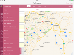
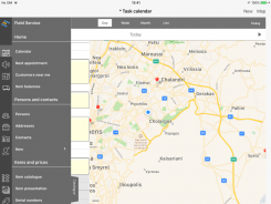 Application style


Through the gray scale style option of the “Settings” screen (menu: Settings/ Services profile), the device user can change the default style of each ESMobile application. This setting has an effect on the menu, lists, management screens and generally on the entire user interface of the application. The activation of these settings will be viewable after restarting the ESMobile application.
In addition, some other elements of the ESMobile app can be adjusted regarding their color & font. This feature requires copying the Theme .xml product file in the CSConfig area. The items that can be configured in this format are:
| Element | Comment |
|---|---|
| Settings | The Settings screen Concerns UWP & Android platforms only. |
| SfSchedule | The Calendar screen Concerns UWP & Android platforms only. |
| MainMenu | The main menu of the application. |
| Navigator | The area where the screen title is displayed. Concerns UWP & Android platforms only. |
| TabMenu | The area of the dashboard & data entry screen pages. |
| PopUpMenu | The application menu buttons (e.g. the “Actions” button). |
| SearchPanel | The search criteria area. Concerns UWP & Android platforms only. |
| ESKeyboard | The pop-up numeric keypad. |
| DetailView | The data entry screen of type DetailView. Concerns UWP & Android platforms only. |
| SFList | Screens with the SFListForm features (e.g. Add lines list, Contents part of the DocForm screen). Concerns UWP & Android platforms only. |
| ColorSize | The color-size dimensions designation screen. Concerns UWP & Android platforms only. |
Notification messages
 It is possible for a notification to be sent from the EBS application to the ESMobile application user. By calling the “Device manager” screen from the back office (menu: Sales/ Mobile devices), the list of available devices appears. From this list, the user can select the devices they wish and call the Send notification action. On the screen that appears, the user assigns the ESMobile app, the message to be sent and press “Send”. The message is immediately displayed to the device user, regardless if they’re in the ESMobile application environment at that specific moment.
Note that
To be able to send a notification to a device, the device notification ID must be designated in the back office. The notification ID is automatically assigned by the system upon the initial installation of ESMobile. Alternatively, the "Prepare to send notification" automation allows the notification ID to be manually assigned. Note that the notification ID information associated with each application-device is provided by the corresponding field in the “Settings” screen of the ESMobile application.
Integration with OneDrive
It is possible to integrate, via the ESMobile application interface, with the OneDrive service. The alternative methods to utilize this feature are:
Specify from the back office an attachment of URL address type
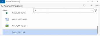
Using the special command type OneDriveCommand, where essentially only the e-mail address of the file to be called is indicated.

<SampleOneDrive Assembly="Entersoft.Mobile.ESMerchandize"
Type="Entersoft.Mobile.ESMerchandize.OneDriveCommand">
<Params>
<Url
Type="System.String"
Value="https://entersoftgr-my.sharepoint.com/.../EcDcDHvUQE5Ov47FNcbxCH0BFFKLOK7TN4TAWaVHgCwMw"/>
</Params>
</SampleOneDrive>
DocForm screen type
Line grouping
It is possible to use a field from a related entity -that means a field not listed in the line’s available fields- as the grouping factor of task-document lines. To utilize this feature, simply specify, using the Business rules tool, the desired value assignment rule in the non store GroupField of the task-document line. Keep in mind that the value assignment should take place both when adding a line (Activation: 1-OnAddLine), as well as when loading the Data entry screen (Activation: 4-OnLoadDetail).
Example
Suppose that we wish to implement a Data entry screen which can be used to create a document of type 1-Order. Suppose also that we want the “Description” field of the “Item group” zoom table as a line grouping criterion.
Be reminded that it is also necessary to fill in mobile parameter Doc_GroupField with the field that constitutes the grouping criterion, for example with the GroupField field.
Line sorting
Given that the task-document line sorting action manages all fields as text fields, for the sorting by a numeric field to be accurate, it is necessary to use a line non store field to “convert” a number to text. The conversion rule is defined using the Business Rules tool. Keep in mind that the conversion should take place both when adding & modifying a line (Activation: 1-OnAddLine& 0-OnChangeField respectively), as well as when loading the Data entry screen (Activation: 4-OnLoadDetail).
Example
Suppose that we wish to implement a Data entry screen which can be used to create a document of type 1-Order. Suppose also that we want to be able to use the "% Discount-2" field as one of the alternative criteria for sorting lines.
Bulk edit line elements
It is now possible to bulk update the numeric field value of a document’s lines. To enable this feature, simply modify the Actions file of the document's DocForm screen and in the ToolbarActions section add the BatchUpdate command.
e.g. to bulk update the quantity of already added document lines
<ToolbarActions>
…
<DocToolbarAction Caption="Μαζική μεταβολή ποσότητας" Command="BatchUpdate#Quantity" ESCaptionID=""/>
</ToolbarActions>
Discount value allocation
The ESMobile application provides the ability to bulk assign in document lines a discount value that results from the allocation of the total discount amount specified by the user. To enable this feature, simply modify the Actions file of the document's DocForm screen and in the ToolbarActions , section add the AllocateDiscount command.
e.g. To bulk assign the corresponding amount in field Discount value-1 of the document lines.
<ToolbarActions>
…
<DocToolbarAction Caption="Επιμερισμός έκπτωσης" Command="AllocateDiscount#Disc1" ESCaptionID=""/>
</ToolbarActions>
Line total discount %
It is possible to display the total discount % of a document line. This percentage results from the three individual field discounts of the line, with the following calculation: Total discount value / (Quantity * Price). To display this information, simply add in the AdvancedList file of the document’s DocForm screen a new element of type TextCell that in property CellSource has value DiscountPercent.
<Cell Type="Resco.Controls.AdvancedList.TextCell">
<Property Name="TextFont" Value="Tahoma, 8pt, style=Bold" />
<Property Name="Bounds" Value="95,10,20,16" />
<Property Name="CellSource" Value="DiscountPercent" />
<Property Name="FormatString" Value="{0:0.##\%}" />
</Cell>
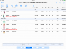 Balance limit excess

It is possible to mark the lines of a document, where the available balance is exceeded. To display this information, simply add in the AdvancedList file of the document’s DocForm screen a new element of type TextCell that in property CellSource has value ItemBalanceErrorMessage.
<Cell Type="Resco.Controls.AdvancedList.TextCell">
<Property Name="Bounds" Value="23,25,180,16" />
<Property Name="Alignment" Value="Left"/>
<Property Name="ForeColor" Value="red"/>
<Property Name="CellSource" Value="ItemBalanceErrorMessage"/>
</Cell>
Gift lines
 The ESMobile application allows the user to implement an action that is called on a selected document line to add an exact copy of the selected line, with quantity 1 in the base measurement unit of the item and 100% discount. Note that this feature is only available for iOS.
At the same time, it is possible to label these lines as “gift” with the desired icon. To implement this action, it is necessary to apply the following modifications to the AdvancedList file of the document’s DocForm screen.
- Add, in the RowTemplate for the selected entry, an element of type ButtonCell that in property Name has value NewByCopyGiftButton.
<RowTemplate>
<Property Name="Name" Value="SelectedRowTemplate" />
…
<Cell Type="Resco.Controls.AdvancedList.ButtonCell">
<Property Name="Bounds" Value="200,44,40,40" />
<Property Name="ImageDefault" Value="iVBORw0KGg..." />
<Property Name="Name" Value="NewByCopyGiftButton" />
<Property Name="Selectable" Value="true" />
<Property Name="CellSource" Value=""-1"" />
</Cell>
</RowTemplate>
- To label these lines as gifts, simply add one more element of type ButtonCell that in property Name has value ConditionalButton and in property CellSource the value IsGift. Finally, in property TrueImageFile specify the area of the icon you wish to use.
<Cell Type="Resco.Controls.AdvancedList.ButtonCell">
<Property Name="TrueImageFile" Value="CSImages/Gift.png" />
<Property Name="CellSource" Value="IsGift" />
<Property Name="Bounds" Value="1,1,10,32" />
<Property Name="Name" Value="ConditionalButton" />
</Cell>
Note that
Assigning a 100% discount is done at the line discount field, where mobile parameter Doc_GiftDiscount_Field has been specified.
Change collection type button
It is now possible to define a conversion button for the type of an already added line of collection. To enable this feature, simply add to the Actions file of the collection's DocForm screen a button that refers to command ConvertLineButton.
e.g. to define a button that directly converts a line type to “Transfer”
<Actions>
…
<ActionButton ImagePath="…" Name="ConvertLineButton#ColPayTransferCode" Width="30" Height="30"/>
</Actions>
Auto generate task
Example SampleAutoTask
It is possible to implement an action called on a selected entry of a person and as a result display the Task entity’s Data entry screen with pre-populated elements in the header and the lines, based on a user-defined select query. To utilize this feature, a NewTaskCommand type command is required, where the desired query for the header & lines is defined in properties CreateHeaderQuery & CreateLinesQuery respectively.
Example
| Suppose that we wish to implement a Data entry screen which can be used to create a task of ES.MCH-Measurement type. Suppose also that we want the auto generation of a Count task which includes all items that current year’s sales exceeds the 5 units updating at the same time the “Quantity to order” with the relevant sales quantity. |
|---|
Auto generate document
Example SampleAutoDocument
It is possible to implement an action called on a selected entry of a person and as a result display the Document entity’s Data entry screen with pre-populated elements in the header and the lines, based on a user-defined select query. To utilize this feature, a NewDocumentCommand type command is required, where the desired query for the header & lines is defined in properties CreateHeaderQuery & CreateLinesQuery respectively.
Example
| Suppose that we wish to implement a Data entry screen which can be used to create a document of type 1-Order. Suppose also that we all items where sales of the current year exceed 5 pieces to be automatically inserted to the Contents part of our screen, while also updating the sales volume in the “Quantity” field. |
|---|
Auto add analysis line
It is possible to extend the add lines process in a document so that, if the line to be added has the Color-Size information populated, the corresponding analysis line is also added automatically. To utilize this feature, simply assign, when adding the document line, the desired Color-Size value to the non store fColorCode and fSizeCode fields, respectively. Note that a necessary prerequisite to auto add an analysis line is that in field “Same item behavior” of the document type value 1-Add new line has been assigned.
Example
| Suppose, that we have configured the measurement input screen so that the measurement & to “order” quantities are defined at a color-size level. Suppose also that the color-size information is specified in fields Text-3 & Text-4 of the measurement line. Finally, suppose that we wish, when creating an order from a measurement, to also automatically add the analysis lines based on the “to order” quantity specified in the measurement. |
|---|
Split document
Example/ SampleSplitGiftDocument
The ESMobile application provides the ability to implement, via the Business rules tool, a rule that activates, the execution of a query or command after saving the current entry.
Example
Suppose for example that we want to automatically issue, when saving an order that has gift lines, a gift document including all gift lines, while at the same time deleting these lines from the original document.
Issue gift document
Create a NewDocumentCommand type of command (e.g. command SampleSplitGiftDocument) that defines the elements required to generate a gift document. The header & lines details are defined in properties CreateHeaderQuery & CreateLinesQuery respectively.
<SampleSplitGiftDocument Assembly="Entersoft.Mobile.ESMobile"
Type="Entersoft.Mobile.ESMobile.NewDocumentCommand">
<Params>
<CreateHeaderQuery Type="System.String" Value="
Select
h.fTradeAccountGID Assign_fTradeAccountGID,
h.fAddressGID Assign_fAddressGID
From ESFISalesDocument h
Where h.GID = '[PARENT]' " />
<CreateLinesQuery Type="System.String" Value="
Select
l.fItemGID fItemGID, l.fItemMUGID fItemMUGID,
l.Quantity Quantity, l.fTaskItemGID Assign_fTaskItemGID,
l.Price Assign_Price,
l.Disc1 Assign_Disc1, l.Disc2 Assign_Disc2, l.Disc3 Assign_Disc3
From ESFISalesDocLineItem l
Where l.fDocumentGID = '[PARENT]' and l.TotalValue = 0 " />
<DocType Type="System.String" Value="9" />
<NullCustomer Type="System.Boolean" Value="false" />
<ShowDocument Type="System.Boolean" Value="false" />
</Params>
</SampleSplitGiftDocument>
Modify the Business rules file of the order to add a rule that is activated after saving (Activation: 6-AfterSave) and results to the execution (Action: 2-Execute) of the above command (ScriptType: 8-Command). Note that, regarding the 8-Command script type syntax, the same apply as those described above for the syntax of action button and that variables [PARENT] or [CURRENT] are fed with the GID of the entity specified in the business rule.
<BusinessRule Title = "Create Gift Document / 6-AfterSave"
Entity = "ESFISalesDocument"
Activation = "6"
Action = "2"
Inactive = "false">
<ExecutionConditions
Entity = "ESFISalesDocLineItem"
Operator = "1"
ScriptType = "3"
Script = "[ESFISalesDocLineItem].[TotalValue] = 0"/>
<Execute
Entity = "ESFISalesDocument"
ScriptType = "8"
Script = "New#SampleSplitGiftDocument" />
</BusinessRule>
Delete gift lines from order
Modify the Business rules file of the order to add a rule that is activated after saving (Activation: 6-AfterSave) and results to the execution (Action: 2-Execute) the delete query of the gift lines (ScriptType: 1-SQL). More specifically, in case the original document updates the van warehouse stock (e.g. Invoice document), the Business rule should also make the appropriate inventory update.
<BusinessRule Title = "Delete Gift Lines / 6-AfterSave"
Entity = "ESFISalesDocument"
Activation = "6"
Action = "2"
Inactive = "false">
<ExecutionConditions
Entity = "ESFISalesDocLineItem"
Operator = "1"
ScriptType = "3"
Script = "[ESFISalesDocLineItem].[TotalValue] = 0"/>
<Execute
Entity = "ESFISalesDocLineItem"
ScriptType = "1"
Script = "
update ESMMItemBalance set
LastUpdate = datetime('now', 'localtime'),
BranchBalance =
(select ib.BranchBalance + li.BasicQuantity
from ESMMItemBalance ib
inner join ESGOCompany com on ib.fWarehousegid = com.fcurrentWarehousegid
inner join ESFISalesDocLineItem li on li.fitemGID = ib.fitemGID
where li.GID = '[ESFISalesDocLineItem].[GID]' and li.TotalValue = 0 )
where fitemGID in
(select fitemGID
from ESFISalesDocLineItem
where GID = '[ESFISalesDocLineItem].[GID]' and TotalValue = 0 )
and fwarehouseGID in (select fcurrentWarehousegid from ESGOCompany);
delete from ESFISalesDocLineItem
where GID = '[ESFISalesDocLineItem].[GID]' and TotalValue = 0" />
</BusinessRule>
Note that
In the scenario of automatic document generation by “splitting”, it is not possible to display the document generated. This means that the document must be signed and printed at a later time.
Online business policy
Match document fields
When calling the online business policy application process, all “named” fields of the current document are sent to & received by the server. To add user-defined header of document header or line to the information exchanged, it is necessary to add commands describing the desired field mapping (OnLineSaveMapping command to send to the server & OnLineSaveRetaking to download from the server) and save these commands to the folder of the document management form (e.g. CSForms\GenericDocForm\6 area for a sales invoice type document).
e.g. to send information “Table-1” of the document header to the server
command: OnLineSaveMapping
<OnLineSaveMapping>
<Header>
<Columns>
<Column ServerName="fADTableField2Code" LocalName="fADTableField2Code" Type="System.String"/>
</Columns>
</Header>
<Line>
<Columns>
</Columns>
</Line>
</OnLineSaveMapping>
e.g. to receive information “Number-1” of the document header from the server
command: OnLineSaveMapping
<OnLineSaveMapping>
<Header>
<Columns>
<Column ServerName="ADValueField1" LocalName="NumericField1" Type="System.Decimal"/>
</Columns>
</Header>
<Line>...
</OnLineSaveMapping>
command: OnLineSaveReturnMapping
<OnLineSaveMapping>
<Header>
<Columns>
<Column ServerName="ADValueField1" LocalName="NumericField1" Type="System.Decimal"/>
</Columns>
</Header>
<Line>...
</OnLineSaveMapping>
Auto apply
The ESMobile application provides the ability to configure the automatic activation of the online business policy process, either on a point of sales basis, or on a conditional basis. The following settings are required:
- Activate on a point of sales basis. The document’s type “Auto apply online business policy” flag must be activated, the address’s entity field (e.g. NumericField1) to be used by the process must be defined in the “Doc_AutoApplyCommercialPolicy_SiteField” mobile parameter and finally, the specific field must be updated with value 1 or 0 for activation or not activation, respectively.
- Activate conditionally. The document’s type “Auto apply online business policy” flag must be deactivated, while, via the Business rules tool, an assignment rule updating the document’s header field AutoApplyOnlinePolicy must be specified. The assignment must take place when saving the document (Activation: 7-OnAboutToSave).
e.g. auto apply online business policy, only when the document includes composite items
e.g. auto apply the online business policy, only when the receipt includes transfer note lines
Appendix
Command / Properties
This appendix lists the properties to be configured at an order level. Some "classic" properties are available for use on all types of screens. However, for certain types of screens, the list of available properties is now enhanced with additional ones.
| All types of screens |
|---|
| AskMessage (String) |
| Displays, when calling an action, a warning message via which the user can execute the action (button: OK) or cancel its execution (button: Cancel). |
 e.g. to execute an ad hoc Count action and display a warning message e.g. to execute an ad hoc Count action and display a warning message
</MerchandisingSiteNewForm> |
| BaseSelect (String) |
| The screen’s main select query. |
| CacheSearchPanel (Boolean) |
| Maintains the content of entry search criteria (true), or clears them the screen is closed (false). |
| ESQueryID (String) |
| The name of the file where the base select query has been defined. It is automatically filled-in only in the case where, for the purpose of re-using the select query, it’s meant to be defined in an independent file. In such a case, the BaseSelect property must be empty.
|
| e.g. to use PersonList as a common select query in screens “Distributors” & “Competitors”
<ESQuery
<DistributorListForm Assembly="Entersoft.Mobile.ESMobile"
<CompetitorListForm Assembly="Entersoft.Mobile.ESMobile"
|
| ExecuteCondition (String) |
| Allows configuring, via the definition of a query, whether an action will be executed (value: 1) or not (value: 0). If the first entry returned by the query has value 0, the action is not executed. |
e.g. to execute an ad hoc Count action, only if the current shift is active
</MerchandisingSiteNewForm> |
| ExtraCommand (String) |
| Allows the extension of the command’s main queries (e.g. extended by the addition of further joins) |
| Filter (String) |
The “static” filtering criteria. The user can use:
|
| FormID (String) |
| The CSForms folder, referring to the form associated with the specific command. |
| GroupBy (String) |
| The screen’s data grouping factors. |
| OnStartValidation (String) |
| Allows configuring, via the definition of a query, of the condition required in order for the command’s execution to be feasible. When the query results to at least one entry, the action is not executed and the content of the 1st column-line appears as an error message. |
e.g. to prevent an ad hoc Count action being added, when the current shift is not active
</MerchandisingSiteNewForm> |
| OrderBy (String) |
| The screen’s data sorting criteria.
|
| PostSaveCommand (String) |
| Used to define the command to be executed after saving a entry. |
| RefreshParent (Boolean) |
| Provides the ability to refresh dashboard screen data, after executing an SQLCommand. |
| RequiresExtraPin (Boolean) |
| Displays, when calling an action, a screen to enter the provided, by a back office-authorized user, PIN to approve the execution of said action. |
| e.g. to request approval by a back office-authorized user in the ah hoc Count action
<MerchandisingSiteNewForm Assembly="Entersoft.Mobile.ESMerchandize"
|
|
| RequiresPassword (Boolean) |
| Displays, when calling an action, a screen to input the user’s password.
|
| e.g. to request the user password when adding an ad hoc Count
<MerchandisingSiteNewForm Assembly="Entersoft.Mobile.ESMerchandize"
|
| SaveMenu (String) |
| The save button options. The typical options are: 1-Save, 2-Complete, & 3-Cancel. |
| SearchPanelFilter (String) |
| The screen’s data alternative search criteria |
| SearchPanelID (String) |
| The name of the file where the alternative search criteria were defined. It is automatically filled-in only in the case where, for the purpose of re-using the search criteria, they’re meant to be defined in an independent file. In such a case, the SearchPanelFilter property must be empty.
|
| ShowMessage (String) |
| Allows to configure, by defining of a query, the condition required in order for a message display to be feasible. When the query results in at least one entry, a message appears, with the content of the query’s 1st column-line. |
| e.g. to display a message when adding a Count action to a customer with open collection orders
<MerchandisingSiteNewForm Assembly="Entersoft.Mobile.ESMerchandize"
</MerchandisingSiteNewForm> |
| SortBy (SortBy) |
| The screen’s data alternative sorting criteria |
| Title (String) |
| The command’s relevant screen caption. |
| ValidateDataEnabled (Boolean) |
| Property disabled for the ESMobile application.
|
| Selection screens |
| FilterBy (String) |
| Provides the ability to limit the data of a list, based on the value of other Data entry screen fields. |
| ImageColumn (String) |
| The column linking a list entry to an image file. |
| ImageDirectory (String) |
| The image files storage folder. |
| ImageExtension (String) |
| The type of image files. |
| LoadDataOnOpenForm (Boolean) |
| Allows for direct display of data (value: true) or for display/refresh of data after filling in the individual search criteria (value: false).
|
| SelectaAllEnabled (Boolean) |
| Allows display of the button related to adding bulk quantity for the total entries. Concerns the iOS platform only. |
| SelectAllQtyEnabled (Boolean) |
| Allows display of the button related to adding bulk quantity for the total entries. Concerns UWP & Android platforms only. |
| Data entry screen: EditForm type |
| ActionsCommand (String) |
| The available entries of menu button -Actions. The desired actions are defined using a CommandSelector type of command.
|
| BaseInsert (String) |
| The screen’s main insert query. |
| BaseUpdate (String) |
| The screen’s main update query. |
| Editable (Boolean) |
| Gives the ability to prevent entry editing. |
| IsParamsPanel (Boolean) |
| Allows the display of a screen that states the required, for EBS view execution, parameters. |
| IsTask (Boolean) |
| Makes it possible to select a save status. Only applicable to the Task entity. |
| OnCompleteValidation (String) |
| Allows to configure, by defining a query, the condition required in order to be able to save a task as 2-Complete or 3-Cancel. When the query results in at least one entry, the save action is not executed and displays as error message with the content of the query’s 1st column-line. |
e.g. to prevent an appointment from being saved/completed, when the current shift is not active
</AppointmentEditForm> |
| RelatedFields (String) |
| Gives the ability of “synchronizing” the value of a field, based on another field’s value modifications. The required definition should:
MainField1[,]RelatedField1[=]Relation1[,]RelatedField2[=]Relation2[;] MainField2[,]RelatedField1[=]Relation1[,]RelatedField2[=]Relation2 |
e.g. to assign a value in fields “Profession description” & “Discount” of the customer form, from fields “Profession” & “Payment method” respectively
</CustomerEditForm> |
| RequiredFields (String) |
| The mandatory fields (comma-separated list). It's also possible to define a condition (using numeric fields), which will render filling in the fields mandatory. |
| Obsolete property, it is recommend that its use be avoided. This functionality is now available via an appropriate configuration of the DetailView file of the EditForm screen (property Required).
|
| TaskType (String) |
| The task’s type. For the tasks Sales appointments & Sales task, a value of 1 & 3 is indicated, respectively. For any other type of task the corresponding InternationalID is indicated. Only concerns NamedTask type screens. |
| Data entry screen: DocForm type |
| AllowZeroLines (Boolean) |
| Allows the insertion of a document -based on task- that has no lines. Only applicable to the Document entity. |
| AutoSave (Boolean) |
| Allows the simultaneous creation & saving of an auto generated document. Only applicable to the Document entity. |
| CreateHeaderQuery (String) |
| The query that assigns values to the fields of a header of an auto generated task-document. |
| CreateLinesAnalysisQuery (String) |
| The query that assigns values to the analysis line fields of an auto generated document. Only applicable to the Document entity. |
| CreateLinesQuery (String) |
| The query that assigns values to the line fields of an auto generated task–document. |
| CreateTaskItemSQL (String) |
| The query that assigns values to the auto generated task’s line fields. Only applicable to the Task entity.
|
| DetailRelatedFields (String) |
| Gives the ability of “synchronizing” the value of a field, based on another field’s value modifications. Only applicable to the Task entity.
|
| DetailRequiredFields (String) |
| The mandatory fields. Only applicable to the Task entity.
|
| DocType (String) |
| The document’s type. Defining this property is necessary only in cases where the document’s type does not result from the configuration of the action's call button. Only applicable to the Document entity. |
| HasValidData (String) |
| Allows to configure, by defining a query, the condition required in order to be able to create a new document. When the query returns no entries, the action is not executed. Only applicable to the Document entity. |
| e.g. to execute an add new Order action, only if the current shift is active
<NewDocumentfromSite Assembly="Entersoft.Mobile.ESMobile" Type="Entersoft.Mobile.ESMobile.NewDocumentFromSiteCommand">
|
| HeaderRelatedFields (String) |
| Gives the ability of “synchronizing” the value of a field, based on another field’s value modifications. Only applicable to the Task entity.
|
| HeaderRequiredFields (String) |
| The mandatory fields.
|
| NoDetail (Boolean) |
| In the case of a task where lines cannot be managed (e.g. Appointment)m specifying value “true” is mandatory. Only applicable to the Task entity. |
| NullCustomer (Boolean) |
| In the case of an item movement document type (e.g. Stock delivery note) the property must be declared as true. Only applicable to the Document entity. |
| ShowDocument (Boolean) |
| Allows to show or hide an auto generated document. Only applicable to the Document entity. |
| TaskType (String) |
| The task’s type. Specify the InternationalID of the task type. Only applicable to the Task entity. |
| ModalForm screen type |
| DoneButtonTitle (String) |
| The caption regarding the screen’s “Accept” button.
|
| Modal (Boolean) |
| Gives the ability to display a screen as a modal window.
|
| MultiSelect (Boolean) |
| Enables multiple selection of a list’s entries. |
| OnSelectCommand (String) |
| Define the action being executed by pressing “Select”. The action is performed on the list’s selected entries.
|
Command / Variables
This appendix lists the variables available for use in properties of the command, where syntax of a query is required (properties: BaseSelect, BaseInsert, Filter, etc). Some "classic" variables are available for use on all types of screens. However, for certain types of screens, the list of available variables is now enhanced with additional ones. Note that, regardless of the type of screen and property, the variable to be used should be declared in brackets (e.g. [CURRENT])
| All types of screens | |
|---|---|
| [CURRENT] | |
| [PARENT] | |
| [USERID] | |
| [APPLICATIONID] | |
| [BRANCHGID] | |
| [CAMPAIGNGID] | |
| [FITEMGID] | |
| [FCATALOGUEITEMGID] | |
| [TASKBEGINDATE] | |
| [TASKENDDATE] | |
| Screen type: Add lines list (e.g. AddLineForm) | |
| [FADDRESSGID] | |
| [DOCTYPE] | |
| [FCAMPAIGNGID] | |
| [PRODUCTPROPOSALGID] | |
| [LEVEL] | |
| [MULTIPLIER] | |
| [FIELD] | The variable is fed directly with the field value of the Header part of the DocForm screen, from which the line add lines list is called, i.e. from a field of the ESTMTask table for the Task entity, or the ESFISalesDocument table for the Document entity.
e.g. [fTradeAccountGID] to be fed from the “Trade account” field of the task or document header |
| Screen type: Local report (DataGridReport) | |
| [PERIOD] | |
| [SALESPERSON] | |
| [UDFFIELD1] | |
| [UDFFIELD2] | |
| [UDFFIELD3] | |
| [UDFFIELD4] | |
| [UDFFIELD5] | |
Mobile parameters
The mobile parameters can be configured from the back office. It is possible to differentiate the parameter value, both at an ESMobile application level and a specific user level. The parameters are transferred to the local database via the data initialization process.
This appendix lists the available mobile parameters having grouped them based on the "area" of the ESMobile application to which they provide a functionality. Note that most of the parameters apply to all ESMobile applications. The parameters that, by way of exception, concern a specific application, are marked accordingly.
| General | |||||||||||
|---|---|---|---|---|---|---|---|---|---|---|---|
| Administrator_Email | |||||||||||
| The email address where application error messages are sent. | e.g. admin@wwf.gr | ||||||||||
| AllCustomers | |||||||||||
| Enables the user rights to send the full customer list, via the data synchronization process. | 0-No or 1-Yes | ||||||||||
 This parameter can be configured using the "All customers" option of the "Communication permissions" field of the device. This parameter can be configured using the "All customers" option of the "Communication permissions" field of the device.
| |||||||||||
| AllowReceive | |||||||||||
| Configure the call permission for the attachment delivery process when communication takes place via the “mobile data” service. | 0-No or 1-Yes | ||||||||||
| This parameter can be configured using the "Allow download" option of the "Communication permissions" field of the device.
| |||||||||||
| AllowSend | |||||||||||
| The call permission for the data delivery process can be configured when communication takes place via the “mobile data” service. | 0-No or 1-Yes | ||||||||||
| This parameter can be configured using the "Allow delivery" option of the "Communication permissions" field of the device.
| |||||||||||
| AllowSyncPushLargeFiles | |||||||||||
| The call permission for the attachment delivery process can be configured when communication takes place via the “mobile data” service. | 0-No or 1-Yes | ||||||||||
| This parameter can be configured using the "Send attachments" option of the "Communication permissions" field of the device.
| |||||||||||
| AttachedSitePhotoCategory | |||||||||||
| The category code that characterizes the image files (attachments) of the point of sales. | e.g. SITE_PHOTO | ||||||||||
| This parameter can be configured from company parameter «Attachment category for site photos».
| |||||||||||
| AttachmentPath | |||||||||||
| Parameter disabled for the ESMobile application.
|
|||||||||||
| AutoCheckVersion | |||||||||||
| Enables the feature of the automatic, upon user login, compatibility check for the version installed on the device with the version installed on the IIS server. | 0-No or 1-Yes | ||||||||||
| CallBefore | |||||||||||
| Parameter disabled for the ESMobile application.
|
|||||||||||
| CradleCommand | |||||||||||
| Parameter disabled for the ESMobile application.
|
|||||||||||
| Culture | |||||||||||
| Configures the display format for localization elements (dates & numbers). Concerns the iOS platform only. | e.g. el-GR | ||||||||||
| CurrencyNegativePatern | |||||||||||
| Display format for fields of type “Currency value” with a negative value. | e.g. 15 | ||||||||||
| The available options are:
|
|||||||||||
| 0 | ($n) | 4 | (n$) | 8 | -n $ | 12 | $ -n | ||||
| 1 | -$n | 5 | -n$ | 9 | -$ n | 13 | n- $ | ||||
| 2 | $-n | 6 | n-$ | 10 | n $- | 14 | ($ n) | ||||
| 3 | $n- | 7 | n$- | 11 | $ n- | 15 | (n $) | ||||
| CurrencyPositivePattern | |||||||||||
| Display format for fields of type “Currency value” with a positive value. | e.g. 3 | ||||||||||
| The available options are:
|
|||||||||||
| 0 | $n | 1 | n$ | 2 | $ n | 3 | n $ | ||||
| CurrencySymbol | |||||||||||
| The currency symbol. To hide the symbol, specify character “empty”’. | e.g. € or EUR | ||||||||||
| ES_TAXISNET_PUBLICAFM | |||||||||||
| The login credentials for the VAT identification service of taxis. | |||||||||||
| This parameter can be configured via the relevant company parameter.
| |||||||||||
| fDamagedGoodsWHGID | xVan | ||||||||||
| The W/H that’s been marked as the damaged goods warehouse. | |||||||||||
| This parameter can be configured from field «Damaged goods» of the user’s services profile.
| |||||||||||
| Googlekey | |||||||||||
| The key to use Google's map service. | |||||||||||
| This parameter can be configured via the relevant company parameter.
| |||||||||||
| GPS_State | |||||||||||
| Configure the feature that tracks the user’s position. The actions during which position is tracked are default by the ESMobile application and listed in the table below. In case the device GPS is turned off, the GPS-disabled detection is recorded as a distinct event in the device event file. This recording is performed once per day. | 0 & 1 Track, 2-No trace | ||||||||||
| Entry type | Action | ||||||||||
| 14 | Sales appointment-Start | ||||||||||
| 6 | Sales appointment-Complete | ||||||||||
| 11 | Sales task-Complete | ||||||||||
| 10 | Collection-Complete | ||||||||||
| 19 | Other task-Complete | ||||||||||
| 20 | Work on site-Arrival | ||||||||||
| 21 | Work on site-Start | ||||||||||
| 15 | Work on site-Complete | ||||||||||
| 16 | Replace on site-Complete | ||||||||||
| 17 | Preventive maintenance-Completion | ||||||||||
| 7 | Sales order | ||||||||||
| 12 | Quotation | ||||||||||
| 22 | Sales return note | ||||||||||
| 23 | Other - Sales document | ||||||||||
| 24 | Transfer document | ||||||||||
| 26 | Open attachment | ||||||||||
| This parameter can be configured by field “Trace method” of the device.
| |||||||||||
| GPS_TimeOut | |||||||||||
| The standby time for GPS position tracking (in seconds). Concerns UWP & Android platforms only. | e.g. 5 | ||||||||||
| HybridOnlineReports_BridgeID | |||||||||||
| The Bridge link to the ESAnalyzer application. | |||||||||||
| HybridOnlineReports_Host | |||||||||||
| The ESAnalyzer server. | |||||||||||
| HybridOnlineReports_SubscriptionID | |||||||||||
| The ESAnalyzer application subscription code. | |||||||||||
| HybridOnlineReports_SubscriptionPassword | |||||||||||
| The ESAnalyzer application password. | |||||||||||
| HybridOnlineReports_Version | |||||||||||
| The ESAnalyzer app version number. | |||||||||||
| KeyboardMainLanguage | |||||||||||
| Parameter disabled for the ESMobile application.
|
|||||||||||
| Lists_RecordCount | |||||||||||
| Displays the "Number of entries" information in the data lists. Concerns UWP & Android platforms only. | 0-No or 1-Yes | ||||||||||
| MailClient | |||||||||||
| The application that sends E-mails. Concerns the iOS platform only. | 0-Native iOS or 1-MS Outlook | ||||||||||
| To be able to send an E-mail containing an attached file, a specify value 0-Native iOS.
| |||||||||||
| MailMergeMode | |||||||||||
| Configures the behavior for the task-document delivery via E-mail process | 0-HTML, 1-PDF, 2-PDF/Speech or 3-Inactive | ||||||||||
| Map_NearestSiteRadius | |||||||||||
| The default value for the search km radius of screen "Nearest customers". | e.g. 10 | ||||||||||
| Memo_Disable_FolderButton | |||||||||||
| Disables the ability to attach an image file by selecting an existing photo. Concerns the iOS platform only. | 0-No or 1-Yes | ||||||||||
| MessageOnLoginCommand | |||||||||||
| The command that specifies the data in the message list to the user. | E.g. UnreadUserMessageListForm | ||||||||||
| MobileDataBasedOn | |||||||||||
| Enables the ability to assign a customer list based on territory. | 0-No or 1-Yes | ||||||||||
| This parameter can be configured via the relevant company parameter.
| |||||||||||
| ModalNumericKeyboard | |||||||||||
| Enables the ability of closing the keypad screen only through the “OK” or “Cancel” buttons. Concerns the iOS platform only. | 0-No or 1-Yes | ||||||||||
| NumberDecimalSeparator | |||||||||||
| The character used to separate the decimal digits of a number. Note that this parameter indicates the character with which the numeric fields are saved in the database. | |||||||||||
| In case the comma character is designated, a relevant adjustment is also required in the txt files of the data import scenarios (“Decimal point” field of the “Source info” screen)
| |||||||||||
| NumberGroupSeparator | |||||||||||
| The character used to separate thousands in numbers. Note that this parameter indicates the character with which the numeric fields are saved in the database. | |||||||||||
| NumericKeyboardSizeFactor | |||||||||||
| The size of the numeric keypad screen. Default values from 1.1 to 1.8. Concerns the iOS platform only. | e.g. 1.3 | ||||||||||
| OnlineServices | |||||||||||
| Configure the call permission for online printing when communication takes place via the “mobile data” service. | 0-No or 1-Yes | ||||||||||
| This parameter can be configured using the "Online services" option of the "Communication permissions" field of the device.
| |||||||||||
| PanicSMSnumber | |||||||||||
| Parameter disabled for the ESMobile application.
|
|||||||||||
| Photo_Url | |||||||||||
| The URL area where image files related to photo captures are saved. | e.g.http://192.168.1.195/ESMobilePhotos/ | ||||||||||
| This parameter is configured by company parameter «Photos from mobiles - Save in folder».
| |||||||||||
| ReceiveNewVersion | |||||||||||
| Configure the call permission for the version downloading process when communication takes place via the “mobile data” service. | 0-No or 1-Yes | ||||||||||
| This parameter can be configured using the "Download new version" option of the "Communication permissions" field of the device.
| |||||||||||
| SFList_GroupFieldCustomer | |||||||||||
| The criterion used to group the data of a list related to the Customer entity. Concerns UWP & Android platforms only. | |||||||||||
| SFList_GroupFieldItem | |||||||||||
| The criterion used to group the data of a list related to the Item entity. Concerns UWP & Android platforms only. | |||||||||||
| ShiftFunctionality | xVan | ||||||||||
| The functionality assigned to the shift. Selecting options 1 or 2 results to the automatic activation, when entering the application and provided that there is no active shift, of the shift starting process. Selecting option 2 also results to the automatic activation of several checks related to issuing documents and data synchronization. | 0-Nothing 1-Display on login or 2-Full control. | ||||||||||
| ShiftOnLoginCommand | xVan | ||||||||||
| The command executed upon login to the application, to call the “Start shift” process. Works in conjunction with the ShiftFunctionality parameter. | e.g. ShiftOnLoginCommand | ||||||||||
| Sync_ReplaceInvalidContext | |||||||||||
| Determines whether, in case of discrepancy between the form-command of an EditForm screen, the content of the incompatible fields will be replaced with value “null”, | 0-No or 1-Yes | ||||||||||
| Main entities | |
|---|---|
| CatalogueItemFieldImageName | |
| Parameter disabled for the ESMobile application.
|
|
| DaysNewPerson | MedRep |
| Number of days to qualify a customer as a new entrant to the device user’s territory. | e.g. 7 |
| GPS_AskPinSite | |
| Activates, when entering a new address, the functionality related to the identifying the current geographical position. | 0-No or 1-Yes |
| ImageFileExtension | |
| The type of image files. In order for the item-item image linking to be feasible, folder ProductImages must contain relevant image files of the specific type. | e.g. jpg |
| Item_ShowThumbs | |
| Enables the display of an image column in search lists. Concerns the iOS platform only. | 0-No or 1-Yes |
| Item_URL_first_part | |
| Parameter disabled for the ESMobile application.
|
|
| ItemFieldImageName | |
| Parameter disabled for the ESMobile application.
|
|
| LegalSiteTypeDefaultCode | |
| The default, when entering a new address, address type. | e.g. HEAD OFFICE |
| The parameter’s content must match the entry code of an “ESGOZSiteType” table.
| |
| PhysicalSiteTypeDefaultCode | |
| The default address type, when entering a new contact person. | e.g. RESIDENCE |
| The parameter’s content must match the entry code of an “ESGOZSiteType” table.
| |
| PreferredCountryInternationalID | |
| The default country code, when entering a new address. | e.g. GR |
| The parameter’s content must match the entry code of an “ESGOZCountry” table entry.
| |
| Site_IBAN_ValidationField | |
| The address field where the bank account's IBAN is indicated. | e.g. StringField1 |
| Task entity | ||
|---|---|---|
| App_Days_Edit_Allowed | ||
| The number of days during which the uesr can edit a past appointment. By specifying value 0, the check is completely deactivated. | e.g. 7 | |
| Appointment_ContextActions_Disabled | ||
| Parameter disabled for the ESMobile application.
|
||
| Appointment_creator_enable | ||
| The scenario of bulk insert entries via the “New” button of the “Calendar” screen. Concerns the iOS platform only. | 0-Simple or 1-Full | |
| Appointment_is_Container | ||
| Hide the add new task or document actions from the customer & point of sales interface. | 0-No or 1-Yes | |
| AppointmentInternationalID | ||
| The International ID of “Sales appointment” task type. | e.g. ES.SAP | |
| This parameter can be configured via the relevant company parameter.
|
||
| AppointmentStartControl | ||
| Activates a check when calling the “Start” action on an appointment. If an active appointment already exists, at the start of another appointment, a prohibitive message appears. | 0-No or 1-Yes | |
| Prerequisite: company parameter "The sales meeting and sales task act as all other task types" (AppTodoAsTask) must have value 1-Yes.
|
||
| AppointmentStartControlRange | ||
| The check range when calling the “Start” action on an appointment. Works in conjunction with the AppointmentStartControl parameter and only when that has a value of 1-Yes. | 0-Today or 1-Any time | |
| Prerequisite: company parameter "The sales meeting and sales task act as all other task types" (AppTodoAsTask) must have value 1-Yes.
|
||
| AppointmentTargetFieldName | ||
| The appointment field where the budgeted turnover of the appointment is assigned. Concerns the iOS platform only. | e.g. NumericField1 | |
| AppTodoAsTask | ||
| Enables the ability to manage ES.SAP-Sales apppointment and ES.STK-Sales tasks types of tasks as "general" tasks. Concerns the iOS platform only. | 0-No or 1-Yes | |
| This parameter can be configured by company parameter "The sales meeting and sales task act as all other task types".
|
||
| Calendar_show_closed_tasks | ||
| Displays the completed or canceled appointments on the Calendar screen | 0-No or 1-Yes | |
| CaseInternationalID | ||
| The International ID of “Case” task type. | e.g. ES.CASE | |
| This parameter can be configured via the relevant company parameter.
|
||
| ComplaintInternationalID | ||
| The International ID of “Complaint” task type. | e.g. ES.COM | |
| This parameter can be configured via the relevant company parameter.
|
||
| DefaultMinutesAppToEnd | ||
| Obsolete parameter, it is recommend that its use be avoided. The functionality of this parameter is now provided by configuring the "Usual duration" field of the task type in question.
|
||
| DefaultMinutesAppToPrepare | ||
| Obsolete parameter, it is recommend that its use be avoided. The functionality of this parameter is now provided by configuring the "Preparation time" field of the task type in question.
|
||
| DefaultMinutesPRMToEnd | ||
| Obsolete parameter, it is recommend that its use be avoided. The functionality of this parameter is now provided by configuring the "Usual duration" field of the task type in question.
|
||
| DefaultMinutesROSToEnd | ||
| Obsolete parameter, it is recommend that its use be avoided. The functionality of this parameter is now provided by configuring the "Usual duration" field of the task type in question.
|
||
| DefaultMinutesSOSToEnd | ||
| Obsolete parameter, it is recommend that its use be avoided. The functionality of this parameter is now provided by configuring the "Usual duration" field of the task type in question.
|
||
| DefaultMinutesTskToEnd | ||
| Obsolete parameter, it is recommend that its use be avoided. The functionality of this parameter is now provided by configuring the "Usual duration" field of the task type in question.
|
||
| DefaultWinLossCode | ||
| The default, upon competion of a sales opportunity, win-loss reason. | e.g. PRICE | |
| The parameter’s content must match the entry code of an “ESTMZOppWonLost” table.
|
||
| EndWorkingTime | ||
| The end time of working hours. The information is used by the bulk add appointment processes. | e.g. 17:00 | |
| ESTMTaskItemExtended | ||
| Activates the functionality that extends the task lines table, | 0-No or 1-Yes | |
| MorningZoneEndTime | ||
| The morning zone end time. This information is used to define the non-grayed area of the calendar screen. | e.g. 14:00 | |
| MorningZoneStartTime | ||
| The morning zone starting time. This information is used to define the non-grayed area of the calendar screen. | e.g. 09:00 | |
| OpportunityInternationalID | ||
| The International ID of “Sales opportunity” task type. | e.g. ES.OPP | |
| This parameter can be configured via the relevant company parameter.
|
||
| Photo_PreferredQuality | ||
| The image files’ degree of compression. Specifies the file size in bytes. | e.g. 70 | |
| Photo_PreferredSize | ||
| The default dimensions for image type files. Concerns the iOS platform only. | e.g. 346.245 | |
| Photo_PreferredSize_Cross | ||
| The % of size reduction for image-type files. Concerns UWP & Android platforms only. | e.g. 70 | |
| POS_related_property_set_code | ||
| The code of “Collect data” property group related to the questionnaire designed for point-of-sales status tracking. | e.g. RDC_POSStatus | |
| This parameter can be configured “POS related property set code (Mobile RDC)”.
|
||
| Questionnaire_Rate_Decimals | ||
| Parameter disabled for the ESMobile application.
|
||
| Questionnaire_Rate_Maximum | ||
| Parameter disabled for the ESMobile application.
|
||
| Questionnaire_Rate_Minimum | ||
| Parameter disabled for the ESMobile application.
|
||
| Service_PRM_fTermServiceGID | Service | |
| The service used when entering an ES.PRM-Preventive maintenance task. | ||
| Service_ROS_fTermServiceGID | Service | |
| The service used when entering an ES.ROS-Swap on site task. | ||
| This parameter can be configured via the relevant company parameter.
|
||
| Service_show_document_created_by_SOS | Service | |
| Automatic display of the sales delivery note issued in the context of a specific service task. | 0-No or 1-Yes | |
| This parameter can be configured via the relevant company parameter.
|
||
| Service_SOS_fTermServiceGID | Service | |
| The service used when entering an ES.SOS-On site task. | ||
| This parameter can be configured via the relevant company parameter.
|
||
| Service_van | Service | |
| Activates the functionality related to van warehouse monitoring. | 0-No or 1-Yes | |
| SOS_AskUpdateActualStartDateMessage | ||
| Parameter disabled for the ESMobile application.
|
||
| SOS_AskUpdateArrivalDateMessage | ||
| Parameter disabled for the ESMobile application.
|
||
| SOS_ReadOnlyControl | Service | |
| Obsolete parameter, it is recommend that its use be avoided. This parameter's functionality is now provided by configuring the "Deny intervention level" field of the task type in question.
|
||
| SOSInternationalID | Service | |
| The international ID of “Task on site” task type. | e.g. ES.SOS | |
| This parameter can be configured via the relevant company parameter.
|
||
| StartWorkingTime | ||
| The start time of working hours. The information is used by the bulk add appointment processes. | e.g. 09:00 | |
| Task_BarcodeSaveField | ||
| The task line field where the barcode, used during item selection, is assigned. | e.g. StringField1 | |
| Task_failure_status | ||
| The caption referring to status option (3). | e.g. Canceled | |
| Task_in_progress_status | ||
| The caption referring to status option (1). | e.g. In Progress | |
| Task_MCH_GroupField | ||
| Obsolete parameter, it is recommend that its use be avoided. This parameter’s functionality is now provided by configuring the "Grouping field" field of the task type in question.
|
||
| Task_MCH_OrderQuantityFormula | ||
| Obsolete parameter, it is recommend that its use be avoided. This parameter's functionality is now available by using the Business Rules tool.
|
||
| Task_mch_ShelfShareCategory | ||
| The item grouping field used by the “Shelf share” task type. | 0-Family or 1-Group or 2-Category or 3-Subcategory | |
| Task_open_status | ||
| The caption referring to status option (0). | e.g. Open | |
| Task_OrderBy_Definition | ||
| Obsolete parameter, it is recommend that its use be avoided. This parameter's functionality is now provided through an appropriately configured of the SortBy section of the DocForm screen Actions file.
|
||
| Task_RDC_CopyLastSurvey | ||
| Activates, when entering a new “Collect data” questionnaire, the functionality of auto populating the responses based on the most recent responses. | 0-No or 1-Yes | |
| Task_SavePerLine | ||
| Saves the task as “temporary” (RecordState 3) with each new line being added. | 0-No or 1-Yes | |
| Task_success_status | ||
| The caption referring to status option (2). | e.e. Succesful | |
| TaskItem_IsFocusedField | ||
| Parameter disabled for the ESMobile application.
|
||
| TaskItem_PrevCountQty_Field | ||
| Parameter disabled for the ESMobile application.
|
||
| TaskItem_PrevSoldQty_Field | ||
| Parameter disabled for the ESMobile application.
|
||
| TaskItemInstDateField | ||
| The task line field used as the deinstallation date in an “Installation” task type. | e.g. DateField1 | |
| TaskItemInstSNField | ||
| The task line field used as a serial number in an “Installation” task type. | e.g. StringField1 | |
| ToDoInternationalID | ||
| The International ID of “Sales task” task type. | π.χ. ES.STK | |
| This parameter can be configured via the relevant company parameter.
|
||
| VisitPlanSelectionEnabled | ||
| Enables, in the bulk create appointment based on plan process, the ability to select meetings. | 0-No or 1-Yes | |
| YammerClientID | ||
| Obsolete parameter, it is recommend that its use be avoided.
|
||
| YammerConversationURL | ||
| Obsolete parameter, it is recommend that its use be avoided.
|
||
| YammerEnabled | ||
| Obsolete parameter, it is recommend that its use be avoided.
|
||
| YammerGroupID | ||
| Obsolete parameter, it is recommend that its use be avoided.
|
||
| YammerRedirectURL | ||
| Obsolete parameter, it is recommend that its use be avoided.
|
||
| YammerSecret | ||
| Obsolete parameter, it is recommend that its use be avoided.
|
||
| Document / Sales entity | |||
|---|---|---|---|
| ApplyInvoicePolicy | |||
| Configure the call permission for the online business policy application process when communication takes place via the “mobile data” service. | 0-No or 1-Yes | ||
| This parameter can be configured using the "Apply invoicing polity" option of the "Communication permissions" field of the device.
| |||
| ApprovalRequestInternationalID | xVan | ||
| The international ID of “Request for exceeding credit limit” task type. | |||
| Barcode_AddItemAfterScan | |||
| The mode of operation of the barcode scanning area. | 0-Nothing or 1-Insert line | ||
| Barcode_AutoQnt | |||
| Simultaneous addition of an item & quantity of the barcode scanning area. | 0-No or 1-Yes | ||
| Barcode_ClearAfterScan | |||
| Clears the barcode scanning area after adding a line. | 0-No or 1-Yes | ||
| Barcode_LogNotFound | |||
| Records atttempts to find an item via barcode to the “failed” events log. | 0-No or 1-Yes | ||
| Barcode_SearchMethod | |||
| The order in which the barcode identification check is performed. | e.g. 1-2 | ||
| The available options are:
1-field “Item code” of table Items (ESFIItem) 2-field “Barcode” of the table Items (ESFIItem) 3-field “Barcode” of the Multiple item codes table (ESMMItemcodes) 4-check the combined table for barcode check based on a formula in the BarcodeProcessor.xml file (ESMobile\ESConfig device area). The individual properties of the file should be designated as follows: Start,Length. | |||
| e.g. for barcodes related to Item, Quantity, Color, Size with the following specifications | |||
| Item | 6 characters | The search is first attempted with the code and then with the item barcode | |
| Quantity | 4 characters | ||
| Decimals | 2 characters | ||
| Color | 1 characters | The search is attempted with the color code | |
| Size | 1 characters | The search is attempted with the size code | |
<BarcodeProcessor Assembly="Entersoft.Mobile.ESMobile"
| |||
| e.g. for barcodes related to Item, Quantity, Lot with the following specifications | |||
| Item | 6 characters | The search is first attempted with the code and then with the item barcode | |
| Quantity | 2 characters | ||
| Lot | 5 characters | The search is attempted with the lot code | |
<BarcodeProcessor Assembly="Entersoft.Mobile.ESMobile"
| |||
| Barcode_UseCamera | |||
| Enables the use of the camera as a barcode scanner device. | 0-No or 1-Yes | ||
| Barcode_UseKeyboard | |||
| Displays the keyboard in a barcode scanning area. | 0-No or 1-Yes | ||
| cce_duration_days | xVan | ||
| The default duration of validity for exceeding limit requests (in days). | e.g. 3 | ||
| CompetitionScroller | |||
| Parameter disabled for the ESMobile application.
|
|||
| CountCatalogueItems | xVan | ||
| Determines whether the stock count quantity concerns a catalogue item. Used in calculation algorithms for the Marketing program targets. Concerns the iOS platform only. | 0-No or 1-Yes | ||
| This parameter can be configured in company parameter «Counting in catalogue items».
| |||
| DOC_ADD_SEPARATOR_Prefix_Series | |||
| A prefix-series separator participates in the document code. | 0-No or 1-Yes | ||
| This parameter can be configured from company parameter «Document Code - Display the separator between the Prefix and the Series».
| |||
| DOC_ADD_SEPARATOR_Series_Number | |||
| Displays the series-number separator in the document code. | 0-No or 1-Yes | ||
| This parameter can be configured from company parameter «Document Code - Display the separator between the Series and the Document number».
| |||
| Doc_AllowEditDiscount1 | |||
| Edit field Discount-1 of the document line. | 0-No or 1-Yes | ||
| Doc_AllowEditDiscount2 | |||
| Edit field Discount-2 of the document line. | 0-No or 1-Yes | ||
| Doc_AllowEditDiscount3 | |||
| Edit field Discount-3 of the document line. | 0-No or 1-Yes | ||
| Doc_AllowEditPrice | |||
| Edit field Value of the document line. | 0-No or 1-Yes | ||
| Doc_AllowFreeProductRewards | xVan | ||
| Enables, during the process of assigning Marketing program rewards, the ability to also integrate “Free item” rewards into the invoice. Concerns the iOS platform only. | 0-No or 1-Yes | ||
| Doc_AllowSaveSet_WithoutOnlineCommercialPolicy | xVan | ||
| Enables a check process for a document that contains a composite item. | 0-No, 1-Warning, 2-Prohibition | ||
| Doc_AllowZeroLines | |||
| Add document without lines. | 0-No or 1-Yes | ||
| Doc_AllowZeroQty | |||
| Add line & analysis line entry with zero quantity. | 0-No or 1-Yes | ||
| Doc_AssignDiscount_Field | |||
| The document line field to which a discount is assigned via action «Bulk discount update». | Disc1 or Disc2 or Disc3 | ||
| Doc_AutoApplyCommercialPolicy | |||
| Obsolete parameter, it is recommend that its use be avoided. This parameter’s functionality is now provided by configuring the "Auto apply" field of the online business policy.of the document type in question.
| |||
| Doc_AutoApplyCommercialPolicy_SiteField | |||
| Specialize in the auto apply company policy process, at a point of sales level, by defining a specific field of the address entity. The user must have made sure that this field’s value is 0 or 1. | e.g. NumericField1 | ||
| Prerequisite: the document type has the auto apply company policy process enabled.
| |||
| Doc_AutoOpenBarcodePanel | |||
| Auto displays the barcode scanning area. | 0-No or 1-Yes | ||
| Doc_BarcodeSaveField | |||
| The barcode, used during item selection, is assigned to this document line field. | e.g. StringField1 | ||
| Doc_CancelPermissionRequest | |||
| Displays, when calling for a document cancellation action, a screen for the authorized user to specify a verification code. | 0-No or 1-Yes | ||
| Doc_CashCollectionOnCreditExcess | xVan | ||
| Enables the ability, when issuing an invoice with credit limit excess, to automatically issue a cash receipt with the exceeding amount. | 0-No or 1-Yes | ||
| Doc_CollectionInCash_AutoHide | xVan | ||
| Enable the ability to hide the receipt when issuing a cash invoice. Concerns the iOS platform only. | 0-No or 1-Yes | ||
| Prerequisite: company parameter “Issue Invoice in cash on common document” (Doc_InCash_PaymentInDocument) should have value 0-No.
| |||
| Doc_ColorSizeSingle | |||
| Parameter disabled for the ESMobile application.
|
|||
| Doc_CommercialPolicy_Editable | |||
| The degree of editing check to document elements after accepting the results of the online business policy. | 0-Nothing, 1-Anything ή 2-Only promotional actions | ||
| Doc_CustomCreditControl | xVan | ||
| Specializes the credit check process, by defining the name of a GetDataCommand type command. | e.g. GetCheckListDocuments | ||
| Doc_DimensionalGrid_ShowBalance | |||
| Displays, in the quantity input screen per color-size, the information concerning the current balance per dimension. It requires balances to be updated via option “Item balances” of the “Synchronization” menu. | 0-No or 1-Yes | ||
| Doc_DimensionalGrid_ShowDescription | |||
| Displays, in the quantity input screen per color-size, the information concerning the dimension description. | 0-No or 1-Yes | ||
| Doc_DisablePriceList_TAPC | |||
| Disables the pricelist application based on the customer pricing group | 0-No or 1-Yes | ||
| Doc_ESFILineCheckList_TradeAccountSiteField | xVan | ||
| The field of table ESFILineCheckList where, when executing the online credit policy process, the customer address of the current document is assigned. | e.g. UDFString1 | ||
| Doc_ESFILineCheckList_TradeTypeField | xVan | ||
| The field of table ESFILineCheckList where, when executing the online credit policy process, the transaction type of the current document is assigned. | e.g. UDFString2 | ||
| Doc_GetTradeTypeCode | |||
| Parameter disabled for the ESMobile application.
|
|||
| Doc_GetTradeTypePaymentMethod | |||
| Parameter disabled for the ESMobile application.
|
|||
| Doc_GiftDiscount_Field | |||
| The document line field where a discount is assigned using action “Gift”. | Disc1 or Disc2 or Disc3 | ||
| Doc_GroupField | |||
| The document line field used as a line grouping field. | e.g. fItemFamilyCode | ||
| Doc_InCash_PaymentInDocument | xVan | ||
| Enables the ability to issue a cash invoice in a common document. Concerns the iOS platform only. | 0-No or 1-Yes | ||
| This pamareter can be configured in company parameter «Issue Invoice in cash on common document».
| |||
| Doc_InvestigateItemLimit | |||
| The number of amounts that corresponds to the "Select all" button of the “insert lines list” type screen. | e.g. 30 | ||
| Doc_InvoiceCash_PaymentMethod | |||
| Parameter disabled for the ESMobile application.
|
|||
| Doc_InvoiceInCashEditable | xVan | ||
| Allows the user to directly mark an invoice as “cash”. Specifically in case the invoice customer or payment method have zero credit days, the document is automatically marked as “cash” by the application and the user cannot change it. | 0-No, 1-Yes, 2-Only when there is no payment delay | ||
| Doc_ItemDiscountField | |||
| The field of the document line where an item discount is assigned. | Disc1 or Disc2 or Disc3 | ||
| Doc_ItemInvForm_DefaultQty | |||
| The default quantity that corresponds to the “Select all” button of the “insert lines list” type screen. | e.g. 1 | ||
| Doc_ItemInvForm_Formula | |||
| The column calculation formula of the add lines list of a document, which is calculated dynamically, based on other screen elements. | |||
e.g. to calculate the NetPrice column based on Price & Item discounts
where the part @ indicates the name of the calculated column Please note that all individual elements of the formula should be present as distinct columns in the select query of the add lines list. |
|||
| Doc_ItemInvForm_Show_Discs_Price | |||
| Enables the pricelist application on an add lines list type of screen on a document. | 0-No or 1-Yes | ||
| Doc_LimitForCashCollection | xVan | ||
| The limit of the sales invoice value, to allow for its collection in cash. | e.g. 5000 | ||
| Doc_LineItemTotal_GroupByField | |||
| Parameter disabled for the ESMobile application.
|
|||
| Doc_max_refers_to_user_discount | |||
| The exceeding max discount check exclusively concerns the field of the document line defined in mobile parameter “Doc_AssignDiscount_Field”. | 0-No or 1-Yes | ||
| Doc_MaxDiscCheck_Exclude_100 | |||
| Disables the check for exceeding maximum discount based on ordering terms for 100% discount (1-Yes), or does not disable it (0-No). | 0-No or 1-Yes | ||
| Doc_OrderBy_Definition | |||
| Obsolete parameter, it is recommend that its use be avoided. This parameter's functionality is now provided through an appropriately configured of the SortBy section of the DocForm screen Actions file.
| |||
| Doc_OrderLinesBy | |||
| Obsolete parameter, it is recommend that its use be avoided. This parameter's functionality is now provided through an appropriately configured of the SortBy section of the DocForm screen Actions file.
| |||
| Doc_Pricelist_type | |||
| Parameter disabled for the ESMobile application.
|
|||
| Doc_PrintLog | |||
| Parameter disabled for the ESMobile application.
|
|||
| Doc_PrintSalesDocumentCommand | |||
| Parameter disabled for the ESMobile application.
|
|||
| Doc_RePrintPermissionRequest | |||
| Displays, when calling for a document re-print action, a screen for the authorized user to specify a verification code. | 0-No or 1-Yes | ||
| Doc_SavePerLine | |||
| Saves the document as “temporary” (RecordState 3) with each new line being added. Concerns a specialized functionality and it is recommended to be used only in installations where the number of lines per document is usually very large. This feature can not be enabled in documents where the document series has been entered. | 0-No or 1-Yes | ||
The status of a document, when it comes to the data synchronization process, is reflected in the RecordState field of the document header. The possible statuses are:
| |||
| Doc_SavePrint | |||
| Parameter disabled for the ESMobile application.
|
|||
| Doc_SaveSync | |||
| Parameter disabled for the ESMobile application.
|
|||
| Doc_Series_Number_Max_Length | |||
| Number of digits in the numerical part of the document code. | e.g. 5 | ||
| This parameter can be configured from company parameter “Digits count in numeric segment of the document code”.
| |||
| Doc_SetPrintedAtFirstPrintout | |||
| Updates the document as “Printed” after printing the first copy. | 0-No or 1-Yes | ||
| Doc_signature_enabled | |||
| Parameter disabled for the ESMobile application.
|
|||
| Doc_SiteDiscountFormula | |||
| Parameter disabled for the ESMobile application.
|
|||
| Doc_SiteDiscountPercentField | |||
| Parameter disabled for the ESMobile application.
|
|||
| Doc_SiteDiscountValueField | |||
| Parameter disabled for the ESMobile application.
|
|||
| Doc_TradeAccountDiscountField | |||
| The document line field where the customer discount is assigned. | Disc1 or Disc2 or Disc3 | ||
| Doc_TradeTypeCode | |||
| Parameter disabled for the ESMobile application.
|
|||
| Doc_UseCatalogueItems | |||
| Enables the list of catalogue items as the first level of the “insert lines list” type screen. Concerns the iOS platform only. | 0-No or 1-Yes | ||
| Doc_VatInTotals | |||
| Calculates the VAT value on the total, per VAT category, net value of the document. | 0-No or 1-Yes | ||
| DocumentLinePromotionDiscountField | xVan | ||
| The document line field where the discount value is assigned, via the the Marketing program reward process. Concerns the iOS platform only. | e.g. DiscountValue3 | ||
| This parameter can be configured from company parameter “Document field line for the value discount due to marketing programs”.
| |||
| eInvoicing_Offline | xVan | ||
| How to handle a document in case of communication failure with the myDATA service. | 0-Stop issuing, 2-Issue offline | ||
| eInvoicing_OfflineInvalidDoc | xVan | ||
| How to handle a document in case of missing-erroneous, based on the myDATA service, data. | 0-Stop issuing, 2-Issue offline | ||
| ESFISalesDocLineItemExtended | |||
| Enables the functionality that extends the document lines table. | 0-No or 1-Yes | ||
| FISequentialDiscounts | |||
| Implementation method for discounts of the document line. | 0-Cumulatively or 1-Sequentially | ||
| This parameter can be configured from company parameter “Items: application of line item discounts will progressively be "on the result" of the previous discount”.
| |||
| LTMPPOSInternationalID | xVan | ||
| The international ID for a task of type “Trade promotion program per POS”. Concerns the iOS platform only. | e.g. ES.LTMPPOS | ||
| This parameter can be configured from company parameter “Long term marketing program for POS task type International code”.
| |||
| OrderPerProductProposal | |||
| Deletes, when selecting a note, the document lines referring to an item “outside” of the note. | 0-No or 1-Yes | ||
| PriceDecimals | |||
| The number of decimals for numeric value fields of type Value. Note that this parameter indicates the number of decimals saved in the database. Concerns the iOS platform only. | e.g. 2 | ||
| Print_2nd_copy_delay_in_sec | |||
| The print delay time between 2 copies (seconds). | e.g. 2 | ||
| Print_InWords_Mode | |||
| Parameter disabled for the ESMobile application.
|
|||
| Print_last_copy_delay_in_sec | |||
| The delay time after the last copy is printed (seconds). | e.g. 2 | ||
| Print_Mode | |||
| Parameter disabled for the ESMobile application.
|
|||
| Print_ZebraMacAddress | |||
| Parameter disabled for the ESMobile application.
|
|||
| PrintDialog_ShowCancel | |||
| Enables the feature to stop printing a document. | 0-No or 1-Yes | ||
| ValueDecimals | |||
| Number of decimals for fields of type “Value”. | e.g. 2 | ||
| Document / Collections entity | |
|---|---|
| Collection_Default_Note_Type | |
| The default note type, when entering a new Note line. | e.g. RECEIVABLES |
| Collection_DefaultAddLineMethod | |
| The default way to add collection lines | 0-Ad hoc and 1-Unpaid invoices list. |
| Collection_DefaultColPaymentMethod | |
| Parameter disabled for the ESMobile application.
|
|
| Collection_SaveMenu | |
| Obsolete parameter, it is recommend that its use be avoided. This parameter’s functionality is now provided by configuring the "Save - Options" field of the task type in question.
| |
| Collection_ShowPopUpSave | |
| Parameter disabled for the ESMobile application.
|
|
| CollectionInternationalID | |
| The International ID of “Collection” task type. | e.g. ES.COL |
| This parameter can be configured via the relevant company parameter.
| |
| CollectionLimitPerCustomer | |
| The cash collection limit per day & customer. | e.g. 500 |
| ColPayCashCode | |
| The code for collection line of type “Cash”. | e.g. CASH |
| The contents of this parameter should match that of the payment method with InternationalID = ES.PM_Cash.
| |
| ColPayCheckCode | |
| The code for collection line of type “Note”. | e.g. BILL OF EXCHANGE |
| The contents of this parameter should match that of the payment method with InternationalID = ES.PM_Check.
| |
| ColPayTransferCode | |
| The code for collection line of type “Transfer”. | e.g. TRANSFER |
| The contents of this parameter should match that of the payment method with InternationalID = ES.MoneyTransfer.
| |
| DefaultMinutesColToEnd | |
| Obsolete parameter, it is recommend that its use be avoided. The functionality of this parameter is now provided by configuring the "Usual duration" field of the task type in question.
| |
| Doc_CollectionInCashProposedAmount | |
| Parameter disabled for the ESMobile application.
|
- |
| Doc_CollectionItem_SetDueDateNull | |
| Parameter disabled for the ESMobile application.
|
|
| Doc_CollectionItem_ValidateFields | |
| Parameter disabled for the ESMobile application.
|
|
| Doc_NoCashCollection_NoSeries | |
| Parameter disabled for the ESMobile application.
|
|
| Doc_PrintCollectionDocumentCommand | |
| Parameter disabled for the ESMobile application.
|
|
| Doc_SyncedCollectionReadOnly | |
| Parameter disabled for the ESMobile application.
|
|
